Posts tagged "ui"
Es geht um Tabs
Tabs sind kaputt. Tabs waren noch nie eine gute Idee. Tabs werden dafür benutzt, um in einem Programm mehrere Fensterflächen voll Inhalt in nur einem Fenster darzustellen. Speziell zu diesem Zweck entwarf man in grauer Vorzeit eine neue Klasse von Programmen namens Fenstermanager. Fenstermanager erlauben es, mehrere Fenster gleichzeitig darzustellen, gerne auch nebeneinander, hintereinander oder übereinander. Kennt jeder. Und Tabs sind eine Krücke, die genau dieses Prinzip unterlaufen, denn sie organisieren Fenster ineinander.
Aber es ist ja nicht nur das. Wir kennen Tabs schon lange in ganz verschiedenen Formen:


All diesen Formen gemein ist, dass sie wenigstens einen Rahmen bilden, der andeutet, welcher Teil des Fensters sich ändern wird, wenn man einen anderen Tab öffnet. Die Ausnahme: Browser.
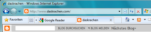
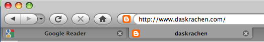
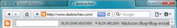
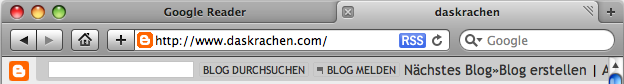
Wo hat ein Browser seine Tabs? zwischen Adressleiste und Webseiteninhalt. Bei Firefox (besondere Perversion) sind die Tabs sogar so dargestellt, als würden sie nur die Adresszeile ändern (oben befestigte Reiter), ganz im Gegensatz dazu ändern sie aber sowohl die Adresszeile als auch -viel wichtiger- den Webseiteninhalt. Wenn überhaupt, dann sollten sich die Tabs also am oberen Bildschirmrand befinden, so dass man mit ihnen wenigstens konsistent den kompletten Fensterinhalt ändert. Immerhin hier sieht man bereits Licht: Google Chrome und Safari 4 funktionieren bereits so:

Die Lösung von Safari hat noch ein paar Probleme: Wo verschiebt man Tabs? (Ungeschickt: an dem kleinen Handle am rechten Tabgreifer-Rand), Wieso haben die Tabs keine Favicons? Aber nicht verzagen: Noch ist Safari 4 lediglich eine Beta. Gut hingegen fände ich es, wenn dieses Tabbed-Fenster-Interface nicht nur für Safari, sondern für jedes andere Programm auch verwendbar wäre, also als Feature des Fenstermanagers implementiert würde. Man müsste daran noch ein wenig feilen, aber es würde Einiges sehr viel übersichtlicher gestalten. Snow Leopard anyone?
Weitere gute Ideen rund um Tabs, sortiert nach Browser:
- Microsoft Internet Explorer 8
- Tabs werden nach Farben sortiert, je nach dem von welchem Tab aus sie geöffnet wurden
- Im neuen Fenstermanager von Windows 7 werden alle Tabs als eigene Fenster aufgeführt
- Jeder Tab läuft in seinem eigenen Prozess. Bringt aber nix, weil wenn einer abstürzt nimmt er trotzdem den ganzen Browser mit. Ist aber auch noch nur Beta!
- Firefox 3 Preview
- Tabs sollen über ein neuartiges Interface beim Wechsel als Miniaturen dargestellt werden, so dass man einfacher zwischen ihnen wechseln kann
- Viele andere nette Vorschläge rund um diese Idee gibts hier: Aza Raskins Blog
- Safari 4
- Die Tableiste nimmt keinen eigenen Platz auf dem Bildschirm ein
- Tabs sind am richtigen Ort (oben)
- Google Chrome
- Tabs sind am richtigen Ort (oben) aber es gibt dennoch eine klassische Titelleiste des Fensters (im Gegensatz zu Safari 4)
- Jeder Tab läuft in einem eigenen Prozess, daher können einzelne Tabs abstürzen ohne den Browser mitzunehmen.
- Jeder Tab läuft in seiner eigenen Sandbox, was es Angreifern wesentlich erschwert, den Browser hochzunehmen.
Fazit: Es gibt noch viel zu tun, aber anscheinend ergibt sich langsam aber sicher ein Konsens, dass etwas mit Tabs getan werden muss. Es bleibt spannend.
Tagged File System
Ein großes Problem bei der Benutzung von Computern ist, dass unerfahrene Benutzer oftmals kein Verständnis für Ordnerstrukturen haben. Das ist im Grunde auch klar, denn die Ordner-Metapher legt nahe, dass sich Ordner auf dem Computer wie echte Aktenordner verhalten, also dass jeder Ordner mehrere Dateien, jedoch nicht andere Ordner enthalten kann. Ganz im Gegenteil dazu basiert aber eine normale Verzeichnisstruktur meist aus vielen, tief ineinander geschachtelten Ordnern. Von einem Usablitity-Standpunkt aus ist daher der Begriff "Ordner" wahrscheinlich schlecht gewählt. Vielleicht würde es schon reichen, den älteren Namen "Verzeichnis" wieder einzuführen. (Dann bräuchten wir nur noch ein passendes Piktogramm für "Verzeichnis"...)
Es wäre daher wünschenswert, eine einfacher zu verstehende Alternative zu Ordnerhierarchien zu haben. Die gibt es auch schon, in Form der bekannten Verzeichnisse "Meine Bilder", "Meine Dokumente", etc. Diese Ordner wollen den Benutzer mit einfachen Piktogrammen und klaren Namen dazu animieren, einen natürlichen Ort für seine Dateien zu wählen und so ein wenig Ordnung zu schaffen. Tatsächlich ist dieses Konzept einer Tag-Struktur schon relativ ähnlich, da auch hier nicht davon ausgegangen wird, dass sich der Benutzer selbst um eine tief geschachtelte Orderhierarchie kümmert, sondern nur wenige, einfach zu verstehende Markierungsmöglichkeiten ("Bilder", "Dokumente") geboten werden.
Ein echtes Tag-basiertes System könnte vollkommen ohne Verzeichnisse auskommen, wobei man dann eben beim Speichern einer Datei nicht mehr aus einer hierarchischen Liste von Ordnern den Speicherort auswählen würde, sondern von einer flachen Liste von Tags. Die Usability-Kosten davon wären vernachlässigbar.
Ähnlich würde das Finden von Dateien funktionieren: Statt eine hierarchische Liste von Ordnern nacheinander anzuklicken, würde man eine flache Liste von Tags nacheinander anklicken, jedoch mit dem Bonus, dass man die gesuchte Datei nicht erst bei Anklicken aller Tags, sondern mit großer Wahrscheinlichkeit schon nach ein oder zwei Tags gefunden hätte.
Ein Problem würde jedoch mit Projekten entstehen, die aus mehreren Dateien bestehen. Hier müsste man sicher stellen, dass sie im Dateisystem nur als einzelne große Projektdatei auftauchen und nicht jede einzelne Unterdatei gelistet wird. Das ließe sich zum Beispiel durch "Bundles" lösen, wie sie heute schon in OSX vorkommen (Ordner mit definierter Namesendung und Inhalt werden wie Dateien behandelt) oder einfach durch einen speziellen Tag, der die einzelnen Dateien vor der normalen Suche versteckt. Dieses Konzept wird übrigens heute schon vielfach verwendet, so ist etwa eine aktuelle Word-Datei nur eine ZIP-Datei, die eine definierte Verzeichnisstruktur mit allen Bildern, dem Text (als XML), einer Vorschau-Grafik etc. enthält.
Ich glaube, dass man mit solch einem Tag-basierten Dateisystem deutlich einfacher arbeiten könnte als mit den heute üblichen Verzeichnisstrukturen. Tja, jetzt fehlt nur noch eine innovative Firma, die sich um die Umsetzung kümmert...
Gedanken zu User Interfaces
Jeder kennt dieses Fenster:

Dieses Fenster ist eine ziemlich schlechte Idee, denn jeder geübte Benutzer hat irgendwann gelernt, dass die Aktion "Dateien Löschen" aus drei Gesten besteht: (1) Dateien auswählen, (2) Die Löschaktion einleiten, (3) Den Löschdialog bestätigen. Leider hat man schon vor mehr als zwanzig Jahren nachgewiesen, dass solche zusammengehörigen Gesten von den Benutzern als einzelne "Datei-Löschen" Geste abstrahiert werden. Man kennt das vom Tippen: Man tippt Worte nicht, indem man einzelne Buchstaben aneinander hängt, sondern man tippt Worte fast immer am Stück; Hat man erst einmal angefangen, ein falsches Wort zu tippen, kann man damit nicht aufhören, bis das gesamte Wort getippt ist. Auf ähnliche Weise ist es dem Benutzer auch nicht möglich, auf den Löschdialog sinnvoll zu reagieren, da das Bestätigen der Sicherheitsfrage vollkommen automatisiert ist und daher nicht einmal verhindert werden könnte, wenn man wollte. Die Alternative ist ein alter Bekannter: Undo. Statt den Benutzer im Vorfeld zu fragen, ob er die Datei wirklich löschen möchte (was er durch Einleiten der Löschaktion bereits bejaht hat) gibt man ihm die Möglichkeit, die Aktion im Nachhinein wieder rückgängig zu machen. Das ist wesentlich effektiver und kommt ohne nerviger Dialogbox aus. Übrigens funktioniert Dateiaktion-Undo bereits heute in allen Betriebssystem außer Linux, jedoch ohne Menüicon und zumeist nur für die letzte Aktion. Wäre es nicht schön, wenn dies noch weiter ausgebaut würde?
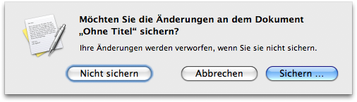
Noch ein gefährlicher Dialog:
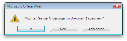
Das ist ebenfalls ein alter Bekannter, der immer dann erscheint, wenn man ein Programm schließen will, welches noch ungesichte Änderungen enthält: Abgesehen von dem offensichtlichen Problem, dass "Abbrechen" keinen wirklichen Sinn ergibt (Was abbrechen? Das Programm?) erfordert diese Frage jedes Mal das komplette Lesen der Meldung, bis man entschlüsseln kann, was "Ja" und "Nein" in diesem Kontext bedeuten. Um das noch einmal zu verdeutlichen, hier ein besonders schlimmes Beispiel:
Es leuchtet ein, dass hier ein eindeutigerer Dialog wesentlich sinnvoller wäre, bei dem sofort ersichtlich ist, was welcher Button tun wird: (Merke: Auf Buttons gehören immer Verben)
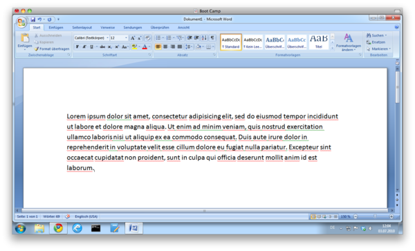
http://bastibe.de/static/2009-04/speichern_windows.png]]
Aber warum eigentlich überhaupt speichern? Warum muss ich mich persönlich darum kümmern, meine Arbeit zu speichern? Ich dachte, ich würde mit einer Datei arbeiten -- aber wenn diese Datei nicht geändert wird, wenn ich nicht zuerst "Speichern" anklicke, habe ich wohl eigentlich doch nicht mit dieser Datei, sondern mit einer heimlichen Kopie gearbeitet. Wäre es nicht viel sinnvoller, immer automatisch zu speichern, und statt des "Speichern"-Buttons eine "auf Urzustand zurücksetzen"-Funktion bereitzustellen? Ich bin mir auf jeden Fall sicher, dass man den "Undo all changes"-Button wesentlich seltener bräuchte als den "Speichern"-Button, denn wenn der Benutzer nicht vorgehabt hätte, neuen Text in eine Datei zu schreiben, dann hätte er keinen neuen Text in die Datei geschrieben. Hat er dennoch "versehentlich" Text eingegeben, ist das ein klarer "Benutzerfehler", also der logische Einsatzzweck für Undo.
Das sind nur zwei Beispiele, wie man intelligente Undo-Mechanismen sinnvoll einsetzen könnte, um das Arbeiten am Computer angenehmer zu gestalten. Ich wünschte, mehr Leute würden sich mit diesen Dingen auseinander setzen...
The strangeness of widescreen displays in modern operating systems
So today, pretty much everyone has widescreen displays. That is, displays that are far more wide than high. This was not always so. In ye olden days, computers were mainly used for displaying text, hence displays tended to have a similar layout as books or magazines. Today, they are more like movies (which might be worrying in itself).
So todays displays are widescreen. To do all that modern stuff, like watch (widesreened) videos or multitask (display two windows side by side). However, this also means that vertical pixels are something of a scarcity. Especially on those small Laptop screens. In fact, the first Netbook screens were so tiny that many of Windows' own windows could not be used at all since the lower parts did not fit on the screen. Raise your hand if Word 2007 leaves barely ten lines of visible text between all its blue-tinted UI-splendour on your laptop screen.
This gets most straining when reading text. On the internet for example. There is practically no website at all that can be displayed in its entirity even on one of those full HD displays. Print-formatted documents are a similar matter. Actually, I find myself craving for pixels regularly. I even disable the bookmark bar in my browser to free those extra two lines of text. And I memorize keyboard shortcuts so I can hide toolbars. And I use Google Chrome instead of Firefox/Safari/Internet Explorer, not least of all since it has the smallest title bar and no bottom bar.
Why, then, do modern operating systems still waste so much vertical space with that Dock/Taskbar? This is something I really don't get. Vertical space is such a scarcity, yet virtually every operating system choses to waste at least three lines of text with something that could easily go on the side of the display. Well, at least on Windows 7 and OSX that is something you can easily change.

So if you are like me and appreciate every added line of text, do yourself a favour and put your Dock/Taskbar on the side. Really, this should be the default.
OS X Finder Woes

The Mac. It used to be the most streamlined, thought-through general computing device on the market.
Even it's file management used to be top-notch. There were many cool little touches. One particularly useful feature was the Proxy Icon--if a window displayed a file's content, that file's icon would show up in the window's title. And you could drag that icon directly onto a thumb drive or email, without having to use the Finder. But the Finder, too, had many neat little features. I loved the fact that when you renamed a file in an alphabetically sorted file list, Finder would not immediately re-shuffle it to its new location, but would wait half a second before doing so. When renaming multiple files, this was really useful, since you could go through them one by one and rename them, simply by pressing arrow keys and return.
But as you might have guessed from my use of the past tense, these golden days are gone. The Finder used to know a JPEG from a ZIP regardless of file extension. Now it doesn't any more. The Proxy Icon is still draggable, but it will create an alias instead of a copy--perfectly useless on a thumb drive or in an email.
And with the newest version of OS X, El Capitan, they finally blew it for me. Before, even though the Finder inexplicably never had the ability to cut and paste files, you could always install programs like TotalFinder to fix that. Not so with El Capitan. The Finder now is holy land, and can not be touched any more by third parties. So no more cut and paste, no more un-hiding system files. No more side-by-side Finder tabs. And brand new with El Capitan as well: No more waiting after renaming. Now, when you rename a file, it is immediately re-sorted to its new position, thus making renaming multiple files terribly inconvenient.
So, good bye OS X. I updated my work laptop first, and I regret it. I never regretted an OS X update before. My home machine is not going to get the update. It is honestly sad to see my once-beloved Mac platform becoming worse and worse and worse with every new release.
Efficiency is not Intuitive
A few days ago, a new version of Darktable was released. Darktable is an Open Source RAW image processor, and one of my favorite pieces of software of all time. It may be THE most powerful RAW processor on the market, far exceeding its proprietary brothers. But in the social media discussions following the release, it got dismissed for being unintuitive.
Which is silly, ironic, sad; why should Intuition be a measure of quality for professional software? Because in contrast to a transient app on your phone, RAW processing is a complex task that requires months of study to do well. Like most nontrivial things, it is fundamentally not an intuitive process. In fact, most of my favorite tools are like this: Efficient, but not Intuitive; like Darktable, Scientific Python, the Unix Command Line, Emacs.
These tools empower me to do my job quickly and directly. They provide sharp tools for intelligent users, which can be composed easily and infinitely. Their power derives from clean metaphors and clear semantics, instead of "intuitive", "smart", magics. They require learning to use well, but reward that effort with efficiency. They are professional, and treat their users as adults.
In my career as a software developer, I know these ideas as traits of good APIs: Orthogonal, minimal, composable. APIs are great not when they are as expansive and convenient as possible, but when they are most constrained and recombinable. In other words, "don't optimize for stupid". That's what I understand as good design in both programming, and in professional UIs.
Which is quite the opposite of Intuitive. Quite the opposite of "easy to grasp without reading the manual". That's a description of a video game, not a professional tool. As professionals, we should seek and build empowering, efficient tools for adults, not intuitive games maskerading as professional software.
A review of iOS, from an Android user's perspective
My Pixel 2 phone received its final software update the other day, and its battery took the occasion to really show its age. So it was time for a new phone. Which is not a decision to make lightly, considering that I spend multiple hours per day using it. And this time, I was inclined to give the iPhone another go, mostly because of Google's gross lack of human decency in the last few years. So, after years of using various Android devices, I bought a used, red, iPhone SE (2020). I made this choice with some trepidations, as my last experience with iOS was an iPad 3 from 2012. These are my experiences.
As a seasoned Android user, my first impressions of iOS were a bit of a mess. There are things that swipe up from the bottom, swipe down from the top, to the left of the home screens, to the right of the home screens, and at various permutations of pressing/holding the home button. Everything animates, takes a long time, and moves the viewport around. Particularly annoying is the placement of the back button in the top left corner, i.e. the most-inconvenient place on the entire screen for the arguably most-important gesture of the entire UI1. A close second are the context menus that slide out from a long-pressed item, with the menu thus in a different position on the screen every time you long press anything. These things may be less flashy on Android, but are seriously simpler.
I also immediately missed Android's customizeable home screen, with freely-positionable app icons and a plethora of useful widgets. iOS is very restrictive in this regard, and seemingly for no good reason. Why is the list of all apps (right-of-homescreen) sorted arbitrarily into nonsensical folders instead of a plain list? Why are app widgets allowed, but only on that weird left-of-the-home-screen screen? Why can't I have a currently-playing widget for my podcast player, a weather radar, or my groceries list? Apparently, iOS 14 has a brand new API that does now allow Android-like widgets in iOS, but at the moment they were only available for Apple's own (useless) apps.
My second big stumbling block was the iOS on-screen keyboard. At first glance, I thought it a terribly clunky thing. Actions as simple as inserting a comma require multiple taps, and positioning the cursor seemed almost comically difficult. But then I discovered that the "123" button in the bottom left can be swiped instead of tapped, which makes commas and periods and hyphens available to a quick swipe. That is seriously cool, if slightly hampered by my accidentally activating Control Center instead of swiping from "123" a bit too often. And precise cursor positioning is hidden behind a long-press of the spacebar. Very cool indeed. With these gestures, the iOS on-screen keyboard is actually not bad at all.
Autocorrect seems capable as well, and multi-language aware (hear that, Android?). And, mind-blowingly, a triple-swipe on the content area engages undo and redo in the current text area. Albeit a nigh-undiscoverable gesture, this is miles better than Androids undo/redo system (there isn't one). Actually, Android text fields do support undo and redo if you press Ctrl-Z on the keyboard, it's just that no on-screen keyboard has a Ctrl key. This is my number one grievance with Android at the moment (although there are workarounds).
As a summary to the keyboard situation, I came to respect the iOS keyboard. I still miss a German "�" key, more control about the autocorrect system, and a more modern design. But it works reasonably well. Better than Android's stock keyboard for sure.
My second big hurdle with iOS was the camera. Just like my Pixel's camera, the iPhone takes perfectly acceptible photos. But everything else is just plain worse than on Android. It starts with the way you get access to the camera, either by swiping right on the lock screen, or by tapping the camera app on the home screen. On Android, you double-click the lock button to start the camera, then hit the volume button to take a photo. Not only is this significantly faster, it also requires no ungloved finger, and no look onto the screen. And it doesn't make that abominable shutter sound, either, that the iPhone requires (unless the entire phone is silenced or you take video).
When I take a picture with my phone, it is because I don't have a dedicated camera at hand. Considering the number of cameras I own, this is most likely to happen when I need a camera fast. Thus the speed from pants to picture is extremely important to me, and this is a clear victory for Android. And additionally, Pixel phones have supported stacked RAWs since the original Pixel2, and offer quite a comprehensive image editing suite right in the stock camera app. And I prefer the Pixel's relatively neutral rendering over the iPhone's oversharpened, over-denoised, waxy images. But that might be just me.
At this point, I had more or less given up on iOS, and bought a Pixel 4a, which is probably Android's closest competitor to the iPhone SE.
Beyond the camera, there were a number of annoyances with iOS that I found hard to get used to. Like the fingerprint reader on the SE being very unreliable for me (50% miss rate), and awkwardly requiring a distinct push to activate the home button, where the Pixel's is quicker and in a more convenient location. The home button is in fact not a button, but an immovable touch pad that fakes a button-like behavior with a little rumble effect when pressed uncomfortably hard. Pressing a hard surface really hard did not get comfortable to me, especially not when invoking the multi-tasking switcher with a double-press. And it's awkwardly placed at the very bottom of the device, where my thumb does not rest with any kind of force in normal usage. Another real problem is the lack of third-party browsers3, which just leaves you in the cold should a website not work in Safari, or should you dislike Safari's rendering or its very limited ad-blockers. I was particularly annoyed by Safari's context menu for links, which slowly slides out from the link's location, often extending far outside of the screen. Thus opening links in new tabs is just awkwardly slow and annoying in Safari, where Android's more utilitarian menu gets the job done much quicker. Although a phone with a bigger screen might mitigate this problem somewhat.
On the topic of animations in general, one of my favorite features in Android is the animation speed setting in the Developer settings. If you want to feel like you got a new, faster phone, just set the animation speed to 0.5x, and marvel at the newfound snappiness of everything.
Apps in general feel annoyingly restrictive on iOS. Where is a true Firefox, with addons? Where is a Youtube player that can play a YouTube video in the background while the screen is locked, or block ads (NewPipe is the bee's knees!). Or a file synchronization tool that can actually synchronize useful data outside of its own sandox? In fact, my original hopes for iOS were driven by my memory of the fabled higher quality apps available only on the App Store. Looking at some of my old favorites on the SE however, I was forced to take off those rose-tinted glasses. These apps might have been radical back in the day, but the world has moved on. I don't see a pervasive difference in app quality between iOS and Android any longer. Of course iOS apps do still cost a more money on average, and often can't be test-driven without paying. That two-hour free return policy on the Play Store is seriously genius.
Additionally, there were a number of odd problems with the iPhone SE that I found hard to make sense of. For example, apps were very frequently getting booted out of memory. So much so in fact, that often my RSS feeds would not refresh in the background, and podcasts would not download. Even though the iPhone SE sure does have a lot less memory than the Pixel 4a, I hadn't expected this to be an actual problem4. And the iPhone would frequently misunderstand a vertical swipe for a horizontal one, or initiate an edge swipe when my finger was still clearly on the screen; My bluetooth headphones sounded noticeably worse, with a strange clipping artifact that should not be there; Significantly worse cell reception and voice quality; Low contrast and tiny text on lock screen notifications; And only barely adequate battery life. And let's not even talk about the stupid Lightning cable, the (comparatively) laggy and tiny TFT screen, the lack of a podcast client I like, and my horrible experiences during the setup process.
So, in summary, the iPhone SE was not for me. Don't get me wrong, it's a nice enough phone, and probably enough of a smartphone for most people. But there were a number of issues with both its hardware and its software, where I found Android and the Pixel 4a plainly more productive. Which is surprising, as my mind still had iOS pegged as the premium alternative, that I would totally buy if I wasn't too cheap for it. But in actual use I was annoyed at its preference of form over function, with many a distracting animation and a number of glaring ergonomic mistakes. Well, another lesson learned. The only truly significant advantage of iOS remains its vastly superior software support story: The SE will probably receive software updates until 2025 or 2027, where the best-in-class Pixel 4a will definitely expire in 2023.
in some places, a right swipe can be used instead of the back button. But the behavior is too inconsistent to be useful↩
what Apple calls "ProRAW", and only makes available in the iPhone 12. iOS does support ordinary RAW, but only in third-party camera apps, and anyway non-stacked RAW files are rather useless from a tiny phone sensor↩
there are different browsers, but they are all required to use Safari's web renderer.↩
I hear this might have been a bug in iOs 14.3? What this says about the software quality of iOS in general is even more troubling, however.↩
