Posts tagged "photography"
What I learned about Amateur Photography
I am an amateur, as in "lover of", photography. I love cameras as tactile devices, I love how photography makes me consider the world as art, how that little viewfinder can reveal unknown beauty in well-known places or people. And I love looking at my photos, and remembering vacations and meaningful moments. For me, photography is about finding beauty, and capturing memories.
However, most of the writing on photography seems to be focused not on my needs, but the needs of professional photographers: A super competitive field of visual artists who compete on image quality and novelty, and use crazy and expensive gear. I have found many of their lessons not applicable to my amateur needs, or even actively detrimental:
Embrace the noise
Many pros limit their ISO numbers, because high-ISO noise is ugly. Which it is. But you know what is even worse for an amateur? Not having that picture of my baby, because it was too dark.
So I set my ISO to unlimited, reduce my shutter speed and aperture so I actually have a chance of capturing my fast-moving toddler. And embrace the ensuing noise. Some of my favorite pictures look unbearably noisy on my 4k screen, but look just fine when printed, or on a smartphone (the two most important mediums in the world). Because of this, I find noise reduction rarely worth the effort. Color heavy noise reduction works ok, but anything else looks worse than the problem. I vastly prefer a sharp, noisy shot to a mushy denoised shot with no detail.
Step it down
Another common Pro argument: Wider apertures are better. Which they are, at capturing light, and blurring the background. But as an amateur, a wide-aperture super-shallow depth of field just makes me miss shots. At f1.8, the area in focus is barely a few centimetres deep. I missed too many shots because I accidentally focused on the nose instead of the eye. So, in the absence of studio lighting, and arbitrarily many retries, I prefer to step it down and live with the noise, if need be.
As a fun corollary, all those fancy prime lenses with crazy-wide apertures, they are simply wasted on me. Anything beyond, say, f2.8, is not something I need to spend money on. Also, lenses are noticeably sharper when stepped down! I have been disappointed with the sharpness of a number of shots because I forgot to step it down. Nowadays, I typically shoot at f5.6 or f8, and only go wider if I actually need to, because of lack of light, or if I specifically want a blurry background.
Wide-ish lenses are easier
I wondered, for a long time, why pros seem to like long-ish lenses for portraits: The answer is, because longer lenses have a shallower the depth of field (for the same f-number), and pro photographers love their blurry backgrounds. But as I said before, that is not for me.
Instead, I prefer wide-ish lenses. If something is too small on a wide-ish lens, it is usually no problem to get a bit closer or to crop afterwards. If something is too big on a long lens though, backing off is often not possible, and you miss your shot1. Plus, wide-ish angles don't blur as much from shaky hands, and are more compact. They often focus more closely, too, which is a huge bonus if you want to take pictures of a toddler.
I have tried, unsuccessfully, a 50mm and 35mm prime (APS-C). Now I own a 27mm pancake prime, which I find perfect: long enough to get nice portraits, but still wide enough to capture a landscape.
Be careful with super-wide angle lenses, though. Even though they are a ton of fun, I have found anything below 16mm to be very difficult to use effectively. It's just too easy to get that fisheye-distorted look, especially near the sides. That distorted look, by the way, is caused by being too close, not by lens distortion. The same thing happens if you take a longer lens or a cell phone and get too close. Just don't do that.
to move closer on a wide lens.
Gear
Pros use the biggest sensor they can get, to get the best image quality possible. But that also makes everything else much more cumbersome: Bigger sensors mean bigger and heavier bodies. And bigger and heavier lenses. And shallower depth of field (see above). And smaller focal ranges, hence more lens changing. And, not least of all, much, much, much higher prices. It is not for me.
To some extent, the same goes for different quality levels: Personally, I have found entry-level APS-C mirrorless interchangeable lens cameras a good compromise. These entry-level plastic lenses and cameras are usually smaller, lighter, and cheaper than their higher-end brethren, but compromise on robustness and aperture sizes (e.g. Fuji X-E2 375g/€250 + Fuji XC 16-50mm, 195g/€150 vs. Fuji X-T1 450g/€250 + Fuji XF 18-55mm, 300g/€250 vs. my old Nikon gear). And for my everyday camera, I' take a smaller, pocketable camera over a "better", bigger one any day.
Haptics are important, too. I have seen great cameras and lenses that just didn't feel good in my hand. Which meant I wouldn't ever take them with me, and wouldn't take any pictures with them. I now go try stuff in the store before I buy anything. This has talked me out of a number of unnecessary purchases, internet consensus notwithstanding.
And finally, I buy used gear. Cameras and lenses depreciate about 70% within the first two years, without losing any quality. A great camera from two years ago is still a great camera, but costs a third of the original price, and can be resold without loss. And is better for the environment. Win-win-win.
TL;DR
I have found many "common" rules about photography useless for my amateur needs. I have found cheap, plastic, used gear more useful than pro gear. I have found noisy, small-aperture pictures to be better at capturing important memories than clean, "professional" ones. I have found haptics, size and weight to be much more important than ultimate image quality (within reason).
The funny thing is, you don't find this kind of information on the internet, since most review websites seem to focus on the professional viewpoint, even for gear that is clearly meant for amateurs like me.
You need to back off much farther on a long lens than you have↩
Learning about Photography: Sunstars
Normally, when you take a picture of something too bright, you get bloom: An all-consuming brightness that plunges everything around it into pure whiteness. Ugly.
But if the light source is reeeally tiny, and your aperture is teeeensy as well, you get something else: sunstars

This particular sunstar has fourteen corners, and therefore comes from a seven-bladed aperture (in my Fuji XC 16-50). It happens because tiny apertures are not perfectly circular any longer, but instead, in my case, septagonal, and therefore bloom more in some directions than in others. The effect is kind of beautiful.
In this picture, the sun was just barely peeking into the edge between the tree and the building, and my aperture was set to its smallest setting, f22. I actually wanted to capture the raindrops on the branches, which I largely failed at. In the end, the picture didn't turn out very pretty, but at least I got some fine sunstars!
On camera sensor sizes
A common internet wisdom about photography is that bigger camera sensors capture more light. So if you want to work in low light, you need a full frame camera, and a bigger sensor always produces better image quality. I have struggled with this a lot. It just doesn't make sense: Lenses can focus light on any surface, so why should the surface size matter?
The answer turns out to be... disappointing. Big-sensor cameras allow for larger (practical) apertures, and lower base ISO. But less noise for the same picture is simply impossible with the same sensor technology. Because that's not how physics works. Let me explain.
(At this point, I had previously launched into a long-winded explanation on equivalence, and reached a slightly misguided conclusion. So here's a better one:)
It is possible to build equivalent lenses for differently sized sensors, which capture the same amount of light, with the same depth of field, and the same field of view, but simply project this light on a differently sized sensor. Or you can use a "speed booster", which adapts a "bigger" lens to a "smaller" sensor. Both of these will give you identical images, and identical amounts of noise (if the same sensor technology is used).
As an example, a micro four thirds 23mm f/1.4 lens produces identical images to an APS-C 35mm f/2 lens or a full frame 50mm f/2.8 lens. You might notice that \(\frac{23}{1.4} = \frac{35}{2} = \frac{50}{2.8}\), which means each of these lenses will have the same physical aperture size, and therefore admit the same amount of light. And be the same size and weight. Since the smaller sensor collects the same light on a smaller area, the image will be brighter, and will need to use a lower ISO for the same exposure. And since lower ISO produces less noise, the "one stop advantage" of bigger sensors is bunk, if equivalent lenses are used.
The one remaining difference between sensor sizes is that bigger photosites carry more charge, which means more dynamic range at base ISO on a bigger sensor. This is only a factor if you indeed shoot at base ISO.
But, that's not the interesting part. Camera manufacturers cleverly designed their product lines such that small-sensor cameras are physically smaller, and get smaller lenses, while large-sensor cameras are bigger, with bigger lenses. Thus, if you want to get access to the most fancy glass, you will have to use a bigger, more expensive camera body as well. And inversely, if you want to use the most compact glass, it will only be available on smaller, less expensive camera bodies. And that's not pure marketing, either, as bigger lenses require bigger bodies to hold them comfortably, while smaller lenses balance better on a smaller body.
So in the end, it comes down to a compromize: If you want/need the best glass, it will only be available on the bigger bodies with the bigger sensors. If, on the other hand, you want to go small and light, you will need to sacrifice big apertures, but get access to smaller bodies with smaller sensors. But it's really all about the glass, not the sensor sizes.
Fuji Zoom Lenses
So I bought a new camera. Now I need new lenses. In this post, I am looking for a standard zoom lens, i.e. something that covers a bit of wide-angle, all the way through the normal range, up to a bit of telephoto. In Fuji's lineup https://camerasize.com/compact/#721.706,721.421,721.359,721.426,721.448,721.388,ha,t][these needs are met by
the XC 15‑45 mm f/3.5‑5.6 OIS PZ (€ 150, 136 g, 4.4 cm)- the XC 16‑50 mm f/3.5‑5.6 OIS II (€ 150, 195 g, 6.5 cm)
- the XF 18‑55 mm f/2.8‑4 R LM OIS (€ 250, 310 g, 7.0 cm)
- the XF 18‑135 mm f/3.5‑5.6 R LM OIS WR (€ 500, 490g, 9.8 cm)
the XF 16‑55 mm f/2.8 R LM WR (€ 650, 655 g, 10.6 cm)a bag of primes (€ inf, many g, lots of cm)- the XF 27 mm f/2.8 (€ 150, 78 g, 2.3 cm)
The XC 15‑45 is out, because the zoom ring is not turn-to-zoom like any other zoom lens. I tried it; I couldn't stand it. The XF 16‑55 is out because it is just too expensive and big for me. A bag of primes is not what I want, but I included the XF 27, because that's what I happened to have at hand. All of the above prices are used prices as of early 2019 in Germany.
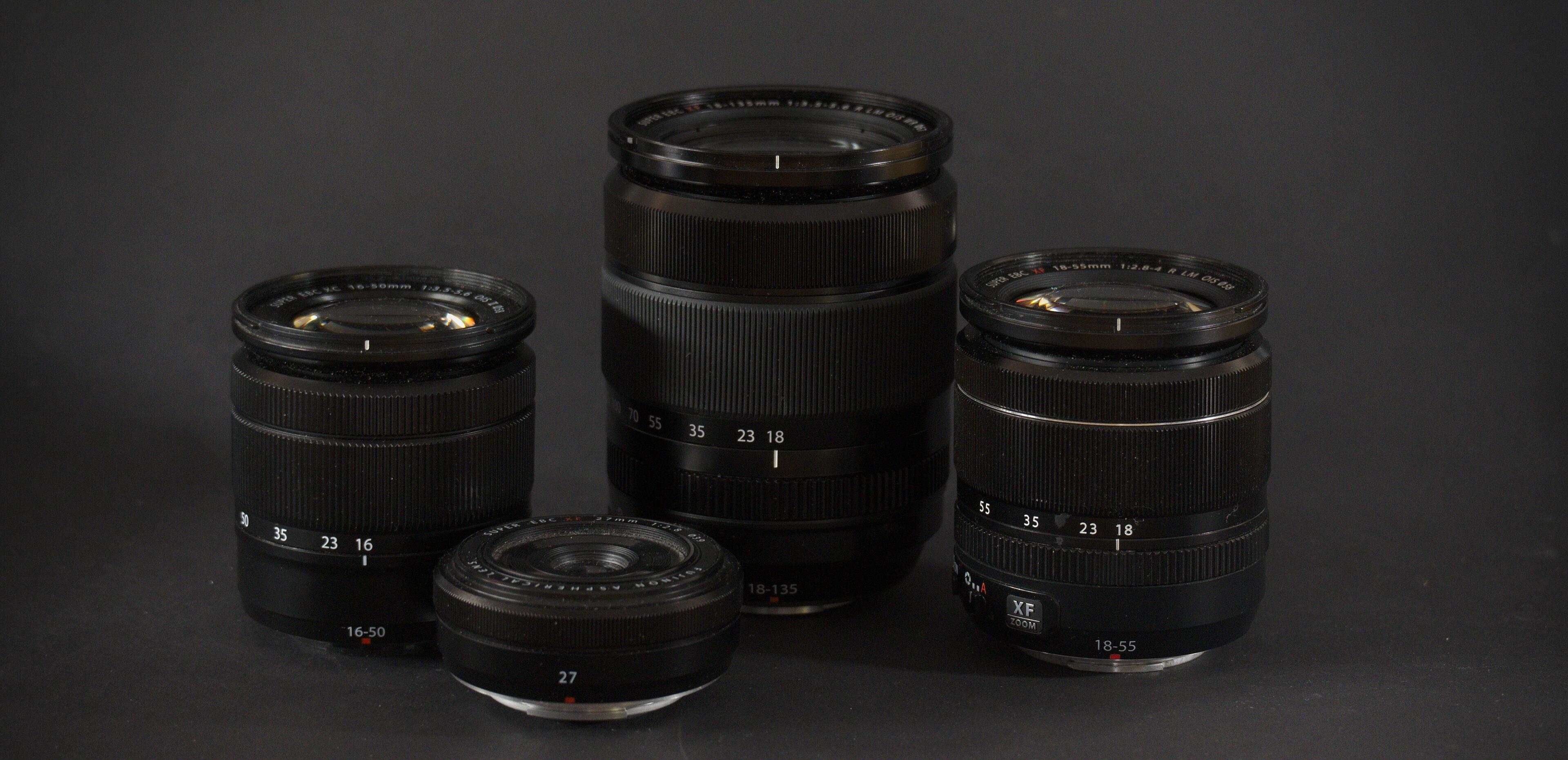
Before we get started, all of these lenses are perfectly sharp to my eyes. At least in the center-ish area of the image, every pixel shows different information, which is not something I could have said about some of the Nikon lenses I used to own. Because of that, I will not compare sharpness.
The word of mouth is that the XF 18‑55 is a stellar kit lens, the XC 16‑50 is a bit cheap, and the XF 18‑135 a bit of a compromise. If internet forums are to be believed, these differences are massive, and the XF 18‑55 is really the only acceptable non-prime lens any self-respecting Fuji fanboy can buy. But then again, that's what internet forums would say, right?
With that out of the way, let's have a look at these lenses! I'll use crops from a terribly boring shot https://bastibe.de/static/2019-05/example.jpg][linked here for most of my examples. Why this shot? Because a), that's what was available, and b), because it contains areas that nicely showcase these lenses' qualities. All shots were taken at f/8 at 27 mm, ISO 400 and a shutter speed around 1/300 s.
Micro Contrast
I often read that micro contrast really tells lenses apart. To illustrate this point, here's an area with very little overall contrast, particularly between the fence and the orange paint, and the fence and the gray stairs:

If you look very closely, you might find the fence slightly less visible on the XC 16‑50 than on the XF 18‑135 and XF 27, and ever so slightly more visible on the 18‑55. But it should also be obvious that these differences are incredibly tiny, and not worth fussing over.
Corner Sharpness and Chromatic Aberrations
Another common point is corner sharpness, which is typically said to strongly favor primes. This time, the images are cropped from the bottom-right corner of the image that contains some detail, but most importantly a bright white warning sign:

And indeed, the XC 16‑50 is noticeably blurry this time, with the other three lenses similarly sharp. The warning sign also highlights color fringes on the transitions from the bright white sign to the dark background. These chromatic aberrations are almost invisible on the XF 18‑55, and mild on the XF 18‑135 and XF 27.
Bear in mind, however, that these are 100% crops in the very furthest corners of a high-contrast image. In normal pictures, none of these issues will be noticeable unless you really zoom in on fine details at the edges of your frame. The chromatic aberrations seen here were already treated in software with the lens correction module in Darktable, but it might be possible to improve on these results with more dedicated processing.
Update 1: Even more comparison pictures
After publishing the blog post, I still wasn't satisfied: What if the results I got were only true at f/8? What if image quality got worse at a longer focal length? How does my XF 18 stack up?
To answer this, I took another set of pictures and prepared another composite of an crops near the image center, and another one near the lower right corner.
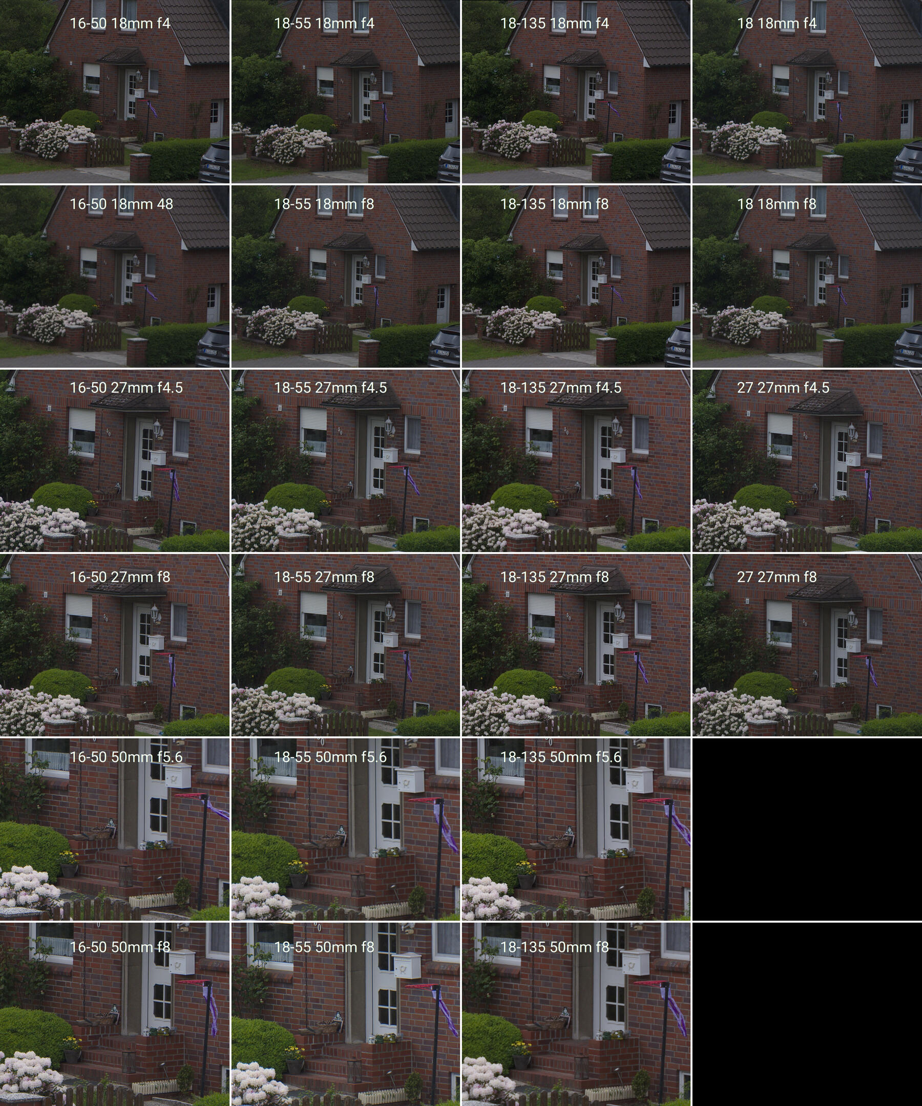
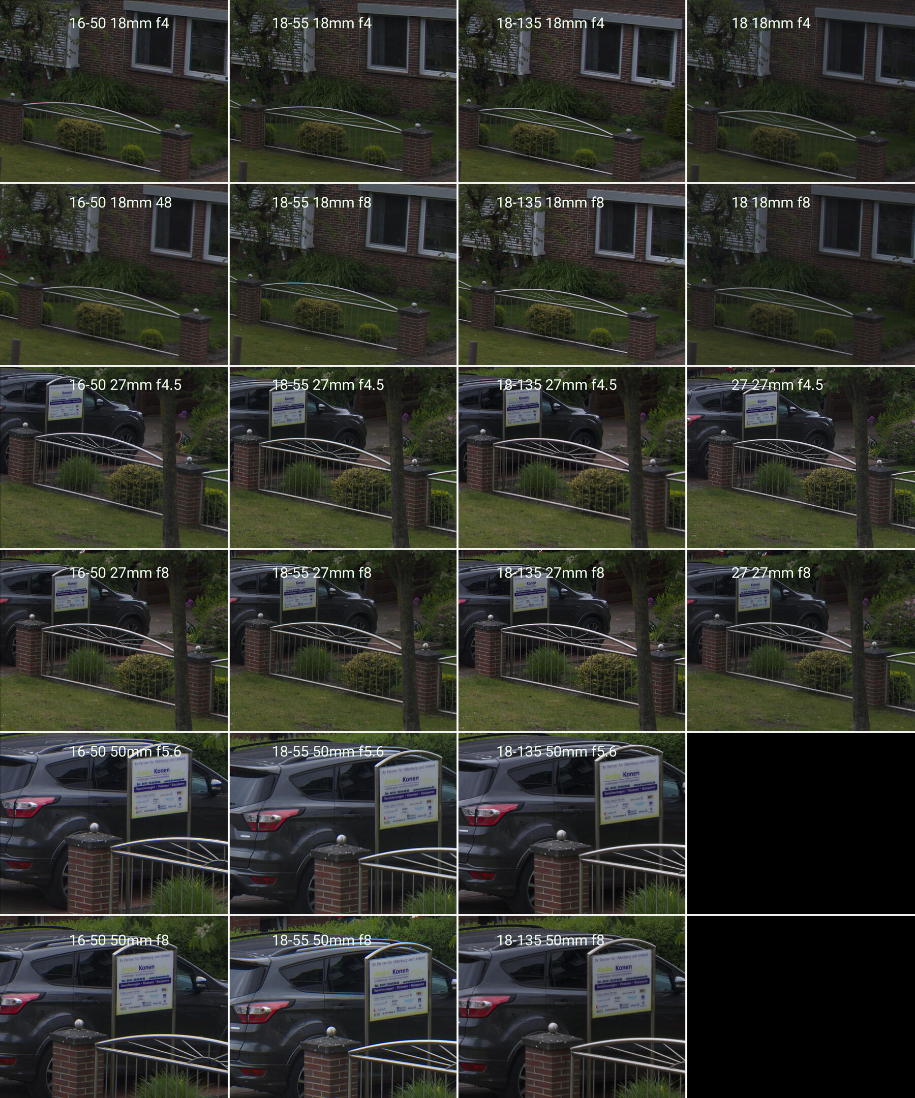
To be perfectly honest, I can not see any significant differences between any of these pictures. At this point, I am starting to question the entire concept of sharpness and micro contrast for evaluating lenses. But at least I learned a lot about how to use the Gimp.
As a sanity check, I repeated the experiment with my old Nikon 18-200, and this was in fact noticeably less sharp. And slightly overexposed. And slightly off-color. That's why I switched to Fuji. But as I said, this was a sanity check, not a fair comparison, as the Nikon D7000 body is much older than my Fuji X-E3, and the lens has surely seen better days as well.
Update 1: Ergonomics and Balance
The XC 16‑50 and XF 27 operate their aperture with the control wheel on your right thumb. The XC 18, XF 18‑55, and XF 18‑135 have a dedicated aperture ring on the lens instead. Thus, the former two lenses can be controlled with the right hand alone, while the latter two require the left hand on the lens barrel. Zoom is always controlled on the barrel, though.
This preference for one-handed or two-handed operation is supported by the lenses' weight, as well: My camera, the X-E3, weighs about 330 g. With the 200 g XC 16‑50, the weight is mostly in the camera body, and can easily be held and operated with one hand. The 250 g XF 18‑55 and the 500 g XF 18‑135 are more lens-heavy, which makes a two-handed grip necessary, which is a better fit for the aperture ring on the lens.
Personally, I actually prefer the aperture on the thumb wheel over the unmarked aperture rings on the XF 18‑55 and the XF 18‑135. It just feels more natural in my hands. On the other hand, I like the marked aperture ring on the XF 18, particularly for resetting the aperture without looking through the viewfinder, or when the camera is turned off. In fact, I find the ability to operate the camera while turned off to be very useful in general. It is one of the major reasons why I like Fuji cameras.
Update 2: Image Stabilization
In order to assess the image stabilization systems built into these lenses, I took a series pictures of a static subject at 18 mm, 27 mm, and 50 mm, for shutter speeds of 1/30 s, 1/15 s, 1/8 s, 1/4 s, and 1/2 s. I then looked at five images for every combination of lens, focal length, and shutter speed, and labeled them either sharp if there was no visible blur at all, or usable if there was micro-shake only visible at 100 %, or miss if the shot was too blurry.
The XC 16‑50 had perfect sharpness at 1/30 s, was at least ok between 1/15 s and 1/8 s, and even 1/4 s still had a few usable shots. 1/2 s or longer was unusable. There was no significant difference between the focal lengths. That last bit is really interesting, as I would have expected shorter focal lengths to be easier to hand-hold than longer ones.
The XF 18‑55 stayed perfectly sharp one stop longer until 1/15 s, but otherwise performed exactly the same as the XC 16‑50. I would guess that the small difference in stability between these two lenses is mostly due to their weight difference, but that the image stabilization system is identical.
The XF 18‑135, however, was another matter: All shots up until 1/8 s were perfectly sharp, and remained at least usable until 1/2 s! Only at 1 s of shutter speed did I see significant numbers of missed shots! Again, there was no significant difference across focal lengths.
With disabled image stabilization, I could hand-hold most shots for at most 1/focal length, but missed or fudged a few shots even there.
In summary, I found the XC 16‑50 and XF 18‑55 image stabilization good for about two stops, and astonishingly, the XF 18‑135 stable for a full four stops over my personal hand-holding skills. Some of that stability is no doubt due to the increased weight of the XF 18‑135, but nevertheless, I find these results astonishing!
Close Focus Distance and Magnification
And now, the darling of all photographers: out-of-focus backgrounds. Common wisdom is that the bigger the aperture, the more the background is thrown out of focus. But that's only part of the truth, and honestly, not the most interesting part for these kinds of limited-aperture lenses. Much more powerful is getting closer to your subject: The closer you focus, and the farther away your background, the more the background will be out of focus. This effect gets even stronger when you zoom in.

The XC 16‑50 focuses much more closely than any other lens in this list, at 12 and 30 cm (Fuji says 15 cm). You can get really nice background separation with this lens, and great magnification in your macro shots. The XF 18‑55 focuses at 25 and 35 cm (Fuji: 40 cm), which is not particularly impressive. The XF 18‑135 focuses even farther, at 33 and 43 cm (Fuji: 45 cm), but gains magnification through its long tele zoom. The XF 27 is not optimized for this kind of thing at all, at 29 cm (Fuji: 34 cm).
Conclusions
To me, the XC 16‑50 is the winner for a small/light zoom kit. It might be the least great option optically, but the differences are not dramatic at all, and it is the cheapest, smallest, and lightest lens with the most useful wide end and the closest focusing. But it lacks a dedicated aperture ring and is a plastic construction instead of a metal one, which does detract from the haptic joy somewhat.
The XF 18‑55 is optically the strongest lens. It might even beat the XF 27 prime lens on its own turf! But the optical differences to the cheaper XC 16‑50 and the more versatile XF 18‑135 are quite small, and are not be worth the price/weight/inconvenience to me.
The XF 18‑135 is really surprisingly good. The much longer focal range necessarily comes with compromises in optical quality and bulk, but it seems no significant corners where cut in this case. And the image stabilization is a significant step above the other two lenses. Considering that this lens usually replaces at least two other lenses, I even find the price reasonable. This is my first choice as a do-everything zoom kit.
The XF 27 is not very strong in any particular way, except size. And that size trumps all. If I just want to throw a camera in my bag without any particular photographic intentions, the XF 27 is my first choice. And possibly the XF 18, if I still have room in my bag.
As some small buying advice, the XC 16‑50 was refreshed in 2015 with the OIS II version, which introduced that nice close focusing distance (highly recommended). The XF 18‑135 was apparently built in two batches, the original made in China version that seemed to have horrible QA issues, and a second made in Philippines version in 2017 without.
What I didn't mention
Aperture. The XF 18‑55 and XF 27 have a wider maximum aperture than the XC 16‑50 or XF 18‑135, by about two thirds of a stop. Shooting at bigger apertures makes brighter pictures with stronger background blur, and some loss in sharpness. I don't find the optical performance wide-open particularly interesting, because most of the time I'd use large apertures to blur the background, making sharpness and distortion mostly irrelevant. And as I said above, getting closer is usually more effective for background blur than maximum aperture, anyway.
Image stabilization. The three zooms offer optical image stabilization systems. From what I can tell, the XF 18‑135 is significantly more effective in this regard than the XC 16‑50 or the XF 18‑55. Hand-held shots with up to about 1/10th of a second seem easily achievable with the XF 18‑135, whereas the unstabilized XF 27 becomes blurry at 1/40th. Videos are noticeably smoother with the XF 18‑135 as well.
Weather sealing. The XF 18‑135 is weather sealed, the other lenses are not. My camera is not, so I don't care.
Distortion and Vignetting. Is fixed in post. No need obsessing over it.
Autofocus speed. Is good. No need obsessing over it.
Travel Cameras
We went on a once-in-a-lifetime vacation this year. Six weeks in the USA, roving New England in an RV, and going on a helicopter tour around New York City. I have spent months thinking about the perfect camera for going on this trip. I went on several vacations with various permutations of cameras and lenses as a test-run. I data-mined my existing photographs to find the perfect setup through science. And I scoured the internet for untold hours to get it right.
Here's what I took with me:
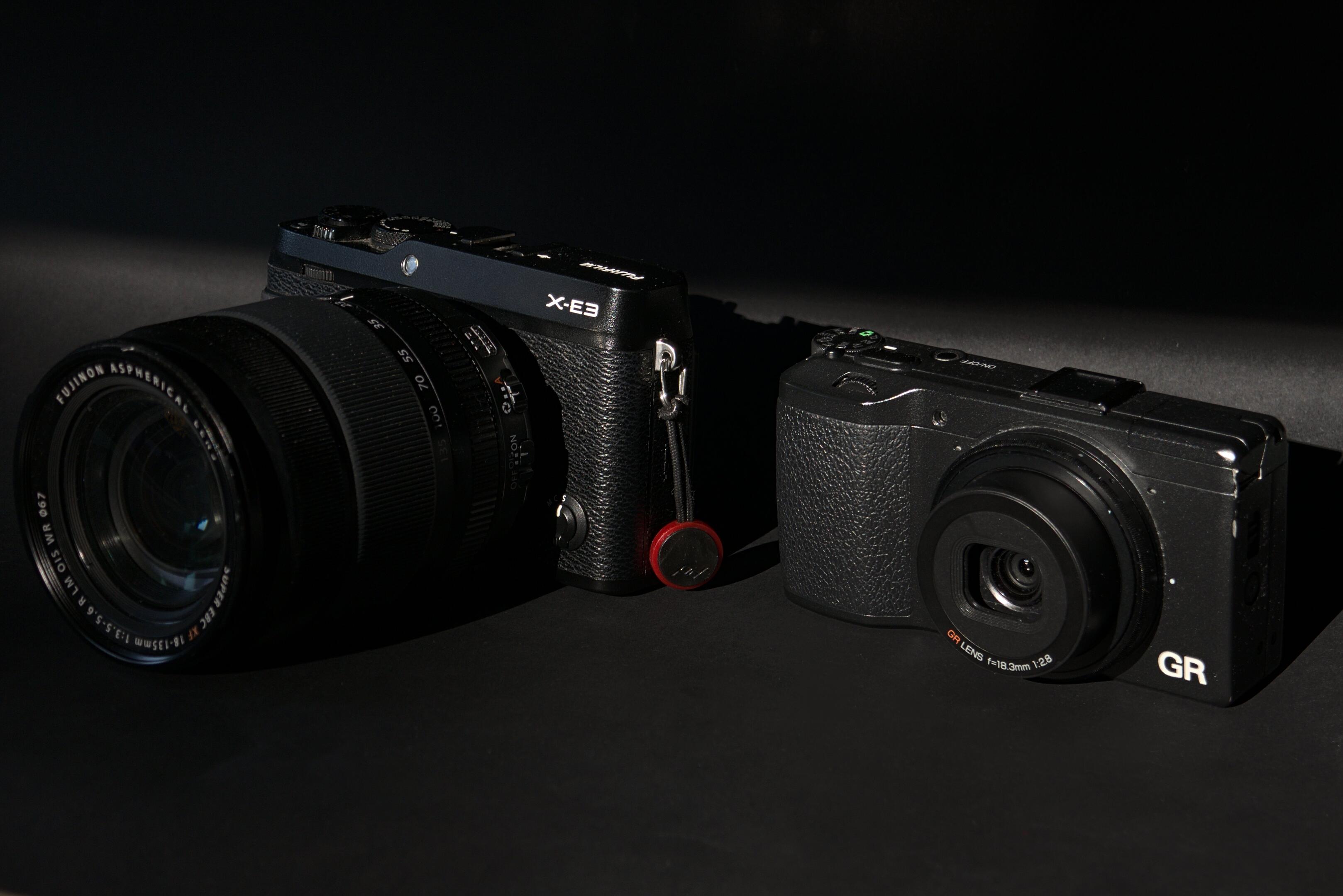
That's two cameras! Most people would take their smartphone one camera with multiple lenses. I take multiple cameras with one lens each. Why? Because they're both awesome, at different things:
The Fujifilm X-E3 with an XF 18-135 f/3.5-5.6 lens
The X-E3 is a mirrorless camera, which means it's small. It is a very recent camera with a modern sensor. It's a rangefinder-style camera with the viewfinder in the top left. So it doesn't obscure my whole face when I lift it to my eye.
Compared to a DSLR, this is a small and light camera1. But paired with the lens, it is neither. That lens, though: a massive focal range from 18 mm to 135 mm is suitable for wide landscapes, as well as tight tele shots of wildlife. Cramming it all in one lens must come with a loss in sharpness and aperture, but the 18-135 is a best of its breed, and still plenty sharp enough for me. And it comes with an image stabilization so sophisticated that I can hand-hold half-second exposures. Which is magic.
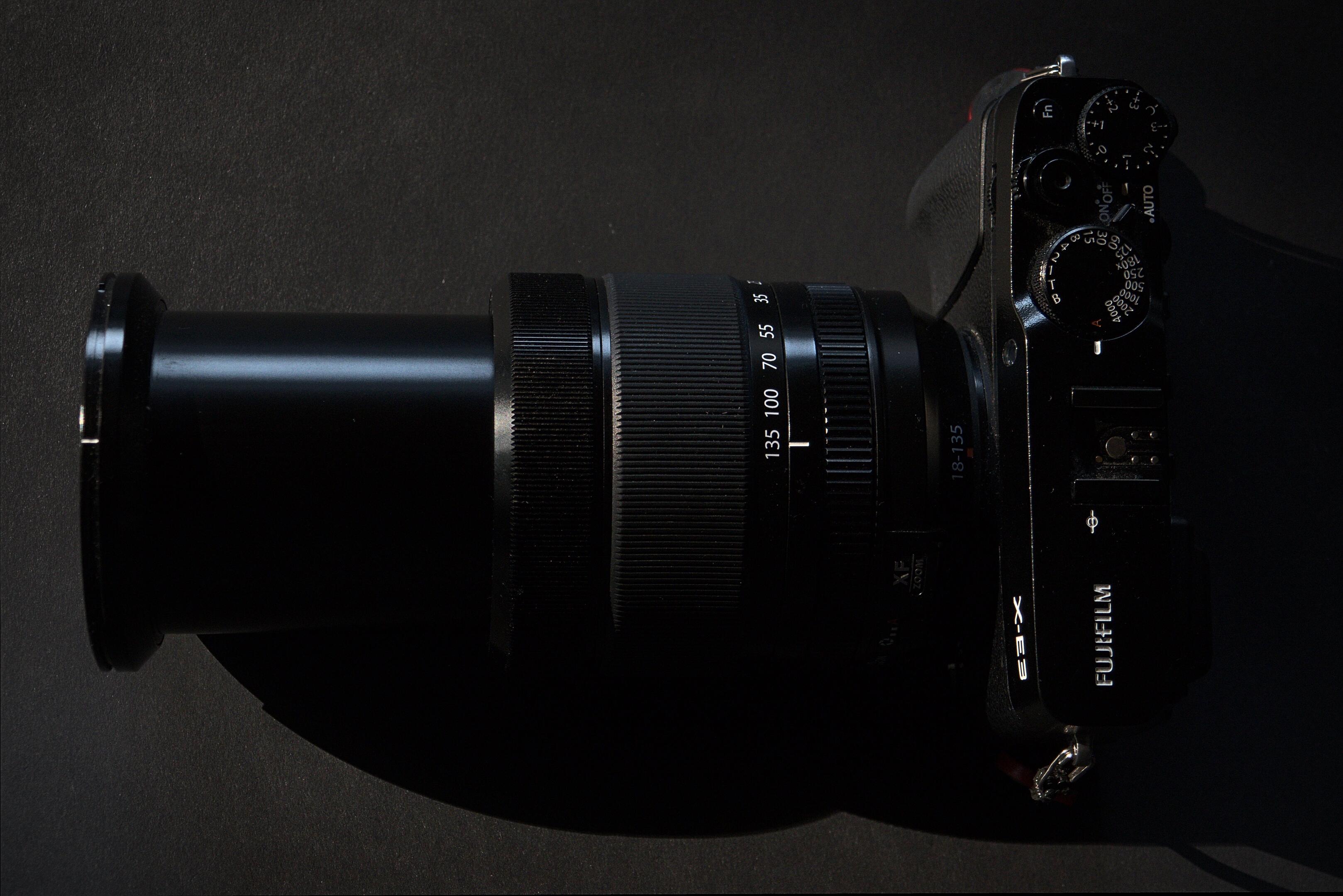
This is a great camera for deliberately framing a shot; it feels great to hold, with a neat and efficient control layout for quickly playing with apertures and shutter speeds and focal lengths with a minimum amount of fuss. It is a dependable tool, an amazing piece of engineering, and an artistic means of expression. It is truly a great camera.
If it has an Achille's heel, it's that it takes a while to get ready. Not because it is slow to start up, but because there's a delay before the viewfinder activates when raised to the face. Which just means you will stare into the void for half a second, while seeing the critical moment pass in front of you. Half a second of missing the shot.
And the white balance can struggle a bit with forests and lakes. Forests are green, and to compensate, the X-E3 turns everything else magenta. Easy to fix in post, but annoying. These are minor complaints, and most of the time the X-E3 is as perfect a camera as I've ever seen one.
Here are a few pictures I took with the X-E3 on my last vacation2:


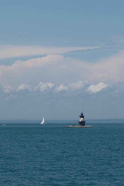


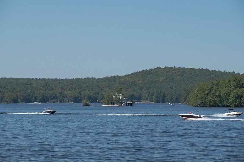


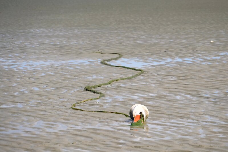


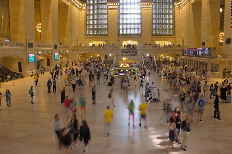


Image quality is simply excellent. Not once has the X-E3 let me down. Autofocus is accurate, and instant. The lens is amazingly sharp all through its focal range. Dynamic range is unreal, at times. As you can see in the pictures, I've shot everything from landscapes to people, to wildlife, long exposures, and even some astro. All with one lens, on one camera.
The Ricoh GR
So, if the X-E3 is my "professional" camera, the Ricoh GR is my fun camera. In 2019, the GR old technology. It was released in 2013, it has a big but aging 16 megapixel APS-C sensor, and a fixed 18 mm f/2.8 lens with no zoom. It shouldn't be able to compete with the Fuji. But there is one thing the GR does better than any other camera: Speed.
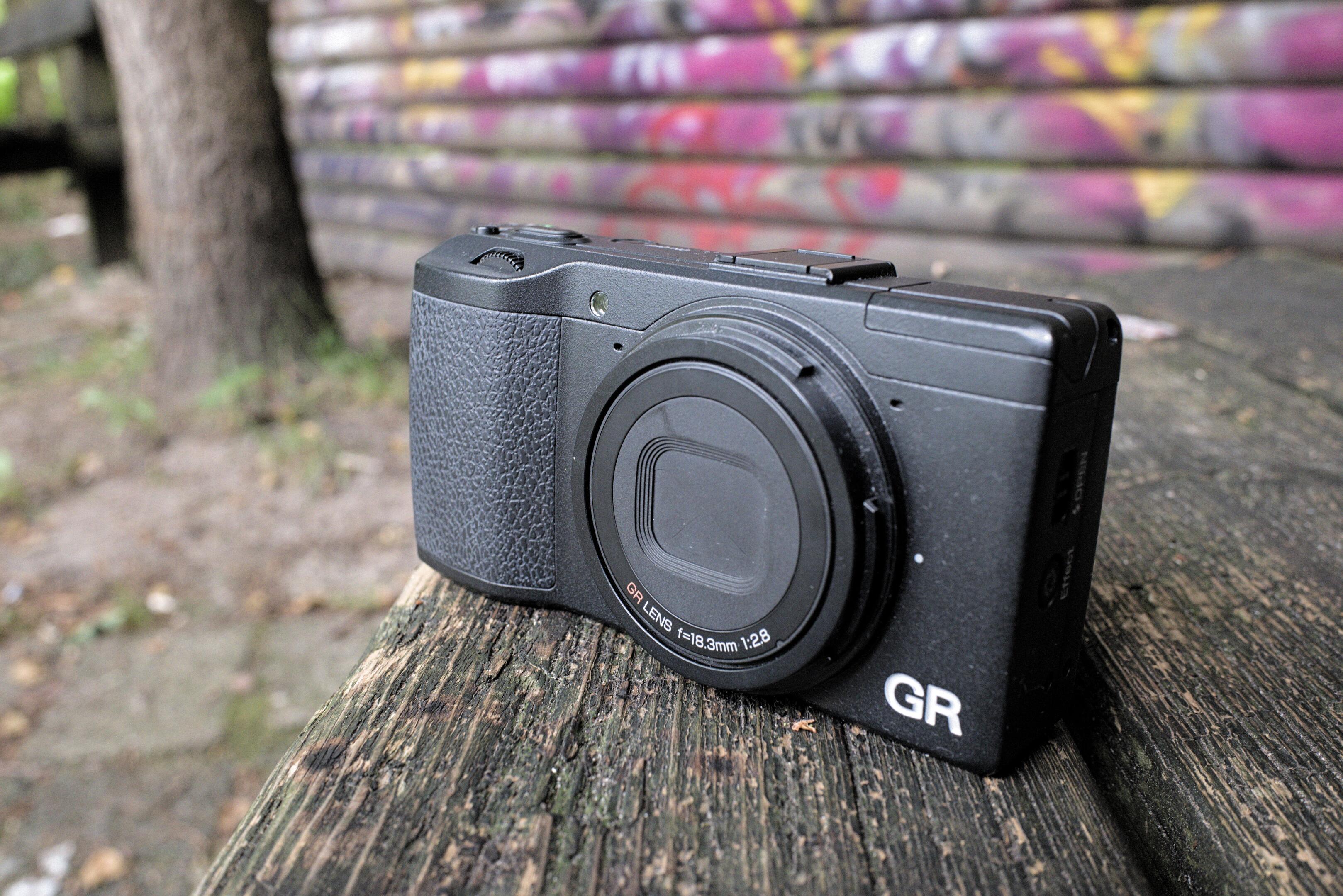
The GR is in my pants pocket. It wouldn't be my pants without a GR in it. I have it with me everywhere, all the time. And at the right moment, I will pull it out, and take a picture, before you even notice it's there. That's the GR's mission: The fastest possible time from pants to picture!
Seriously, the GR goes from off to taking the first shot before even its screen turns on3. I can whip out my GR and take a picture long before you have unlocked your phone, never mind started the camera app, selected a focus point, or aimed it at your prey. In the car, I had the GR in the center console, and could take a picture of the roadside before it whizzed past. And without taking my eyes off the road, naturally.
Since the GR has a fixed and wide focal length, I don't have to look at its screen to see what I'm taking a picture of. I can do it by feel. Because all the controls are on the right, I can adjust everything with my right hand only, without taking my hands off the wheel, or stroller, or wife. And then there's snap focus, where a full-press of the shutter will take a shot at a pre-defined distance, without waiting for autofocus. I wish every camera had this feature!
However, all of this took some getting used to at first. I missed focus a lot in the beginning. But once I figured it out, a new world opened up. A world of whimsy and spontaneity that is simply not possible with a bigger or slower camera. A good half of my favorite pictures were only possible thanks to the GR.
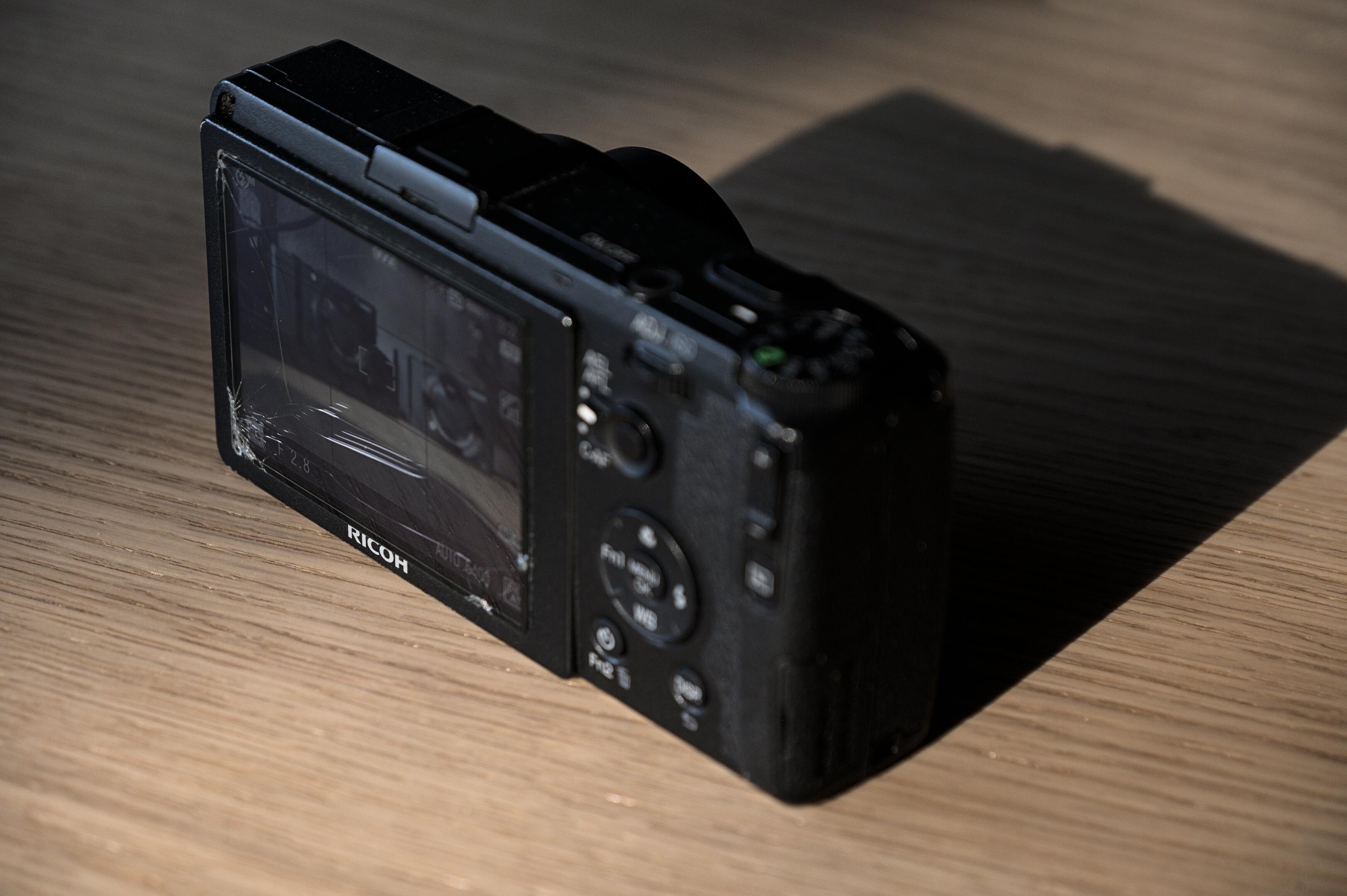
Again, there are downsides. It's an old sensor. Dynamic range is limited. Autofocus could be faster. There's a noticeable shutter delay. There is no viewfinder or image stabilization. The white balance is not great. It can struggle with a full memory card4.
But none of that matters. I love its colors. I love its sharpness. It has taken quite the beating on this vacation, but I wouldn't have it any other way. The GR is magnificent. There is nothing else quite like it5. And so many memories would have been lost if not for the GR:

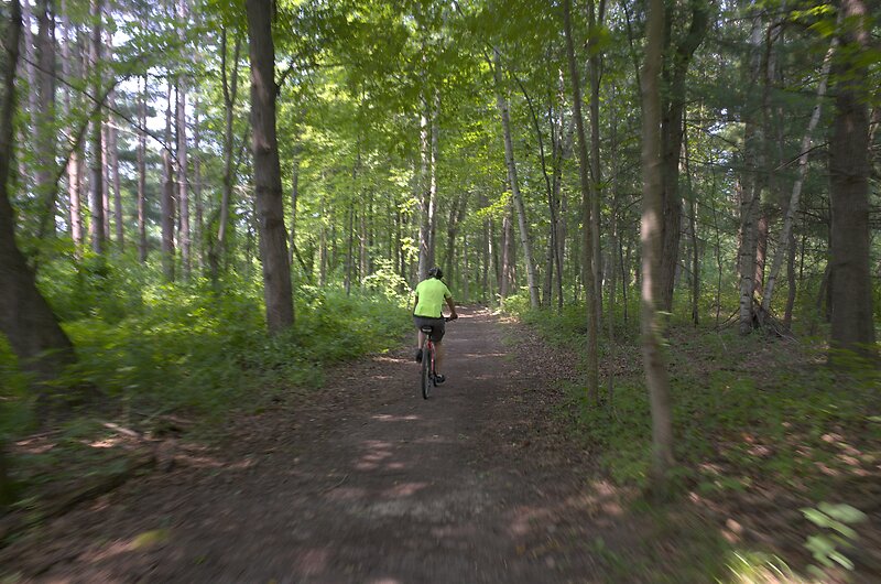

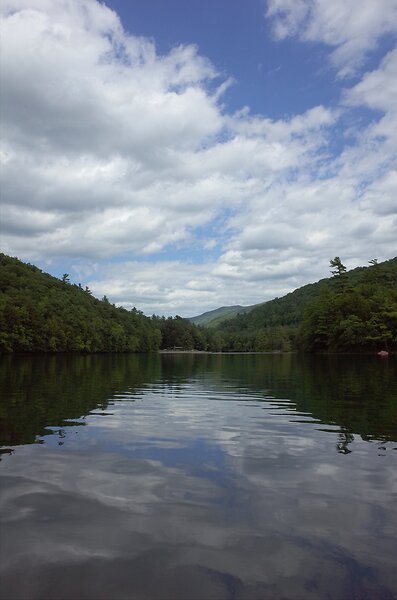
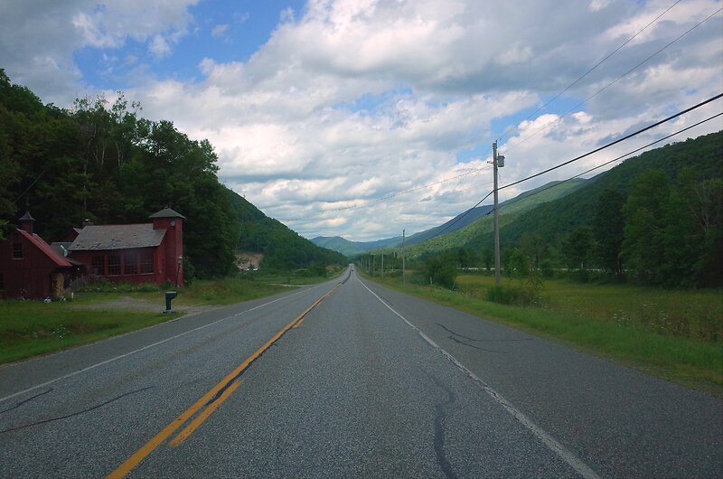
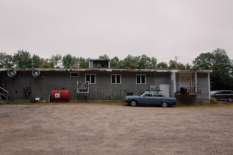


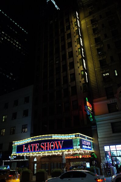
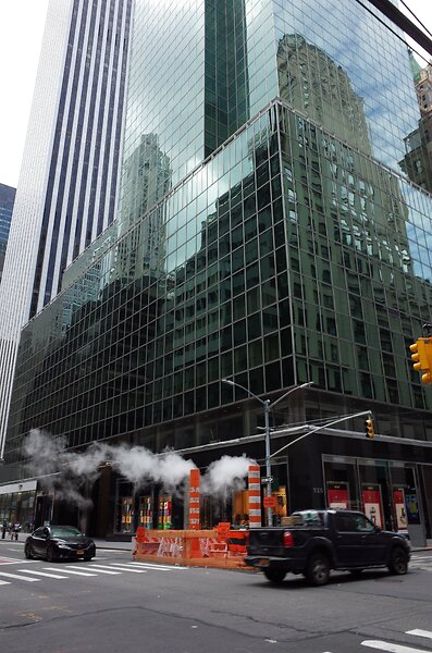


Many of these shots were taken in the spur of the moment. In situations where I didn't take the big camera with me. Where a big camera would have been inappropriate. But the GR is so tiny, so non-threatening, it can become part my daily life. And capture the fleeting moments that make life worth living. That is a photographic super power if there ever was one.
The body weighs 337g, which is a feather. The lens weighs 490g.↩
No personal pictures, though. I don't share those publicly.↩
The magic is "snap focus". If you depress the shutter fully, without waiting for autofocus, the GR immediately takes the shot at a pre-set distance. Works in any mode, and even when just powering on: Press the power button, aim, press the shutter, and before even the screen turns on you will have taken a picture. Lightning fast.↩
As the card fills up, getting into playback mode takes longer and longer. Minutes, for a full 64 Gb card.↩
Forget about the Fuji XF10. I tried it. It's a newer sensor, but so clumsy, so slow, so awkward to use. It's no comparison.↩
Editing Fuji Photos on Linux
Darktable is my favorite RAW editor. It's a program for developing digital negatives ("RAW files") to JPEGs. But, I've long struggled with matching the quality of the out-of-camera JPEGs of my Fuji camera. Let me explain.
Today's cameras capture an astounding amount of detail, far more than monitors can display or printers can print. And then they crush it down to a printable and viewable JPEG file. But that crushing operation is idiomatic for each camera, irreversible, and not always appropriate to the image. And at those inappropriate times, when you want a wider dynamic range or different colors, a RAW editor like Darktable can take a digital sensor dump ("RAW file"), and render it differently. The challenge is that the camera's own JPEGs are already very, very good, and it's a fine line to walk between fixing a particular flaw with the image, while retaining as much detail as possible.
Fuji cameras produce notoriously difficult RAW files, as their internal processing is (said to be) particularly elaborate, and they use an unusual image sensor. This post is about matching the quality of Fuji's JPEGs in Darktable, while maintaining the fidelity and malleability of the RAW files.
Here are a few renditions of a photograph I took, the first created with my revised process, the second is Fuji's JPEG, and the third is Darktable's default rendition. First the entire picture, the a zoomed view so you can see each pixel:
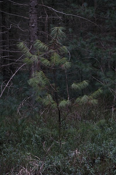
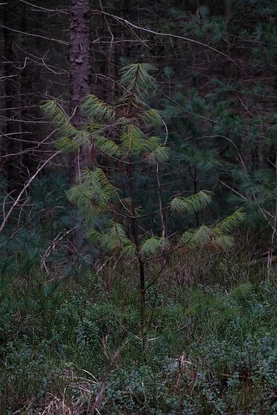

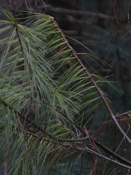


While contrast and saturation don't match 100% in my version and Fuji's, the colors are close enough for further processing. Darktable's default version does not match those colors at all. The zoomed-in version highlights even worse problems with sharpness and detail retention. After working with Fuji files in Darktable for about a year, and editing about 3500 Fuji files, I finally found a workflow that reliably produces results on par with Fuji's JPEGs:
- Use the Iridient X-Transformer to convert Fuji's RAF RAW-files to DNG RAW-files, and have the X-Transformer do the "More Detailed" demosaicing, and the full lens correction.
- Use Stuart Sowerby's LUTs instead of Darktable's Base Curve or Filmic RGB.
My first gripe with Darktable's rendering of Fuji files is that the demosaicing and lens corrections are not particularly great. Pictures simply come out softer than with other tools, and chromatic aberrations remain an issue. The Iridient X-Transformer completely fixes this issue for me. The X-Transformer can also do sharpening and denoising, but I find those are better relegated to Darktable where needed. "But... that's proprietary Windows software!!!". Yes, it is. And it works beautifully in Wine.
My second issue is colors. Darktable needs a lot of massaging to produce Fuji-like colors. The Base Curve module (shown above) really does not do Fuji files justice most of the time. And while Filmic RGB is much better, it requires a lot of tedious adjustments even in simple cases. So instead, I use LUTs extracted with a color chart and some fancy math to replicate Fuji's colors. At the moment (v3.0), Darktable understands only .cube and .png LUTs. But Stuart Sowerby's website has them in .3dl. So for now, you need to install a 3D LUT converter, and convert them to .cube manually. On Windows.
With these two steps you can develop your Fuji RAFs better than your camera, and with relatively little fuss. I'll leave you with a finished render of the image above:
RAW Developer Comparison
It bit me again: I got software envy. What if I could develop my pictures faster with a different RAW developer? What if they looked better than they do now? Questions like these keep me up at night.
The Problem
Choice. There are so many RAW developers out there. And they all have rabid fan bases, and apparently unique rendering. How to choose?
Here are my house rules:
- Must run on Windows or Linux
- Must run acceptably on my Surface tablet
- Must run acceptably with files on a network share
- Must support my past and present cameras (Fuji X-E3, Ricoh GR, Pentax Q7, Nikon D7000)
In contrast to most other comparisons on the 'net1, I won't concern myself too much with sharpness and noise reduction and demosaicing. I have yet to see a photograph that was ruined by them, and most RAW developers seem to do a sufficient job at them.
I would prefer a file-based workflow with edits stored alongside the RAW files2, and I would prefer a perpetual license instead of a rental contract, but I'm willing to compromize on both if it's worth it3.
Obviously, I am a lot more proficient in my current tool, Darktable, than in any of the others. But for this test, I'm explicitly not doing anything particularly artistic; merely some highlight recovery, shadow recovery, and local white balance adjustments. By limiting myself to these edits, I hope to get an unbiased idea of the various RAW developer's implementations, without needing to ask the endless “what if” of what else I could have done. That said, I will leave all other adjustments on their default settings, to still get an impression of the general look of the programs.
The Contestants
- Darktable 3.0.2 (Free)
Free, works on Linux, very familiar to me. Allegedly, not particularly fast, with a confusing user interface. - Adobe Lightroom Classic CC 7.5 ($10/month)
Probably the most widespread tool. Somehow unappealing to me. Currently only available at a subscription price, but there is a “free” version available through my university. - Capture One 20.0.4 (\(29/month or \)350)
Enormously expensive, even with the educational discount. Allegedly the best default color rendition, particularly for Fuji cameras. - RawTherapee 5.8 (Free)
Free, works on Linux. Allegedly extremely high image quality, but no local adjustments whatsoever. - Luminar 4.2.0 ($90)
A rather new developer, with fancy AI features such as automatic sky replacements. Not exactly what I'm looking for, but we'll see about its “normal” RAW development chops. - ON1 Photo RAW 2020.1 ($100)
Another highly regarded developer with rather traditional tools. This one works straight on files in the file system, though, which is highly attractive to me. - ACDSee Photo Studio Ultimate 2020 13.0 (\(9/month or \)150)
Wasn't this a fancy image viewer a few years ago? Apparently it's now a RAW developer. - Exposure X5 5.2.1.211 ($120)
Allegedly super fast, with great sharpening and noise removal. - Photo Ninja 1.3.7a ($130)
Another new developer, borne out of a dedicated noise reduction tool, and with an emphasis on “intelligent” tools. - Silkypix Developer Studio Pro 10.0.3.0 ($200)
A Japanese RAW developer. I wasn't aware of it until a comment brought it up, thank you for that! And I mention its country of origin, as the English translation is a bit rough sometimes. Quite unusual in its feature set. - Zoner Photo Studio X 19.2103.2.317 ($50/year)
A somewhat unknown RAW developer. So much so that I only stumbled upon it one year after the original article. A true Windows-only product that feels at home in Windows like none of the other programs in this list. - DXO Photolab ($220)
For the longest time, did not support Fuji X-Trans files. But this has changed in version 5, and I am eager to try it out!
Not considered:
- Aftershot ($80)
Works on Linux, but doesn't support my Fuji camera because it hasn't been updated in ages. - Iridient Developer, Raw Power, Aperture
Mac only - Affinity Photo ($55)
Cheap, awesome, but not non-destructive. I'll probably buy this regardless in a sale, just because it's so affordable.
In terms of price, it is hard to argue with free. But considering the price of my other photographic equipment, most prices in this list are pretty adequate. Except for Capture One (and maybe Silkypix). \(350 (\)200) is a hard price to swallow.
The Test
I prepared 18 RAW images for this test, and made a plan of what exactly I would do with every one of them. Then I developed them all in each of the RAW editors. I will only show excerpts here, both to keep private the pictures I don't want to share, and to keep this already long post from exploding.
Also, I mostly show difficult files here that have some obvious challenge. This is because I am usually quite satisfied with my cameras' JPEGs in easy cases, and don't bother with RAW development.
Highlight Recovery
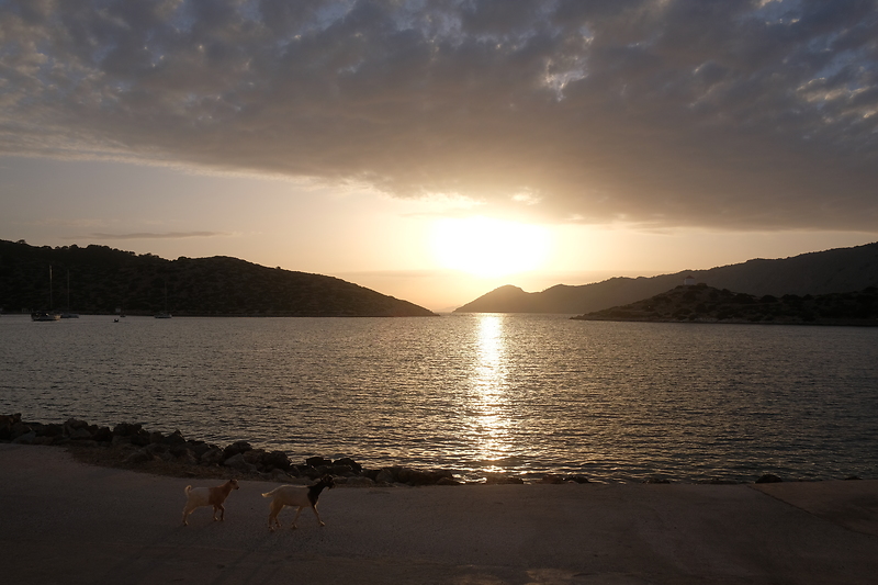
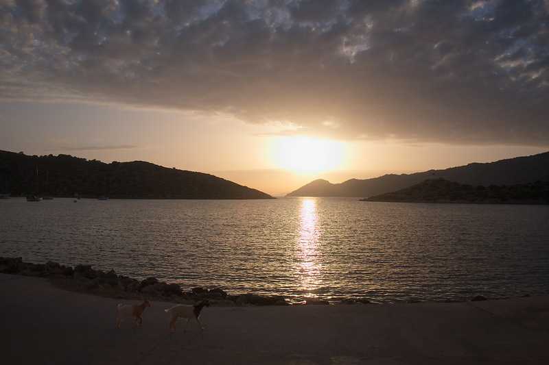


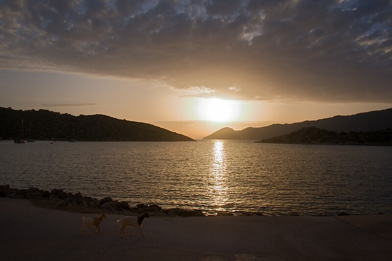

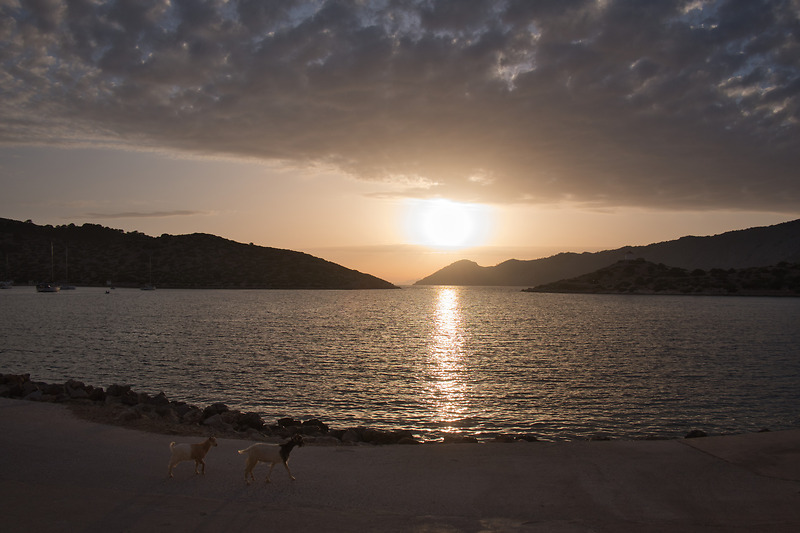
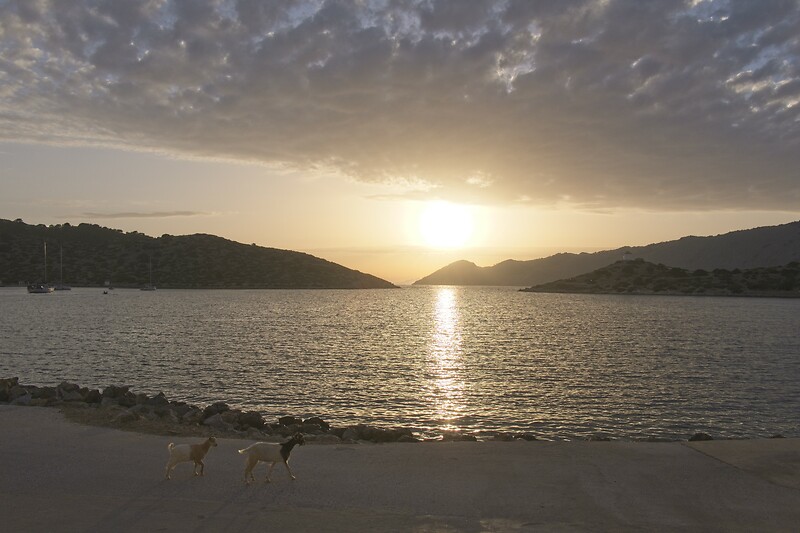
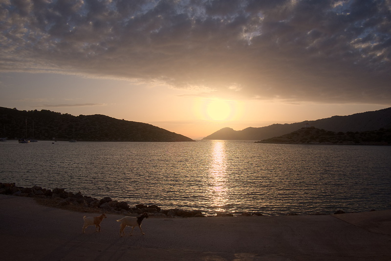


📂 DSCF3861.RAF (23.0 MB) 
A shot of the sunset in Greece, with both the sun and its reflection in the water blowing out. I want to lower the highlights, and boost the shadows a bit. The transition from sky to sun should be smooth without lightness reversals or rings. The transition from water to reflection should have no color cast. The hills in the background should not show any halos.
Capture One, Lightroom, and DxO show the smallest sun without artifacts. RawTherapee, Darktable, ACDSee, Silkypix and Zoner produce a smooth transition, but a bigger sun. In Luminar, Exposure, Photo Ninja, and ON1 the sun is smaller, but has a distinct ring around it that looks wrong. In RawTherapee the sun is big and slightly ringed. Actually, Capture One and Silkypix also have a ring, but so faint that it wouldn't matter to me.
The reflections in the water are artifact-free in Darktable, Lightroom, Exposure, RawTherapee, and Zoner. The other developers show magenta artifacts to varying degrees, and DxO has some false-color pixels (their X-Trans support is still in beta). In terms of detail, Capture One, Lightroom, DxO, and Exposure recover a bit more wave details in the blown-out reflections.
The hills in the background show distracting halos in Capture One, Lightroom, and Exposure.
In the following list, the RAW developer name links to the sidecar file, if there is one:
- Camera: Dynamic Range 400
- ACDSee: Highlights 100, Fill Light 25
- Darktable: My Defaults, Filmic RGB to shift dynamic range to include highlights, Highlight Reconstruction LCh and lower until magenta halo disappears
- Capture One: Highlight and White -100, Shadow +20
- Exposure: Highlights -100, Whites -50, Shadows +50 (less Whites desaturates)
- Lightroom: Highlight -100, Shadow +50
- Luminar: Highlights -100, Whites -50, Shadows +25
- ON1: Highlights -50, Shadows +25 (More Highlights produce lightness reversals)
- Photo Ninja: Illumination 27, Exposure offset -1.62, Highlights -0.50 (all chosen automatically)
- RawTherapee: Highlight Compression 250, Highlights 100, Shadows 25
- Silkypix: Highlight Dynamic Range +3, Hue 100
- Zoner: Lights -50, Shadows 25
- DxO: Highlights -100, Shadows 25
While a bit of a pathological image, there are clear differences in how these RAW developers handle it. Really, only Darktable, DxO and Lightroom produce a truly pleasing image for me, with second place to Capture One, ON1, and Silkypix. Surprisingly, the camera's own JPEG is amongst the best renditions as well.
Silkypix deserves a special mention, though, as its highlight control tool has a fantastic Hue slider, which trades off higher saturation against more accurate hue. Which is exactly the tradeoff that underlies all the rings and magenta artifacts in all the other programs.
On a side note, I have never quite understood why nobody seems to complain about the obvious haloing in Lightroom. I see it in almost every high dynamic range landscape shot on the internet, and I do not enjoy the look. But apparently I'm alone with this.
Dynamic Range Reduction

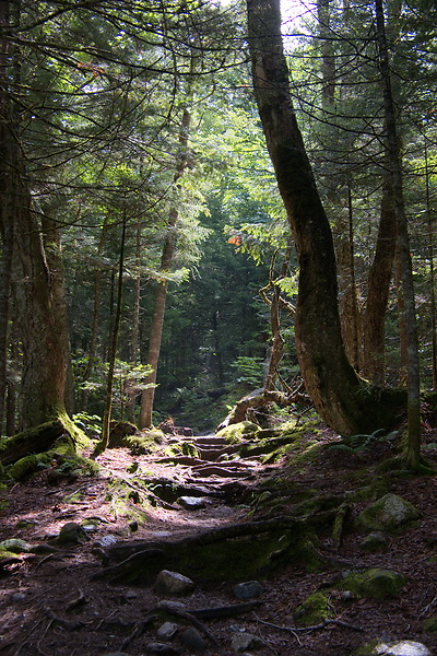

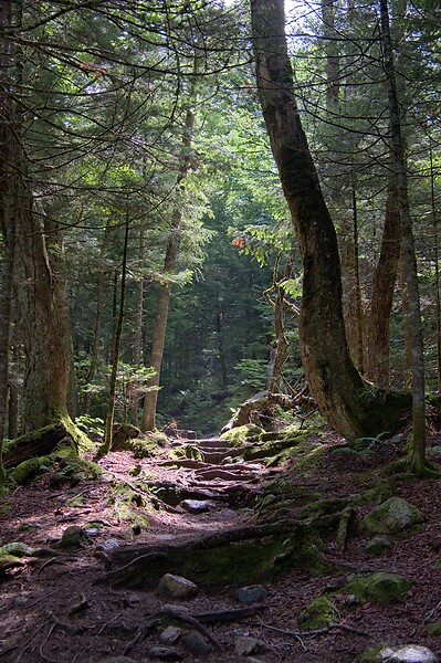
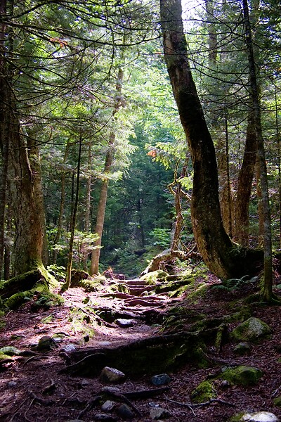
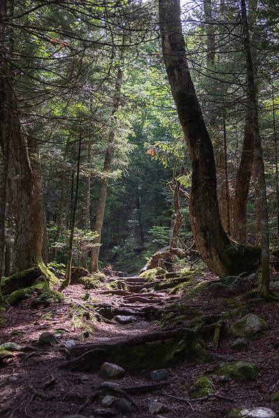


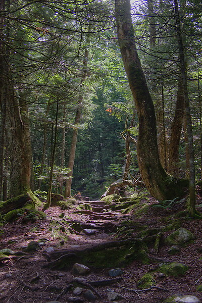


📂 DSCF6535.RAF (21.6 MB) 
A shot of a very contrasty forest scene at Mt. Washington, with highlights slightly blowing out, and shadows close to drowning. I want to lower highlights and raise shadows, without it looking crushed or unrealistic.
The most important thing in this picture is to maintain a realistic progression of tones, even though the dynamic range is crushed beyond reason. To my eyes, Lightroom really stands out here, with a three-dimensional look that no other developer can match. ACDSee, Darktable, ON1, Photo Ninja, and RawTherapee come second, with a believable progression. Exposure, Luminar, and Capture One seemingly applied some kind of local contrast compression that destroys the balance between highlights and shadows and flattens the image.
All developers show magenta artifacts on the bright forest floor to some degrees. They are particularly unpleasant in Capture One, Darktable, ACDSee, and Exposure.
- ACDSee: Highlights 100, Fill Light 25
- Capture One: Highlights -50, Shadows +25, Black +50
- Darktable: My Defaults, Filmic RGB to expand dynamic range
- Exposure: Highlights -100, Shadows +50, Blacks +25 (Blacks and Shadows interact weirdly)
- Lightroom: Highlights -75, Shadows +50, Blacks +50
- Luminar: Highlights -100, Whites -50, Shadows +50, Blacks +50
- ON1: Highlights -75, Shadows +50 (disable Recover Highlight Hue to prevent color fringes)
- Photo Ninja: Illumination 25, Exposure offset -1.47, Highlights -0.50 (all chosen automatically)
- RawTherapee: Highlights 50, Shadows 25, Dynamic Range Compression 50
- Silkypix: HDR 50, Exposure -2/3
- Zoner: Lights -75, Shadows 25, HDR Lights 25%, HDR Shadows 10%
- DxO: Highlights -75, Shadows 25, Blacks 10
In terms of tools, I like the explicit dynamic range slider in Darktable, RawTherapee, and Silkypix better than the shadows and highlights sliders in the other tools. But if calibrated well, both methods can result in a pleasing image.
To my eyes, Lightroom, DxO, RawTherapee, Photo Ninja, and Zoner take the crown in this shot. But I expect that the tone progression could be improved in the other tools as well if I strayed beyond the default tools.
Local White Balance

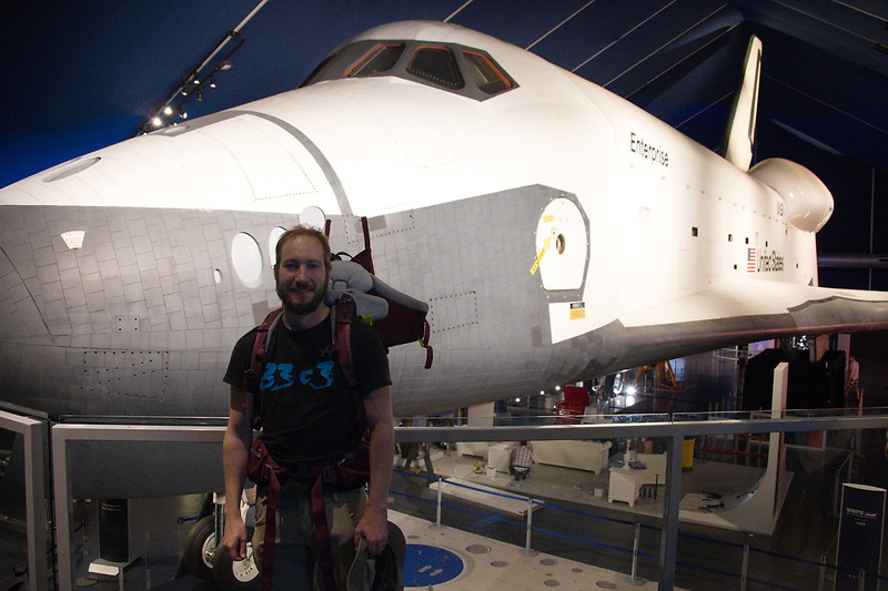
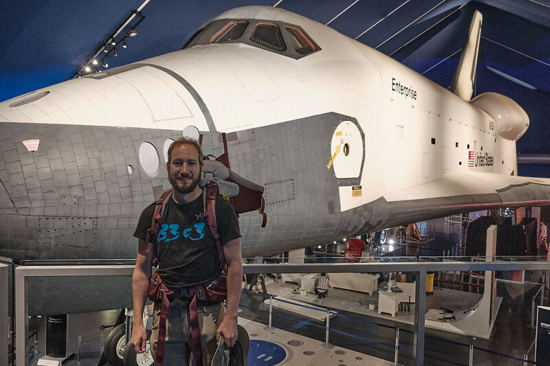
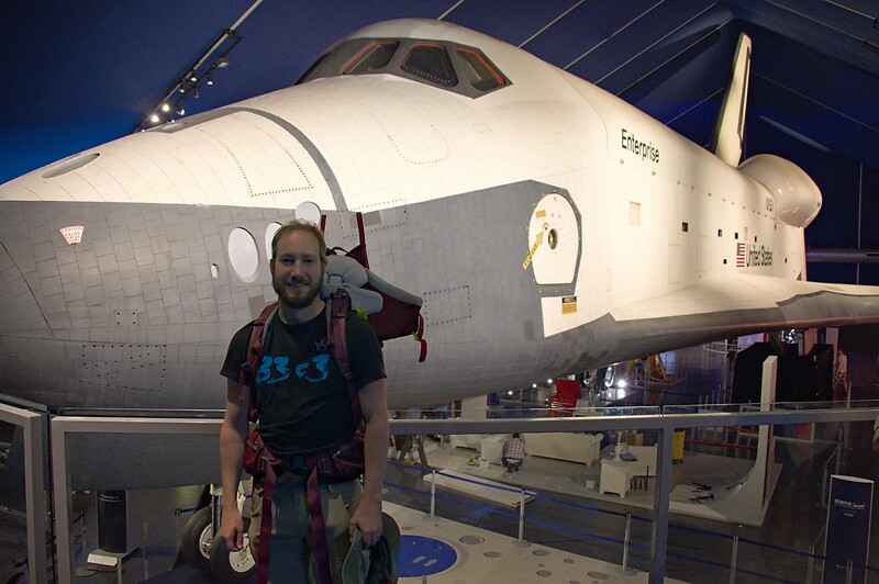


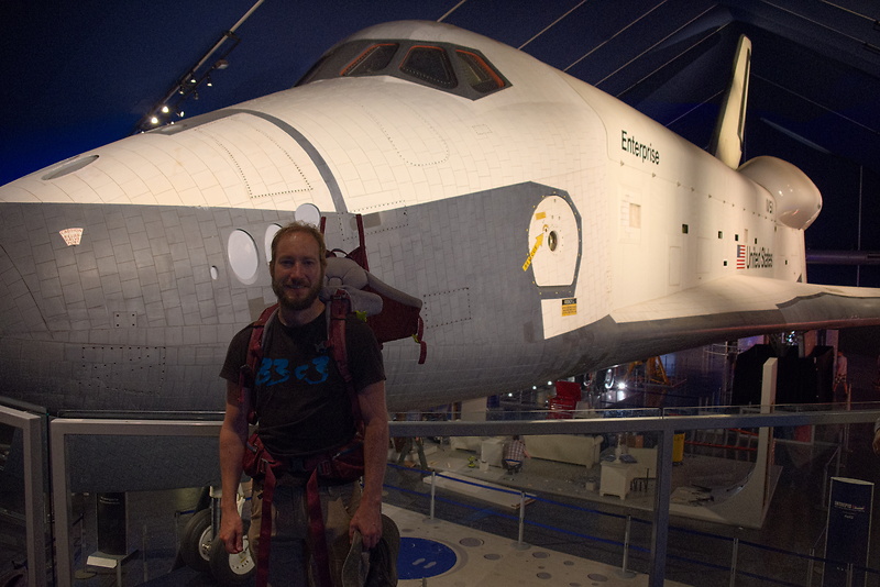
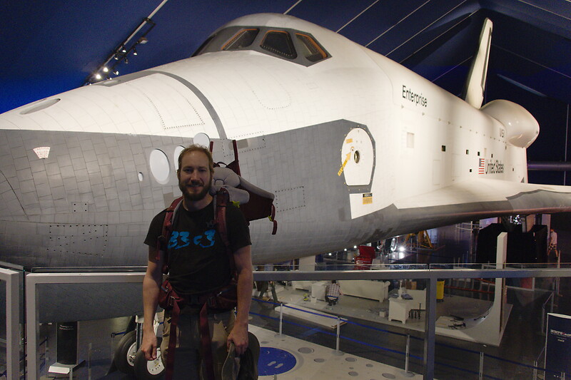
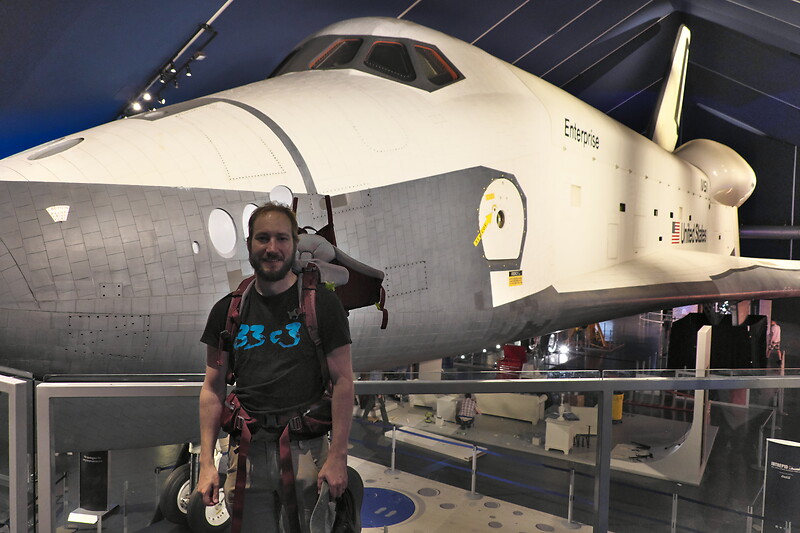

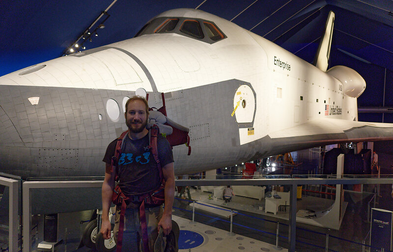
📂 DSCF8214.RAF (22.1 MB) 
A shot of myself, underexposed, in front of Space Shuttle Enterprise. I want to brighten myself and adjust the white balance on my body so it matches the rest of the room. (I have better examples than this, but they showed people other than me, which I don't share.)
Photo Ninja, and RawTherapee fail this test, as they lack local adjustment tools. Exposure for some reason shows terrible color bleeding, where my arm's color is leaking out onto the Space Shuttle in the background. Truly noteworthy is ACDSee with its intelligent brush, much like the intelligent selection tools in pixel editors. Darktable als stands out for being able to combine a drawn mask with a luminosity and hue mask.
Capture One strangely did something terrible to my skin, with weird gradients where there should be none. The Shuttle in the background lost details in the highlights in ACDSee and Exposure and Zoner. DxO has various ways of drawing masks. In this case I used control points, but none of them worked particularly well. I expect that they would need some practice to use well. Silkypix by default insisted on crazy noise reduction that turned the picture into a watercolor. Thankfully that is easy to turn down.
- ACDSee: Fill Light 50, Develop Brush with WB -50 (no picker)
- Capture One: Shadows +50, Black +75, Drawn Layer with White Balance picker on Backpack
- Darktable: My Defaults, Filmic RGB to shift dynamic range to include shadows, Luminosity and Painted mask with Color Balance picker
- Exposure: Shadows +100, Blacks +25, Layer with Color Temperature lowered (no picker)
- Lightroom: Shadows +100, Local Adjustment with WB -14 (no picker)
- Luminar: Shadows +50, Local Adjustments with WB -46, Tint -6, Shadows 100
- ON1: Shadows +50, Local Adjustment with WB -18 and Tint +4 (no picker)
- Photo Ninja: Illumination 25, Exposure offset -1.61, Highlights -0.50 (all chosen automatically), Shadows +0.50, No local adjustments available
- RawTherapee: Shadows 50, No local adjustments
- Silkypix: Dodge HDR 50, Noise Reduction Smoothness 25, Partial Correction with Hue 130, Saturation 0.37
- Zoner: Shadows 50, Black 10, Local Adjustments with Shadows 30, Saturation -10, and Blue/Green pushed in Tone Curve (no picker)
- DxO: Shadows 25, Black 25, Local Adjustments with lowered WB, Shadows 25
I find local color adjustments my main use for localized edits. Having a color picker for that is very useful, but only available in Capture One, Darktable, and Luminar. In the other tools, I had to either eyeball it, or manually adjust tones until the RGB values read grey.
Thus, it is Lightroom, ON1, and Darktable that pass this test.
Out of Gamut Colors


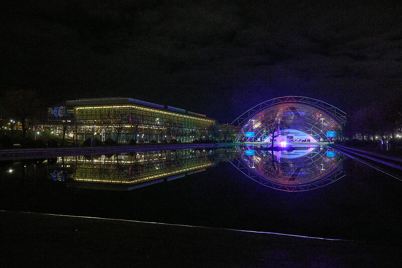
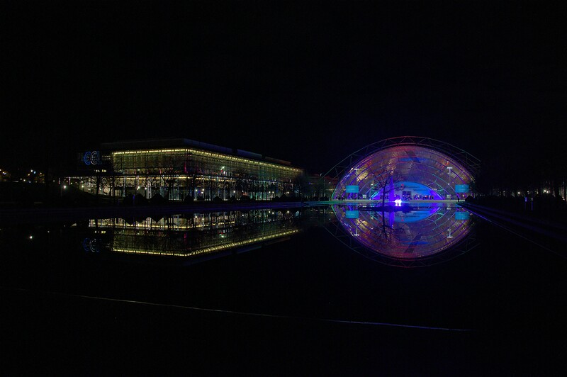


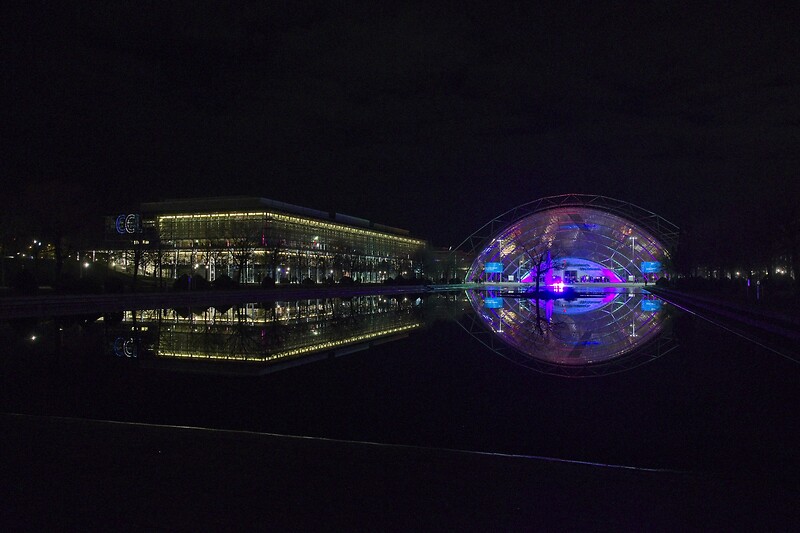
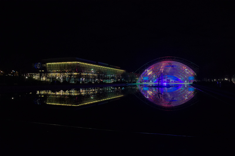
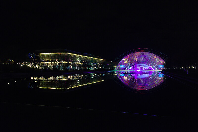


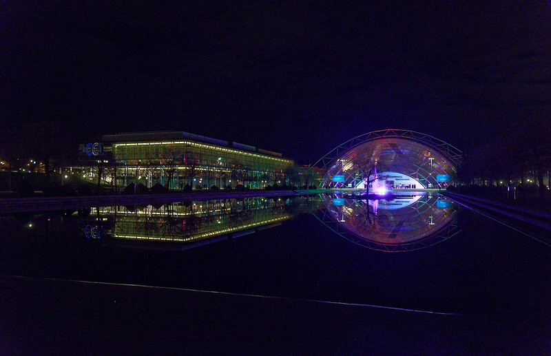
📂 DSCF0034.RAF (15.7 MB) 
A shot of the Congress building in Leipzig, with a bright purple light that blows out the red color channel, which is wildly out of gamut of any reasonable color space. I want to see how the RAW developers deal with out-of-gamut colors. I raise Exposure by 1 EV, then push shadows until the clouds become faintly visible.
ACDSee, ON1, Photo Ninja, and RawTherapee fail this task, with obvious magenta or blue artifacts on the illuminated water jet. The other developers use various methods of inpainting, which look particularly convincing in Capture One, Lightroom, Silkypix, Luminar, DxO, and Zoner. Exposure and Darktable look less realistic, but acceptable in a pinch. Again, Silkypix' hue slider is very handy.
- ACDSee: Fill Light 50, Exposure +1
- Capture One: Black +75, Exposure +1
- Darktable: My Defaults, Filmic RGB
- Exposure: Blacks +50, Exposure +1
- Lightroom: Shadows +100, Exposure +1
- Luminar: Shadows +25, Exposure +1
- ON1: Shadows +50, Exposure +1
- Photo Ninja: Illumination 9, Highlights -0.50 (all chosen automatically), Exposure offset 0.0
- RawTherapee: Shadows 50, Exposure +1 (Highlight Reconstruction: Blend)
- Silkypix: Dodge HDR 100, Noise reduction Smoothness 25, Highlight Hue 100
- Zoner: Exposure 1.0, HDR Shadows 25%
- DxO: Exposure 1.0, Shadows 75, Midtones -100
I know the Darktable devs are actively working on improving this. In truth, Darktable would have failed this task just a few months ago. Issues like these also often happen with deep-blue flowers, which turn purple in the failing developers but maintain hue in the better ones.
Color Rendition and Detail
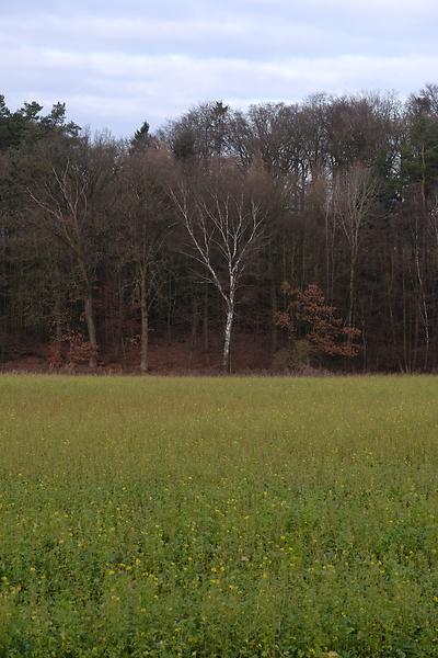

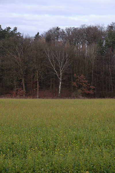


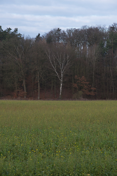
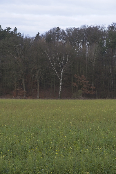


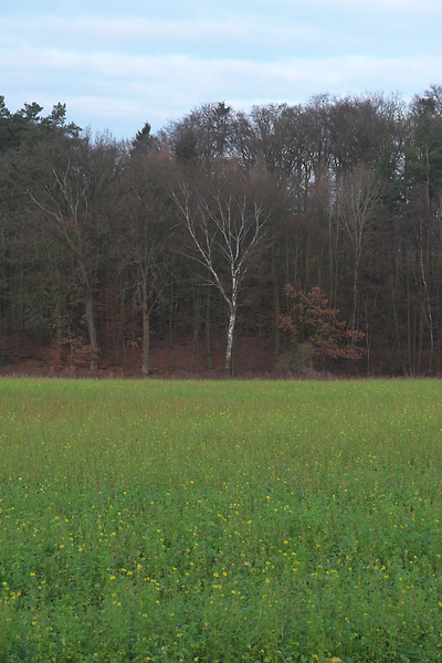
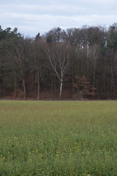

📂 DSCF9670.RAF (25.7 MB) 
A shot of a field and forest. I want to see how the RAW developers render these details and colors. Zero out noise reduction, use default sharpening, JPEG 100%.
In terms of detail, Lightroom, Capture One, Exposure, Silkypix, Zoner, DxO, and Darktable seem to retain the most fine details, particularly in the little trees and the forest floor. ACDSee, Luminar, RawTherapee, Photo Ninja, and ON1 look comparatively soft or lose detail in the shadows. Silkypix, however, has a strange, painterly look to the grass details that I wasn't able to get rid of.
In terms of overall color, Exposure, Photo Ninja, RawTherapee, and Capture One clearly tend towards the most saturated look, with a clear distinction between a green and a yellow part in the field. I suspect that these try to approximate the punchy look of Fuji's colors. These color transitions are much more subtle in ACDSee, Darktable, Exposure, Lightroom, Luminar, Silkypix, Zoner, DxO, and ON1. The sky is distinctly blue in Darktable, Photo Ninja, DxO, and Luminar, more cyan in ACDSee, Lightroom, and Silkypix, and weirdly purple in Capture One and RawTherapee.
- ACDSee: Amount 25
- Capture One: Amount 140
- Darktable: My Defaults, Sharpen 2
- Exposure: Amount 50
- Lightroom: Amount 40
- Luminar: Details Enhancer, Sharpen 50
- ON1: Sharpening 50
- Photo Ninja: Sharpening strength 50
- RawTherapee: Sharpening 20
- Silkypix: Zero Noise reduction, Outline emphasis 30, Ringing artifact control 15 (defaults)
- Zoner: Sharpening strength 150 (Smart Sharpen)
- DxO: Lens Sharpness Global 1.0
I would not put too much emphasis on the colors, saturation, and contrast here, as these are easily and typically adjusted manually. I am a bit surprised about the differences in detail retention, however.
The Result
I went into this expecting to find Lightroom and Capture One to be vastly faster in use than Darktable, particularly on my Surface tablet. I also expected better out-of-the-box image beauty, large differences in user interfaces, and for most tools to have very few graphical artifacts. Surprisingly, however, almost every tool showed obvious artifacts of one kind or another, and few tools were actually faster than Darktable. In terms of tools, I found most tools look very similar, yet function vastly differently.


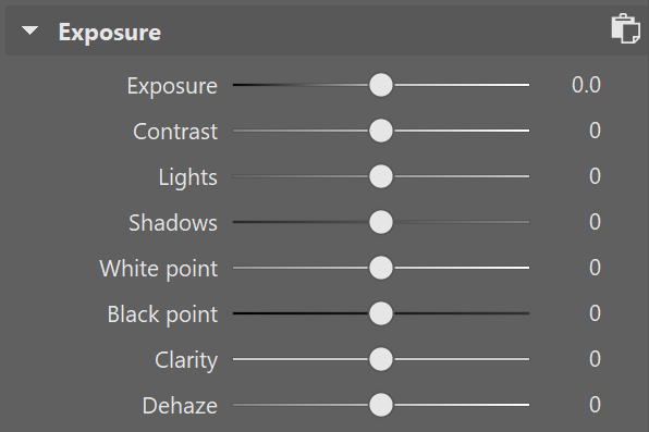
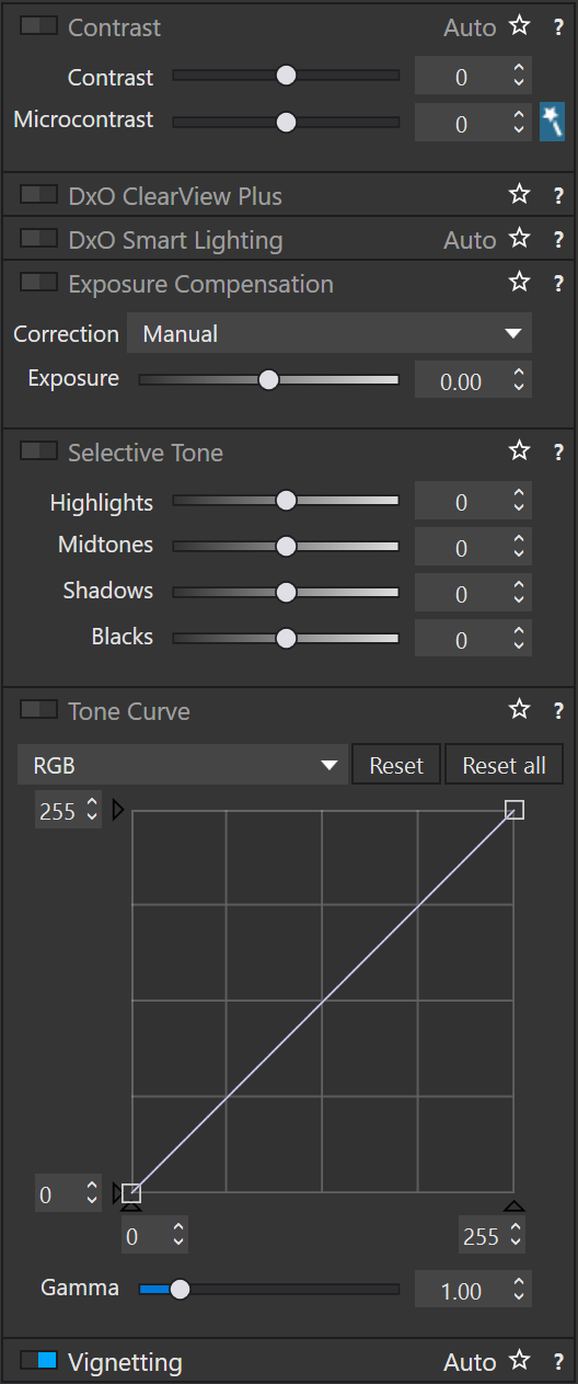
Simple saturation and contrast adjustments, a bit of local contrast, and rarely some dodging and burning or local color adjustments are apparently all I do most of the time, and this generally works well and similarly in all of these tools. However, that is not to say that the individual sliders do remotely the same thing in different tools. So confused was I by this that I measured the response curves of several tools, and they indeed did entirely different things. In one tool, Highlights pushes the upper half of the tone curve. In another, even the darkest shadows are affected a little bit. In yet another, Highlights burns out to the upper quarter of the tone curve if pushed all the way. Sometimes the white point stays white, sometimes it moves. Sometimes it only moves if the slider is pushed past half-way. And that's not even taking into account their different blending behavior and value scales; these sliders may look the same, but there hides complexity beyond measure.
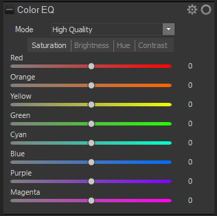
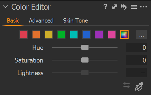

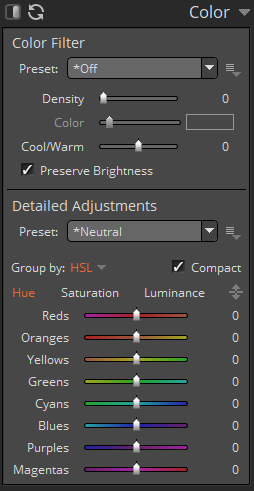
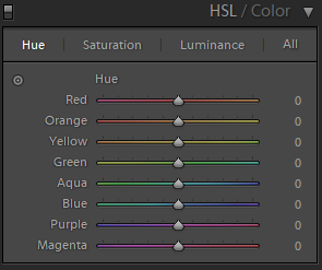
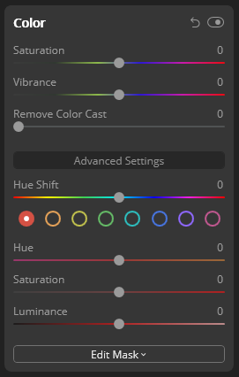


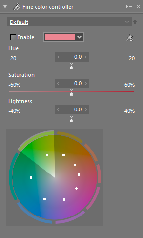

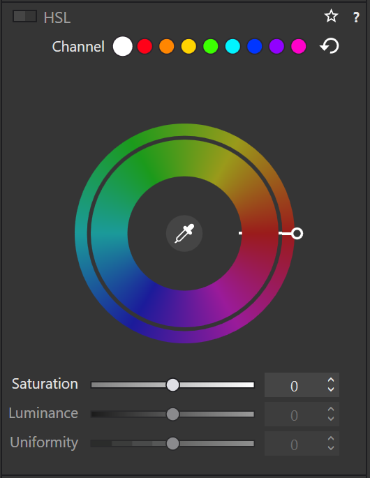
And I did find a surprising amount of graphical artifacts in these programs, particularly the color bleeding in Exposure, and the highlight recovery problems in Luminar and ON1, as well as a number of smaller issues. The one program that truly stands out here is Lightroom, which is more robust to artifacts than any other tool in this list, seemingly due to some significant image-adaptive intelligence under the hood.
I have strong mixed feelings about Capture One. On the one hand, it has one of the most attractive user interfaces of all these tools. On the other, its color renditions are very opinionated, and not my favorite. I love how it reads and applies Fuji color profiles as shot, but then it doesn't apply the Fuji shadow/highlight adjustments and crushes the shadows unnecessarily. And while its color tools sure look nice, their functionality is not that much different than the other developers', and they are spread out needlessly across several tabs. And that price.
Playing around with Luminar was deeply impressive. There are a ton of magic and automatic features in there. But as cool as AI sky replacement is, it simply has no place in my toolbelt, and the general speed of the UI are a big minus.
I like ON1. It's relatively affordable, works with simple JSON sidecar files instead of a library, has reasonable tools, and impressive effects. It can even mimic the look of the embedded JPEG and supports Fuji film simulations. Not quite on the graphical level as Capture One or Lightroom, but very close. And it even runs acceptably fast on my Surface tablet.
Exposure is another program I could like a lot, but the color bleeding and graphical artifacts are just not up to snuff. In one example, it entirely failed to guess colors from an underexposed bar scene (not shown). In another it bled colors out onto adjacent objects for no reason. And white balance sometimes changed lightness as well as colors. I read that this might be a graphics driver issue, but regardless, it shook my confidence in Exposure.
ACDSee was a real surprise to me. I seem to remember it as a fast image viewer, but apparently it is (now?) an impressive RAW editor as well. There is a lot to like about this tool. The magic brush for local adjustments is a particularly noteworthy touch, as well as very robust healing tools. Alas, I found the UI rather slow, and it failed on exporting a few files. I'll try again in a year or so.
I was only made aware of Silkypix through a comment after the post had already been published (thank you!). And what I read on the website made me quite excited! Its tools stray somewhat from the Lightroom-inspired norm, which is a very good thing in some cases, such as the hue-priority highlight recovery. It also works on plain files, and seems to have outstanding Fuji film simulations. Alas, it was very slow to use, and not suitable for my Surface tablet.
I had tried RawTherapee a few times in the past, and was always frustrated by its lack of local adjustments, and the need to view things at 100% to see some adjustments. On the other hand, it can match the embedded JPEG tones, and has quite a number of impressive algorithms. Still, it does not appeal to me. But it's still an amazing achievement and a pretty inspiring community as well.
Photo Ninja is a curious program. Certainly not because of its ease of use, or speed of operation, or image quality. But because it did most things almost correctly automatically. That's not what I am looking for, but it is truly impressive.
I only discovered Zoner Photo about a year after this post was originally published. But I was impressed by what I found: It is a well-designed program with a solid array of tools, even including a pixel editor. And rather affordable, too. Curiously, Zoner Photo does not officially support some of my cameras, but can utilize the free Adobe DNG converter to make them readable on the fly, without creating a separate copy. Smart!
DxO PhotoLabs was another latecomer, which only started supporting Fuji X-Trans files in late 2021. I downloaded it on the day it became available, and was duly impressed. Its tools are less streamlined than in other programs, but seem to be of great algorithmic quality; there was hardly a lightness reversal or halo to be found, the bane of many a cheaper product. I am deeply intrigued.
And Lightroom. As I said, I somehow do not like Lightroom. Maybe because I like to be “different”, or because I associate Adobe too much with bloated software. But I have to say, Lightroom surprised me. While its tools are sometimes in weird locations, it is highly streamlined for a very fast workflow, and it deserves my highest praise for being outstandingly robust against artifacts. But I still don't like it.
Which leaves Darktable. This is a tool I am deeply familiar with, and have used for several years. Yet until this day, I never realized just how strange its tools are compared to the other programs. How weird Filmic RGB must feel if you are used to shadows and highlights sliders, and how alien the graph-based color zones and tone equalizer and contrast equalizer must seem.


Yet, in direct comparison, I find Darktable's tools equally efficient at solving problems, even if the solutions are sometimes a bit different from its Lightroom-inspired peers. One tool in particular I want to emphasize: Color Zones. At first glance, it looks like your standard HSL tool that allows brightness, saturation, and hue changes by color (albeit as a graph instead of sliders). But then you discover the “select-by” switch, and realize that you can modify colors by lightness and saturation, as well as hue. I use this frequently to saturate shadows, which is a great effect I haven't seen in any other program.
No doubt other programs have cool features, too, but Darktable (and RawTherapee) seem uniquely open about their inner workings. And this brings joy to me, on a level the closed, artistic programs can't match. I like graphs, and maths. I'm weird like that.
But what really prompted this whole comparison blog post was my frustration with Darktable's speed. Particularly on my 4K screen, it is not the fastest program out there. And the AMD/OpenCL situation on Linux is still a travesty, which doesn't help. But I learned a thing during this experiment: You must work bottom-up through the rendering chain, if you want Darktable to be fast4. Which, in my case, usually means working through Lens Correction → Crop and Rotate → Exposure → Tone Equalizer → Contrast Equalizer → Color Balance → Filmic RGB → Color Zones. As long as I (mostly) edit things in this order, Darktable is fast enough, even on my Surface tablet.
Lastly, I have to say a few words about file management. Most programs here work on some kind of local library that stores all edits. The downside of this is that these libraries are hard to sync between computers, are hard to back up, and need to manually be kept in sync when file locations change. Notable exceptions here are Lightroom, Darktable, Exposure5, Silkypix5, RawTherapee, ON1, DxO, and Zoner, which keep their edits alongside the RAW files in little text “sidecar” files6. Thus even if their library goes out of sync or is lost, at least the edits are still there. To be honest, this is quite an important factor for me.
As for library management, my requirements are small: I want to filter by date, rating, and maybe camera or lens. These needs are met by all programs except possibly Luminar and Photo Ninja. I do most of my file management in external programs on camera import, and with the exported JPEGs, so this area of the RAW developers is not very important to me.
However, this comparison also highlighted just how useful sidecar files are to photo management. I might choose different RAW developers over the years, and my photo management solutions might change over time as well. But as long as all edits are stored in simple text files next to the RAW file, I can rest safe in the knowledge that my edits will never be lost. This is a serious downside to ACDSee, Capture One, Luminar, and Photo Ninja, who keep edits secretly7 in their opaque databases.
I also timed my work with every one of these programs. Quite surprisingly, I couldn't find any significant differences between programs. Darktable's workflows, for example, are sometimes entirely different from other tools; but if you know what you're doing the path from identifying a problem to fixing it is still similarly straight-forward and fast. And there is no less experimentation until I arrive at a look I like.
Thus, I am left with Darktable, Lightroom, and ON1. And theoretically Capture One, but that price is just too high for me. If Capture One were \(100 instead of \)350, I would probably switch to it. Even educational pricing is only available for rentals. I'll have to decline that. And despite all my praise for Lightroom, I still don't like it.
I'll probably buy ON1 at its current, discounted price ($50), and see how I like it in actual daily use8. But at the same time. I'll also stick with Darktable on my Linux machine, at least for more complicated edits. I now know that Darktable can dance with the best of them, which is mighty impressive for a piece of free software.
With all that said and done, I have learned a lot about RAW development during this experiment. Regardless of which tool I end up sticking with, this has been a fascinating comparison. We'll see how long I can resist the urge to compare this time.
Addendum: Customer Support
So far, I have been in contact with the Customer Support people of ON1, Capture One, and Zoner. And I must say, ON1 and Zoner were incredibly pleasant and quick and helpful, while Capture One seemed almost reluctant to help. This is actually a big plus for ON1 and Zoner, and kind of big turnoff for Capture One.
Update: Silkypix
I added Silkypix to the comparison, thanks to kind comments underneath this post.
Update: Luminar Local Adjustments
I was made aware that Luminar does indeed have local adjustments, they were merely in such an uncommon place that I hadn't found the initially.
Update: Zoner Photo
One year after the original post, I added Zoner Photo to the comparison.
Update: DxO PhotoLab
One-and-a-half years after the original post, DxO Photo Labs added support for Fuji files, so I added them to the comparison.
There are surprisingly few non-superficial comparisons; most are just feature matrix comparisons. The best ones I could find are a fantastic, in-depth comparison on nomadlens, A Fuji-centric discussion of detail extraction on Fuji vs. Fuji, one by Andy Bell that might be sponsored/biased by Luminar, a pretty good one on PetaPixel, an older one on DPReview, and a Nikon-centered one on WY Pictures.↩
Makes it much easier to share edits between computers, and back them up↩
I don't like rental software, as it locks away all past edits once I stop paying.↩
because lower stages in the pipeline are cached, but higher stages need to be recalculated after every edit.↩
in an unnecessary subdirectory↩
Capture One saves sidecar files, too, but only for metadata, not edits↩
They would say, "securely"↩
not really daily, but you know what I mean↩
Lenses Matter
A common trope in discussions about cameras on the internet is: “sensor size trumps all”, and as a corollary, “smartphone cameras suck”. Which is obviously false to anyone who has ever taken a good picture on a smartphone (with its tiny sensor).
The argument, however, goes like this: Bigger pixels1 can capture a greater dynamic range, and bigger sensors are made from bigger pixels. Therefore, and here is the dangerous leap, cameras with bigger sensors take better pictures.
But I currently have a bit of time on my hands, and way too many cameras, so let's try it out, shall we?
My five contestants are:
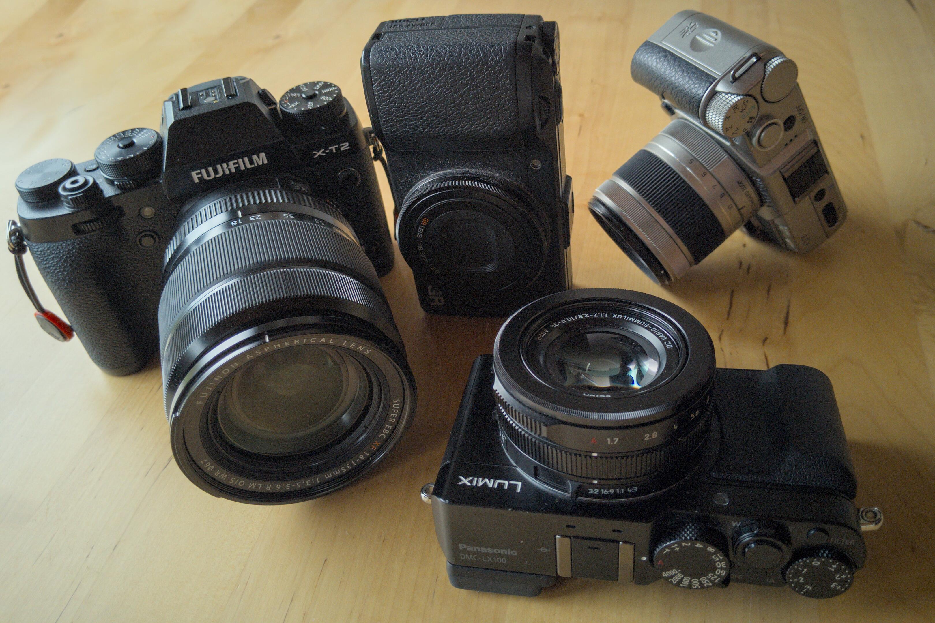
- A Google Pixel 2, with a 12.2 MP 5.75 × 4.32 mm “1/2.55 in” sensor from 2017, and a 3.8 mm f/1.8 lens (27 mm f/13 equivalent, crop 7.14),
- A Pentax Q7, with a 12 MP 7.44 × 5.58 mm “1/1.7 in” sensor from 2013, and a 5-15 mm f/2.8-4.5 lens (24-70 mm f/13-22 equivalent, crop 4.76),
- A Panasonic LX100, with a 13 MP, cropped 17.3 × 13 mm “micro four thirds” sensor from 2014, and a 11-34 mm f/1.7-2.8 lens (24-75 mm f/3.8-6 equivalent, crop 2.2),
- A Ricoh GR), with a 16 MP 23.7 × 15.7 mm “APS-C” sensor from 2013, and a 28 mm f/2.8 lens (27 mm f/4.2 equivalent, crop 1.5),
- A Fujifilm X-T2, with a 24 MP 23.6 × 15.6 mm “APS-C” sensor from 2016, and a 18-135 mm f/3.5-5.6 lens (27-200 mm f/5.25-8.4 equivalent, crop 1.5).
So I went for a walk around the neighborhood, and took a few pictures with a bag full of cameras. In particular, I was looking for a high dynamic range scene, in the form of a sunset. All pictures were taken at a low ISO2 and underexposed by two stops to account for the backlighting. All images were taken at 27 mm (equivalent3) focal length.
Measurements predict that the dynamic range and noise levels of these cameras should get better as the sensor size increases.
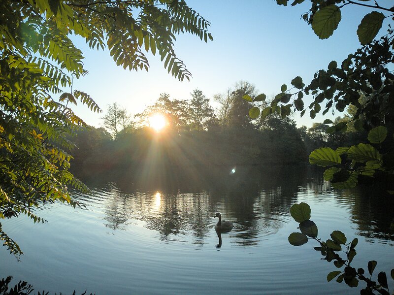


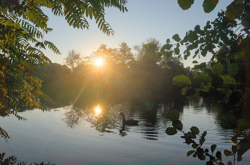
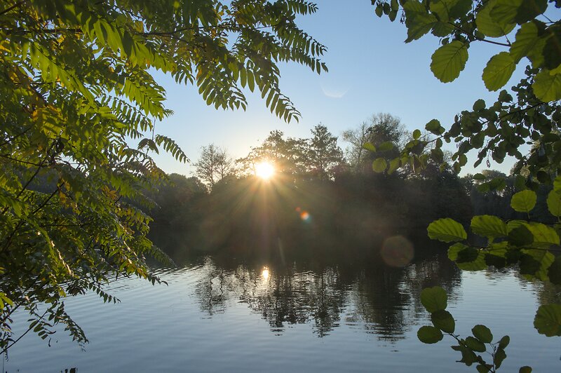
The first scene was taken essentially in auto mode, and adjusted in Darktable to match roughly in tonality (exposure adjustments of ±0.25EV), but not color. In general, all cameras were able to capture the entire dynamic range of this scene, from the brightest almost-white area around the sun, to the darkest patches in the shade near the waterline.
This, right off the bat, is the most important result of this experiment: Most scenes do not have enough dynamic range to matter.
Differences appear in the noise levels, which are fairly constant across all cameras, with only the X-T2 being noticeably less noisy than the rest. However, this advantage of the X-T2 is not one of sensor size (the Ricoh GR has a same-size sensor), but simply of being two-generations newer.
The largest difference between these photos is instead in flare: The Pixel 2, Pentax Q7 and Ricoh GR are flaring across the entire image, while the LX100 and X-T2 are far more controlled. This is probably because the Pixel 2 and Ricoh GR have collected dust and scratches from my pockets, and the Pentax Q7 lens being somewhat mediocre. The LX100 and X-T2 are in a better condition, and a better design, too. All lenses also show some amount of colorful lens flares to the bottom-right of the sun, particularly in the LX100 and Pentax Q7, and strange, colored rings around the edge of the Ricoh GR's frame.

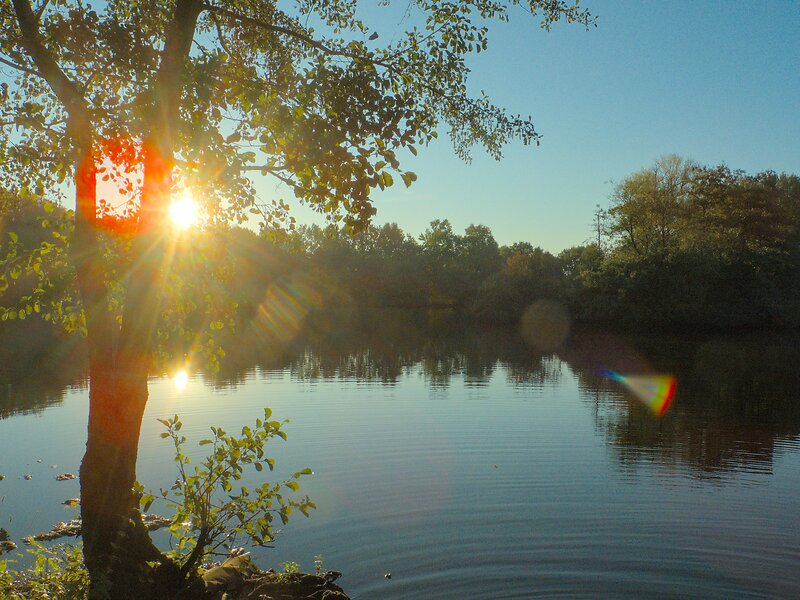
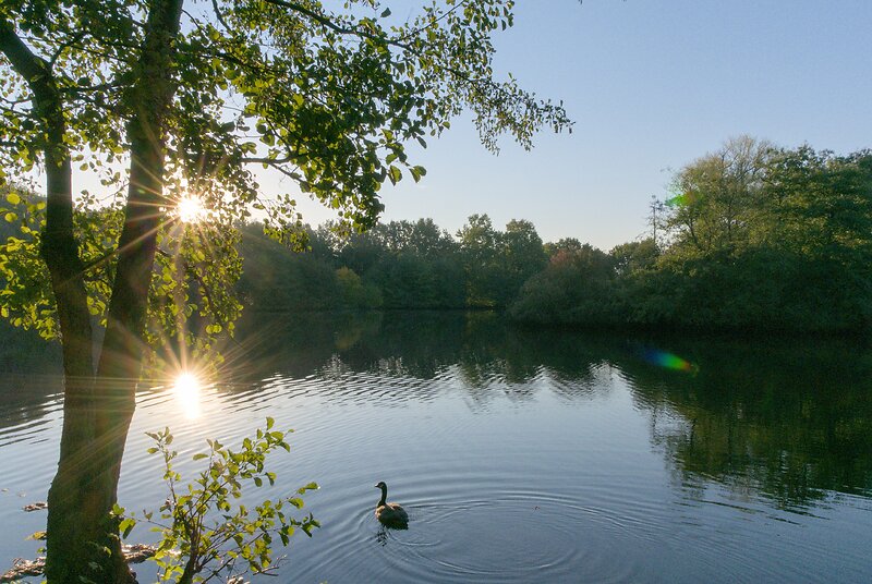


To look into these differences between lenses in more detail, the second scene was taken from a slightly different spot, with the lenses stopped down (if possible). This image includes two bright sun spots, one from the sun itself, and one in the reflection on the water.
Notably, the Pixel 2, like most smartphones, can not change its aperture. And it produces a bright red flare towards the left edge of the image. The Pentax Q7 again flares dramatically and colorful, and my Ricoh GR's lens is probably beyond cleaning at this point, judging from the massive flare it produces. Again, the standout pictures here are the X-T2 and LX100, with well-defined sun stars and comparatively little flaring. (Note the red dots in the X-T2: these are the phase-detection pixels on the X-T2's sensor reflecting light back into the lens and back on the image.)
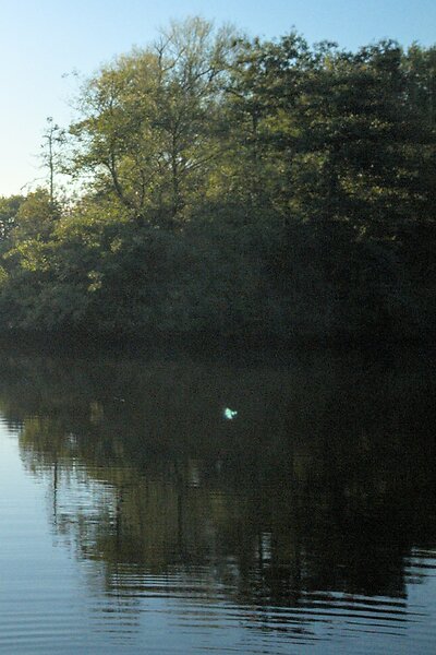

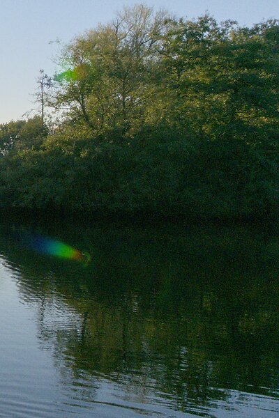

Here is an enlargement of the dark patch at the right edge of the second scene, to judge noise levels and detail in the shadow. Perhaps surprisingly, the differences between these images are not big at all. The X-T2 clearly wins in terms of both shadow detail and noise levels, but by a rather small margin, and only really visible when enlarged. The Pentax Q7 resolves almost no detail in the shadow, but neither does the Ricoh GR. So sensor size does not seem to affect this round.
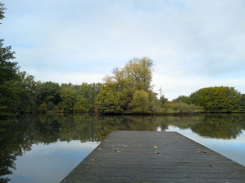


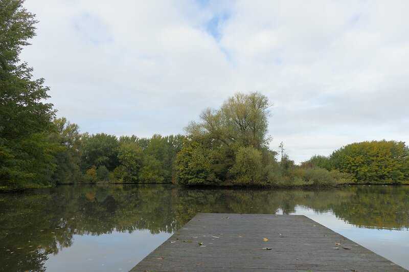
This third scene was shot one day later, with settings optimized for optimal image quality: Base ISO, aperture one stop closed from wide open, focused on a high-contrast part of the scene. I processed these images with white balance from a grey card, then edited exposure, contrast, and saturation to match across images. Chromatic aberrations and vignetting were corrected using a profile or by hand. No sharpening was applied, but the highest-quality deinterlacing was selected (AMaZe for Bayer sensors, Markensteijn 3-pass for X-Trans sensors).
At this magnification, even my 24in/4K screen only barely hints at differences in sharpness. Which implies that prints up to A3 should be possible from all of these cameras without much difference in perceived sharpness.


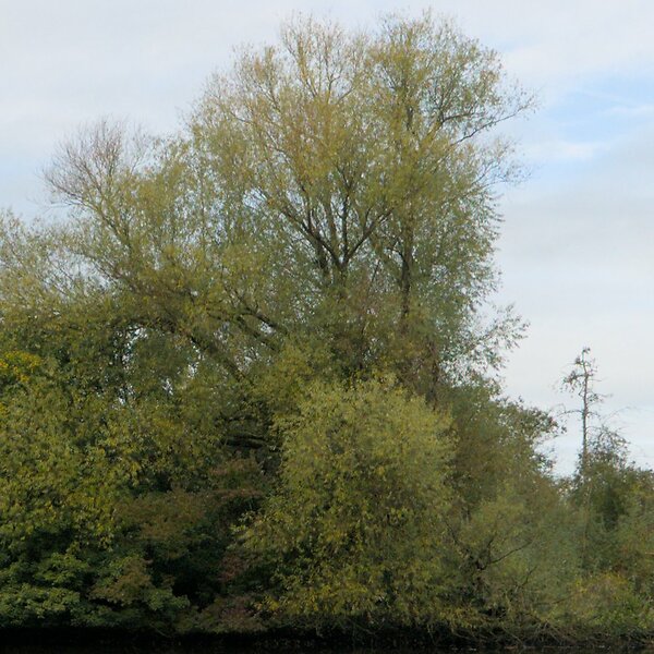
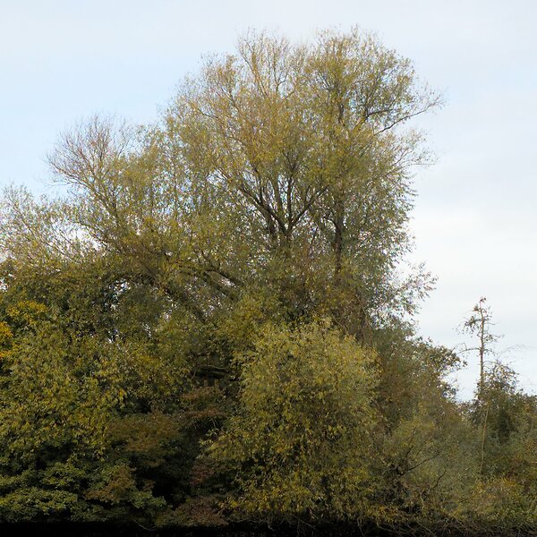
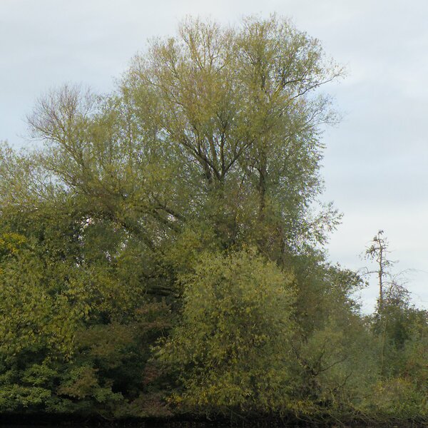
If we crop into these images, differences in detail resolution indeed become apparent. The Pentax Q7 is definitely the least detailed, on account of its soft lens. The Pixel 2 and LX100 show a very similar amount of details, which is a testament to how good modern smart phone cameras truly have become. While the two cameras with the biggest sensors, the Ricoh GR and the X-T2, do resolve visibly more detail, the differences are not dramatic.
So does sensor size trump all? From these experiments, I wouldn't say so. Essentially, all of these cameras took decent images. The X-T2 clearly was better than the rest, but not hugely so, while being much bigger and more expensive and newer.
While the measured dynamic range differences surely exist, they did not manifest even in a sunrise, so I'm inclined to discount their importance. This is, frankly, not what I expected. The miniscule differences in resolution were equally unexpected.
What did however make a big difference was lens quality. Flare control, aperture range, and focal range play a huge role in the resulting image quality. Zooming in (and stopping down) are still the most effective way of extracting more detail from a scene. And having a camera with a secure grip that is quick to operate helps, too. I think I am growing out of sensor size snobbery, is what I'm saying.
Differences Between Camera Sensors
get sRGB coordinates here: https://www.babelcolor.com/index_htm_files/RGB%20Coordinates%20of%20the%20Macbeth%20ColorChecker.pdf
Most cameras have the option to capture raw images, i.e. un-processed image data right from the image sensor. In theory, these images are pure physical measurements of light, and should therefore be very comparable between cameras. But are they? To investigate, I took a raw picture of a color target with each of my five cameras, and compared their output.
Capturing accurate colors is a surprisingly intricate matter, as the color depends on the spectrum of the illumination, the reflective spectrum of the colored object, and the color filters in the camera. I normalized the illumination by taking pictures on an overcast day outside1, and used a standard color target with 24 colored patches of a certified color.
The resulting colored spectra are captured on the camera sensor by photon counters behind three color filters “red”, “green”, and “blue”2, which differ from camera to camera in their spectral sensitivity. The recorded colors then get projected on a computer screen with another set of “red”, “green”, and “blue” LEDs of some different spectral makeup, or printed in three or more inks on paper. And this is then seen with eyes of yet another set of “red”, “green”, and “blue” retinal cells. Let's leave it at color is complicated.
At any rate, I took pictures at base ISO in raw, white-balanced and exposed for the third grey patch, and adjusted in saturation on the red patch. Here are the colors on the color checker and the recorded colors of my cameras:
The image shows the 24 colored patches of the color target3. Within each patch, five rectangles show the recorded color of (in reading order) the Pentax Q7, the Ricoh GR, the Panasonic LX100, the Fujifilm X-T2, and the Google Pixel 2.
Due to my exposure and white balance calibration, the third grey patch is completely equalized and shows no difference between the cameras and the target. The “Light Skin” patch (second on the first row) is also very close to equal, which is an important sanity check for my measurement procedure, as skin tones are optimized by all cameras. Seeing that the skin color patch is one of the most similar hopefully indicates that I did not do anything gravely wrong.
The last row shows greys, which are very similar across cameras (excluding the white patch for now). This indicates that RAW values indeed correspond to photon counts, with little additional processing. I have no idea why the white patch is off. Perhaps due to specular reflections on the white patch? Color is complicated.
As for the other colors, the Panasonic LX100 (center) and the Fujifilm X-T2 (bottom left) seem to record somewhat more accurate colors than the other three cameras. The Pentax Q7 (top left) and Ricoh GR (top right) seem comparatively weak across the board. The Panasonic (center) is great in darker blues and reds and greens, but somewhat weaker in yellows and pastels. The Fujifilm (bottom left) is very good in almost all colors, with pastels somewhat weaker than darker colors. The Google Pixel 2 (bottom right) is better in reds and greens and yellows than in blues and oranges. Pastel colors in general seem weaker than darker colors, which might be due to the same process that affected the white patch as well.
I think I learned something from this experiment: There are indeed color differences between cameras even when shooting RAW, but they are relatively minor. Whenever I see larger differences in my pictures, they are likely (easily correctible) white balance differences, and not sensor differences. When in doubt however, my Panasonic LX100 and Fujifilm X-T2 do capture more lifelike colors than my other cameras.
any kind of artificial light is comparatively terrible for color reproduction!↩
in quotes, because colors are three-channel information, and we're talking about single channels here.↩
encoded as sRGB, which might or might not be displayed correctly on your screen, depending on your OS, your browser, your settings, your room's illumination, and your screen. Color is complicated.↩
A Review of the RAW Photo Editor Capture One
About half a year ago, my second child was born, and all that precious free time I had used for photo editing evaporated. So I started looking for faster photo editor, as a temporary replacement for Darktable. Based on my research last time, I chose Capture One. During the last six months, I got to know the program well, and want to share my thoughts on it, and how it compares to Darktable.
Let's start with a bit of background about my photography, to put my views into context. I learned photo editing on Linux, with Darktable, mostly for documenting my travels and family. I gather that a photographer who does not know Lightroom is a bit of an oddity. But it should provide an interesting perspective for the purposes of this review. Furthermore, my interest in post processing is not purely artistic. Being a signal processing scientist, I can't help but analyze the underlying image processing algorithms, and am perhaps more annoyed by certain editing artifacts than most people.
In terms of photography, I tend towards quick reactionary shooting of the fleeting moments of my family's life. Mostly because I prefer to spend my time playing with my kids instead of pointing a camera at them. I am therefore perhaps a bit more tolerant of slight imperfections in terms of focus and exposure than is usual. This also means I value my camera/editor's capability for recovering misjudged exposures or imperfect lighting very highly.
Most review articles of photo editing software are conducted from only a short glance at the contesting programs, since spending the months necessary to get to know each program is usually neither practical nor affordable. But due to my particular circumstances, the present text actually comes from a few months of more-or-less exclusive use of Capture One, on about 30 thousand pictures, of which I edited about 2000 (all new, not just re-edits of old ones, and implicitly the incentive to recreate another program’s rendering).
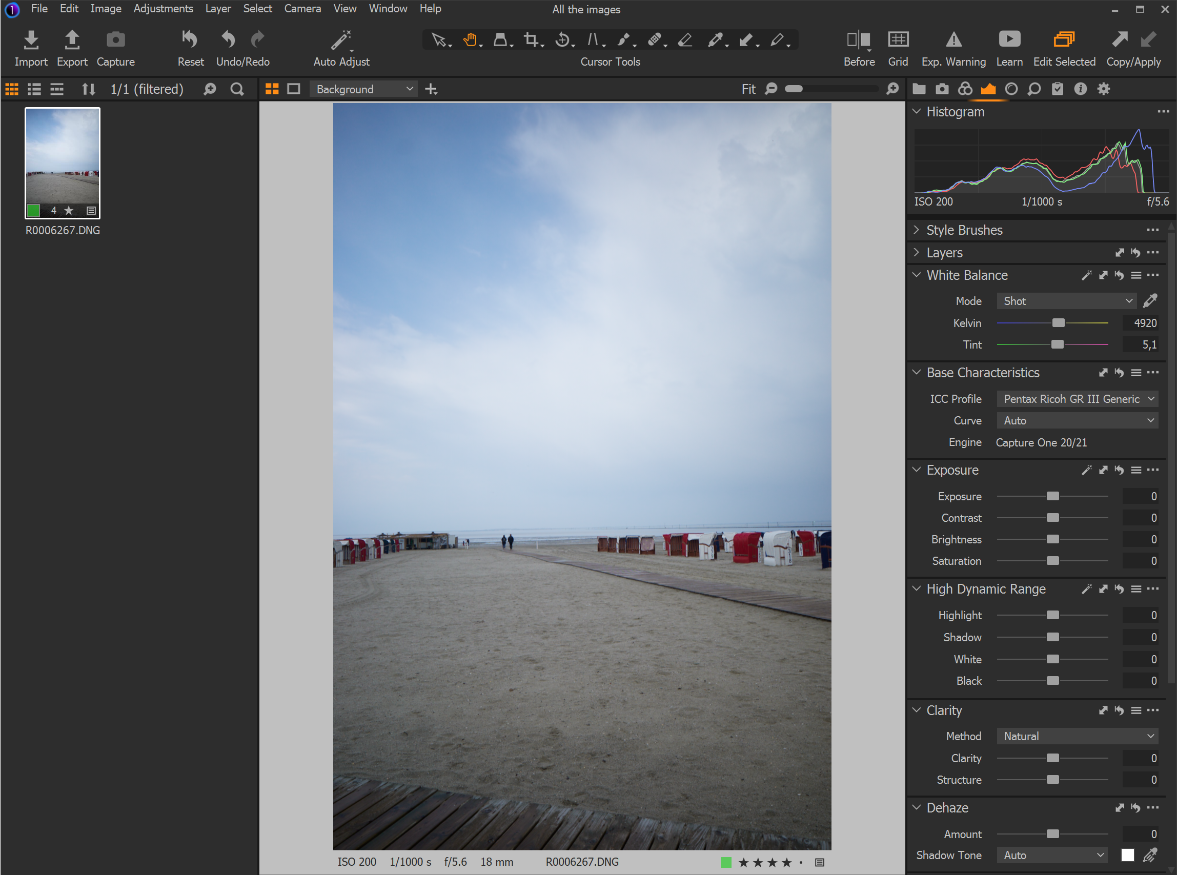
So, Capture One. It is very fast. You move a slider, you see the results of that change immediately, even on my lowly Surface 7 Pro tablet. But this focus on speed actually goes deeper than just slider movements: I discovered that many parts of the application seemed actively optimized for quick operation, which allows me to process pictures much more quickly. This was frankly a revelation in the time-starved months after my second baby’s birth.
As an example of how much quicker Capture One's default workflow is than Darktable's, here's my usual editing flow in Darktable: I start with fixing exposure, in the Exposure module. Then I adjust shadow density and recover highlight color with the black and white sliders in the Filmic RGB module. Then I adjust white balance to taste in the Color Calibration module. Then I crop in Crop and Rotate, then add additional adjustments such as Color Zones, Color Balance, Tone Equalizer, Denoise (Profiled), or Contrast Equalizer. Last come local adjustments if necessary. The thing is, more or less every image needs at least Exposure adjustments, some Filmic RGB tweaking, and cropping. All of these items are situated in different modules in Darktable, each requiring multiple clicks to access the module and then change the value. This is supposed to be improved in the next version of Darktable, which will let you put all your favorite sliders in a custom module. I am very much looking forward to that.

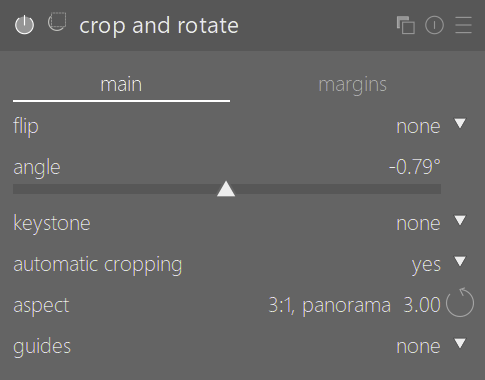
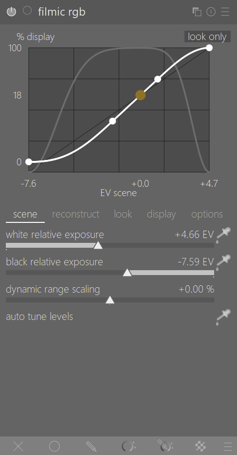
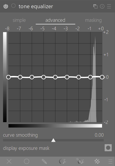
In contrast, a similar workflow in Capture One happens entirely on one screen, just by going from one slider to the next:

Furthermore, common tools such as cropping, rotating, and the white balance picker are accessible at all times with highly memorable keyboard shortcuts (C, R, W, respectively). Taken as a whole, this allows me to positively blaze through images compared to my Darktable workflow. It took me a while to appreciate how significant this difference was in my use: I now sometimes do a few days’ edits in a spare half hour, which used to be an all-evening affair in my usual Darktable workflow.
Which is not entirely Darktable's fault. Assigning custom keyboard shortcuts in Darktable can speed things up, and of course Darktable’s module system is infinitely more powerful, so there's a reason for its complexity. But the above example highlights a bit of a philosophical difference between Darktable’s unflinching priority on user control, and Capture One’s compromise between power and speed. There are upsides and downsides to both, but at this moment in my life, I begrudgingly value speed over power.
However, there were also a number of occasions where I missed Darktable’s deep control. Most notably, Capture One’s High Dynamic Range sliders and Clarity controls feel a bit restrictive and oversimplified: It can be hard to control which parts of the image are affected, and the tools are prone to produce artifacts such as halos if not managed carefully. In contrast, Darktable's continuous Tone Equalizer mask gives very precise and adjustable control over the affected area. Similarly, Darktable's Contrast Equalizer can control local contrast at arbitrary wavelet sizes, not just the very small ("Structure") or very big ("Clarity") ones, for example for specifically highlighting tree trunks or bird feathers.
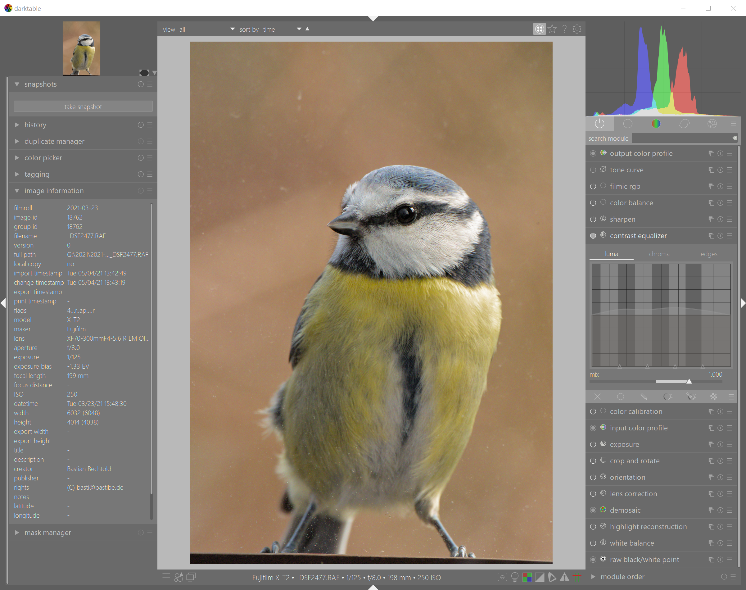
Another annoyance with Capture One can be found in colors at the edges of the tone curve: When pushing exposure, Capture One tends to turn brightly colored highlight towards primary colors such as cyan/magenta/yellow before desaturating them into white. Similarly, shadow recovery sometimes pushes brightness and saturation a bit more strongly for brightly colored shadows than for dull ones, leading to an unnatural glowy effect. These cases are usually easy enough to fix with a quick tug on the shadows/highlights slider or by reigning in the offending color's lightness in the Color Editor, but they smell a bit of a runaway algorithm, which bothers me. Although in direct comparison they bother me less than the various rocks and hard places in Darktable's Filmic RGB chrominance preservation modes.
On the topic of bothersome details, Capture One's repair layer seemingly has a mind of its own when deciding whether to create a new control point, or adding to an existing one. The Highlight and White slider in the High Dynamic Range module sometimes can't quite decide whether to move white point, and sometimes lead to lightness reversals around bright objects. More on the algorithmic side, it annoys me that only the Exposure and High Dynamic Range modules have access to the full dynamic range of the raw file, while all the other tools apparently come after the screen transform, and therefore can't reach beyond the black point and white point. This makes Levels and Curve a bit less useful than I'm used to. Demosaicing is also not quite as detailed as Darktable's, although only by a tiny margin.
One surprising limitation of Capture One is that its support for cameras and lenses is a bit hit-and-miss. Film simulations are only supported for my Fuji X-T2, but not for the older Fuji X100T, nor the Ricohs or Panasonic. Some of their lens profiles are also laughably bad, and leave obvious reverse-vignetting or barrel distortion when enabled. Frankly, Darktable does better in terms of lens support, despite relying solely on volunteer support.
In terms of UI, Capture One is generally well-organized and easily configurable. But there is a constant stumbling block in the Layers module that I find very annoying: many of Capture One's tools automatically create new layers, but deselecting the tool does not deselect the layer. As delightfully easy it is to press B for the brush and paint in some Clarity, as unnecessarily laborious it is to then spend three clicks to slide open the Layers module and select the background layer again to resume editing. Or alternatively, wonder why your edits don't work while you don't have the background layer selected. It's a true pain.
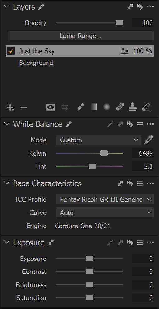
As the last point of the nit picking, I was disappointed by the number of minor technical bugs I encountered in my use of Capture One: Half the time, Capture One starts half zoomed-in, and leaves me scratching my head at what weird compositions I chose for a few seconds. And the main, zoomed-out view is weirdly blurry if you use two displays with different DPI. Both of these issues are well-documented on their forums for several releases, but have not been fixed. For the exorbitant price that Capture One commands, such issues and customer communication are frankly unaccetable.
Finally, a few words about the library module and file organization. At first glance, I hated Capture One’s library. You have to import every single directory manually (I organize my images in daily directories), all the edits go into a central catalogue and nowhere else, and the sidecar files contain no editing information. But then someone told me a much better way: Instead of using Capture One’s Catalogue, create a Session, but ignore all those pre-built input and output directories, as well as the import button, and instead simply navigate to any old directory on your computer with the sidebar file browser. This is clearly not how sessions are meant to be used. But it actually works reasonably well, and puts editing information in a subdirectory next to the raw file.
On the whole, I grew to quite like Capture One, despite its flaws, mostly for its streamlined user interface and speed of operation. In terms of image quality, I honestly didn’t see much difference between Darktable and Capture One. But perhaps I am not the most discerning of users, either, as my focus is not on crazy detail recovery or the more technical arts of macro or astro. When it comes to control, I occasionally felt restricted and, dare I say, patronized by Capture One. But the speed of operation and general good-enough-ness of the image quality are still hard to argue with. I just wish they fixed their UI bugs, and improved their algorithms a bit.
Camera Resolution
Some of my photographic lenses are reknown for their outstanding sharpness, others are said to be mediocre. But somehow I never quite saw a big difference in sharpness between them. Do older lenses have less resolution than the newer ones? Can a dedicated prime lens resolve more detail than a multi-purpose zoom lens? Let's find out.
These questions recently came to a head for me, in the choice between two compact cameras: A Fujifilm X100T, 16 MP, with a 23 mm lens, and a Ricoh GR III, 24 MP, with an 18 mm lens. In the last few months, I grew to like the X100T's 23 mm viewpoint, but did not enjoy how bulky the camera is in comparison to the GR III. So I wondered if I could replace the X100T with the Ricoh GR III and simply crop to 23 mm.
Being a scientist and all that, I set up an experiment: I printed out a resolution chart, set my cameras on a tripod, and took pictures with all my cameras such that the chart filled a similar portion of each image. Base ISO, two-second timer, processed in Capture One. White balance and contrast were equalized.
Each row in the above grid is one camera/lens/focal length combination, taken at the brightest aperture in the left column, and at the sharpest aperture in the right column. The text on the left shows photographic parameters, and the text on the right image parameters. The red line is the spot on the chart where some lines start to blend together, the limit of the image's resolution, as judged by my eyeballs. Depending on the exact framing, DPIs vary somewhat between the images, but generally at a factor of around \(\sqrt{14/16} = 1.22\) between the 24 MP images and the 16 MP images. The bottom row shows a synthetic image at simulated 24 MP ∕ 380 DPI and 16 MP ∕ 280 DPI.
From these images, the biggest contribution to resolution seems to be sensor megapixels. All 24 MP images resolve closer line pairs than any 16 MP image. This could also be a hint that lenses seem to generally outresolve their sensors.
Looking closely at the images, another hint becomes visible: aliasing is visible in all images. This is only possible if lens resolution is higher than sensor resolution.
Frankly, this is a rather big surprise to me. Reading discussions on the internet had predisposed me to believe that some lenses should be much higher resolution than others, and my big travel-zoom in particular should be terribly soft. From my measurements however, I see no evidence of this claim. All of these lenses outresolve their sensors, and differences between lenses is rather miniscule in general.
Another common wisdom is that lenses wide open are less sharp than stopped down. In this test sample, this seems to be true for the X100T's, and to a lesser extent for the LX100, and the Fujifilm XF 60. All other lenses do not show significant (!) differences between apertures. And even for the affected lenses, the difference in resolution is not dramatic.
However, resolution is not sharpness. While line pairs may remain resolvable, their edges do lose definition at wide-open apertures on the Fujifilm XF 18-135 at some focal lengths, and the X100T. These lenses definitely need at least additional sharpening at wider apertures. Contrast is also visibly different, but I chose to edit out contrast differences to keep the graphs legible. Generally, the Ricoh GRs' lenses (particularly the GR I) were by far the most contrasty of these lenses.
Another interesting comparison can be drawn between the synthetic images in the bottom row and the camera exposures above: None of the 24 MP images reach the resolution of the synthetic image, perhaps due to demosaicing artifacts. However, the 16 MP exposures are very close to the synthetic image. I don't yet know how to interpret this.
Speaking of demosaicing however, there does not seem to be a difference in resolution between the X-Trans Fujifilm sensors and the Bayer Ricoh/Panasonic sensors. I also checked whether a different raw developer would make a difference, but did not find anything noteworthy.
Overall, this experiment has taught me that all my lenses are high resolution, and that lens resolution in general is probably not a topic worth fussing over. Subpixel patterns are equally unimportant. Instead, lenses do differentiate themselves in contrast and sharpness, and camera sensors in megapixels. And finally, the tiny GR III in crop mode can indeed outresolve the X100T, and out-contrast and out-sharpness it as well.
A Review of Darktable
With version 3.0, my favorite photo editing software Darktable started the journey towards a scene-referred editing pipeline. Which means that most edits are no longer bounded between a fixed black zero, and a white one, but can range between zero and infinity, like light itself. This is the norm in video editing and video games, but unique in photo editors at the moment. The scene-referred pipeline has brought changes to pretty much all parts of the editing workflow. I have been frustrated with it, too, even opting to use Capture One for a while. But with version 3.6, Darktable seems to have found a new stride. This article is about my favorite features in Darktable 3.6, contrasting it with Capture One's more traditional toolset.
A camera sensor records light. When there is very little light, we call that "black", but there is really no similar label for when there is a lot of it. It's just very bright. A very bright blue light is still blue, and could always be brighter. However, screens and print and analog film can not get arbitrarily bright. Instead, they have a limited maximum brightness, and the brightest color is always white. Which is why pushing things ever brighter in photo editing eventually turns them white, because that is the brightest thing possible on screen or print.
But this is a limitation of the display, not the editor or the recording. Thus it makes sense to edit photos with a physical understanding of light, where making things brighter does not make them whiter. Consider sharpening, or color grading, or contrast adjustments: All of these can push pixels brighter or darker, but really shouldn't suddenly whiten them at some arbitrary brightness. In the new scene-referred Darktable, colors are squeezed into a viewable or printable form only at the very end of the processing, retaining their physical properties for as long as possible. In most other tools, the squeezing is done early on, and edits hobbled thereafter.
In practice, this means Darktable can change tones with any number of tools without losing color information: the tone equalizer, or the rgb curve, or levels rgb, or the contrast equalizer, or sharpening, or color balance all manipulate tones without fear of losing highlight information. Only filmic rgb at the very end determines which bright pixels to turn white. In a way, the scene-referred part of the pipeline feels like raw editing, while the rest feels like editing a JPEG. Contrast this with Capture One, where only the sliders in the Exposure and High Dynamic Range modules can recover bright pixels from white, but e.g. Clarity, Levels, and Curve can not. After getting used to the scene-referred way of working, this seems like an arbitrary limitation, and really makes Levels and Curve less useful than they should be.
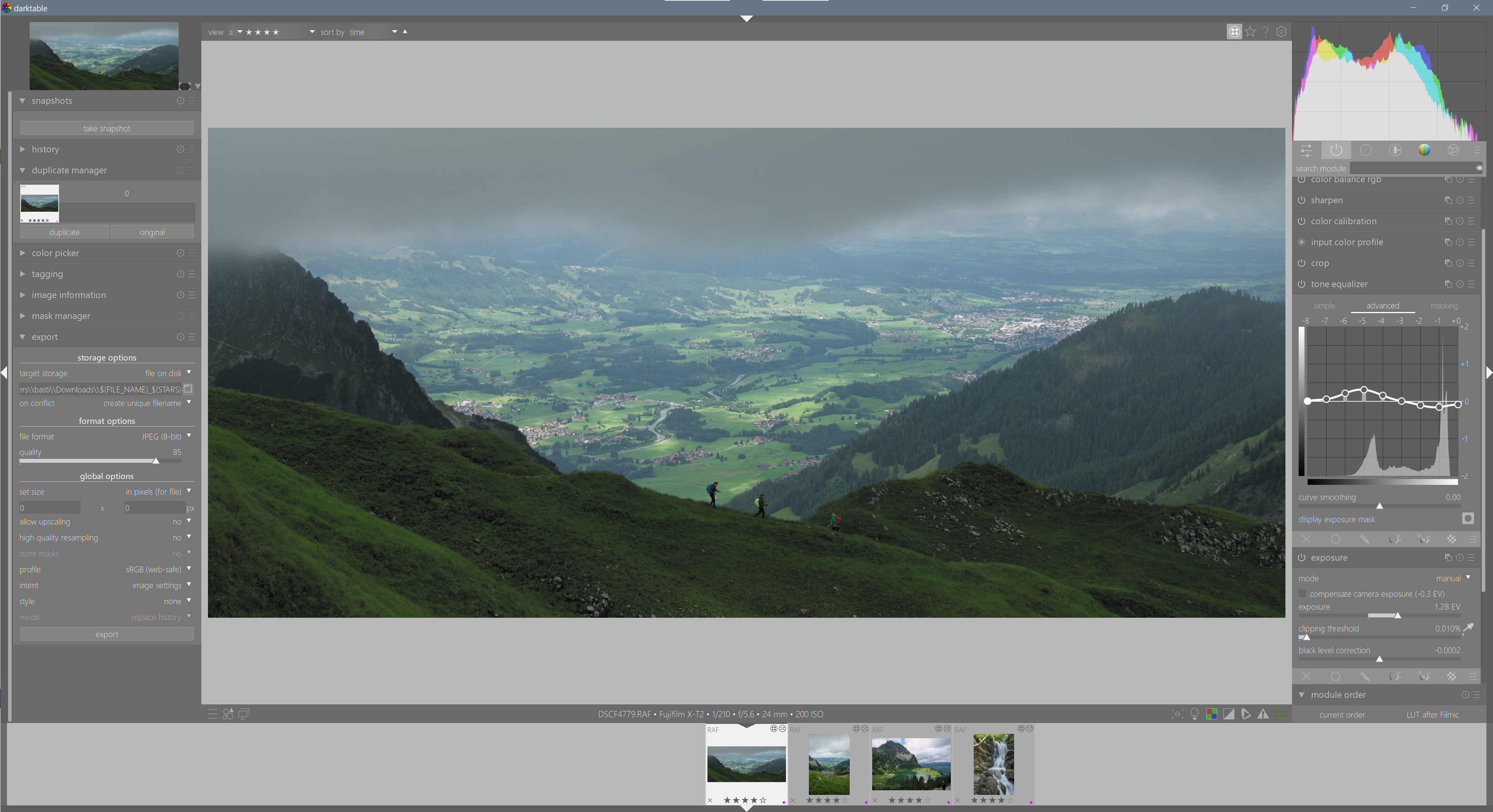
Interestingly, this leads to a somewhat different editing workflow in Darktable compared to Capture One. Since the scene-referred pipeline is mostly nondestructive, I can play with the overall tonality with abandon, safe in the knowledge that I will be able to recover any lost detail later. Thus I commonly use the exposure slider to expose for my mid-tones, and then reign in my burning highlights with the tone equalizer1 or filmc rgb white relative exposure2. In Capture One, digital overexposure is much more difficult to recover than underexposure, so I usually use the high dynamic range tools to underexpose slightly, and then recover mid-tone exposure with the high dynamic range shadows slider or tone curve. While these two workflows are largely equivalent, I find it interesting that Darktable can go either way, while Capture One can not.
A related area of rapid development in Darktable has been the color balance rgb module, and color calibration. Both of these allow for very fine-grained control over various aspects of color, handily parametrized by hue or tone or channel. There is some subtlety in the various controls for "colorfulness", "vibrance", "chroma", "brilliance", and "saturation" that took some learning. But it also taught me to see color in a more nuanced way, which is a good thing. In mixed lighting, I can now use several instances of color calibration modules3 for different image areas, producing more natural results that I am capable of in Capture One.
A particular pain point in Darktable 3.4 and Capture One was the rendering of colored highlights. In Darktable 3.4, bright colors often turned weirdly radiant, and then aggressively desaturated, with a sharp and unnatural edge in between. I don't quite know why, but this problem seems much reduced in 3.6. Both issues are now dealt with quickly and cleanly with a quick tug on the filmic rgb white relative exposure slider. A real boon that slider is. Now I just wish it didn't affect contrast quite so much and didn't also influence shadows, despite its name. Oh well, a man can dream. Capture One had the opposite problem, and sometimes wisted colored highlights into bright primary colors before desaturating, leading to cyan skies and yellow skin at the fringes of overexposure. This is still one of my major complaints about Capture One.
My last point of struggle with Darktable has long been the rendering of colors of my Fujifilm camera. Something about the colors always seemed off, in a way they weren't in Capture One. Greens too blue, browns too magenta, and skin too pink. After quite some experimentation, I found that this was simply due to Fujifilm depending on a bit of proprietary color magic for appropriate rendering. I now apply one of Stuart Sowerby's LUTs in chromaticity blending mode after filmic rgb. This leaves tonal adjustments fully to Darktable, but fixes the awkward colors perfectly. And it even allows me to play with the film simulations Fuji is famous for.
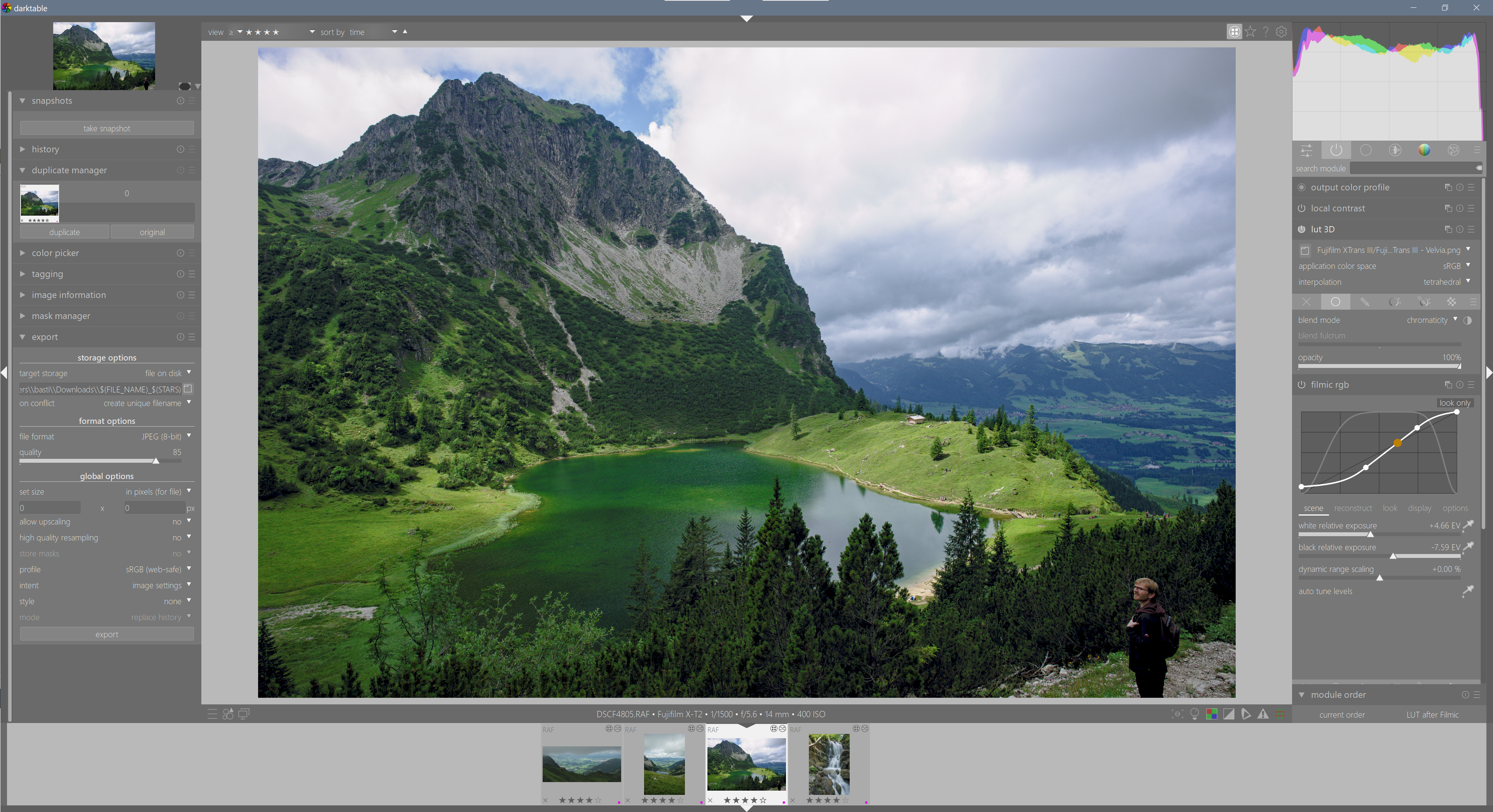
Actually, this highlights a unique strength of Darktable: the order of modules in the image editing pipeline is customizable, and most modules can be applied with masks and blending modes. Only since I used Capture One for a few months did I understand how powerful this concept really is. The key difference is that "layers" in Capture One (et al) merely apply the image editing pipeline with different parameters in different places[^4], while Darktable's modules actually apply sequentially. This enables true incremental editing, such as fixing white balance correctly for one part of the image, then applying another level of white balance just for the blue parts. Or fixing colors in a LUT after all the tonal edits, without fear of destroying highlights or shadows in the process.
[fn:4 i.e. you can fully desaturate a picture to black-and-white, then "recover" saturation in a layer
So overall, I am very happy with Darktable in its latest iteration. As always, there are plenty of nitpicks I could bring forward, such as being a bit sluggish in operation, and the UI could be streamlined a bit4. But it has once again displaced Capture One for my own work, and it makes me happy.
Comparing the Fujifilm XF 16‑80 with the XF 18‑135 Travel Zoom Lenses
When I bought into the Fuji system, I selected the XF 18‑135 f/3.5‑5.6 R LM OIS WR as my main zoom lens. This is a lens with a very wide focal range, that is commonly called a “travel zoom” because you could travel the world with just this one lens. And indeed I happily did. In 2019, Fujifilm released a second travel zoom lens, the XF 16‑80 f/4 R OIS WR. Ever since, I have wondered how this new 16‑80 compares to my 18‑135. But given that these lenses are somewhat similar, few people on the internet were ever able to compare them side by side. This blog post will change that.
The 18‑135 has served me very well indeed. Of course it is not the world's brightest lens, nor sharpest, nor smallest. But so long as I can get the shot, these limitations don't bother me. Except for two things: The transition between in-focus and out-of-focus can be a bit rough, and my lens extends on its own when carried on a sling. My hope is that the 16‑80 has a nicer rendering, especially for people photos with out-of-focus backgrounds, and a stiffer zoom ring that doesn't creep.
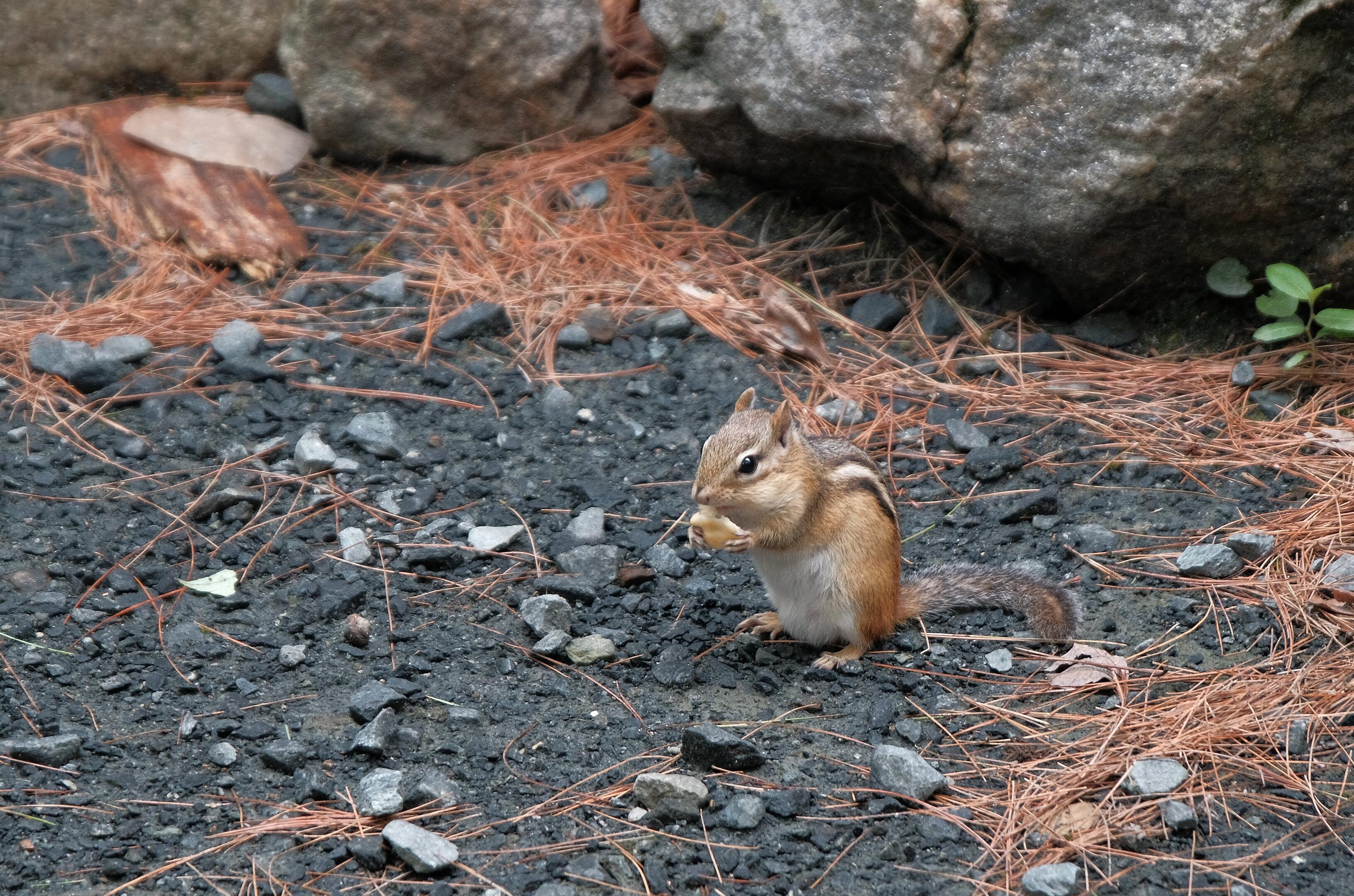
Physical
Physically, the 16‑80 is a slight bit smaller (89 mm vs 98 mm) and ligher (440 g vs 490 g) than the 18‑135, but the difference is negligible on camera. If anything, the 16‑80 actually feels a bit bigger to me due to its larger front element. Some people claim that the 16‑80 feels better built than the 18‑135. To that end, the rings on my 16‑80 turn more smoothly than my 18‑135's, but then that is comparing a new-ish lens to a well-used one. Autofocus speeds are also reputably different, but they feel similar to me.
The 16‑80 has a numbered aperture ring that allows for adjustments while the camera is turned off. On the other hand, the 18‑135 can switch to and from auto-aperture without losing its preset aperture, which is useful as well. The ideal lens for me would have both the auto-aperture switch and the numbered aperture ring. Oh well.
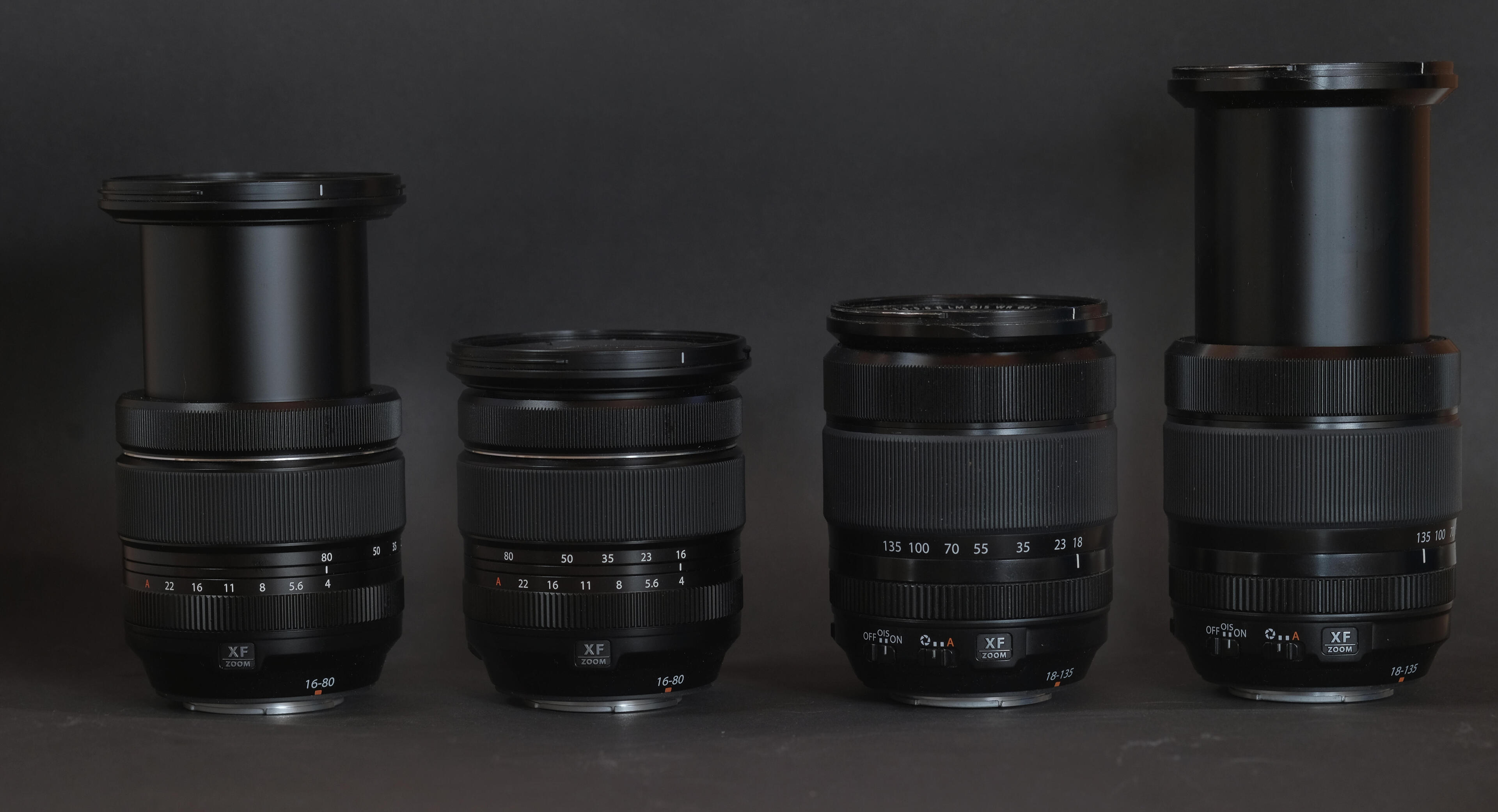
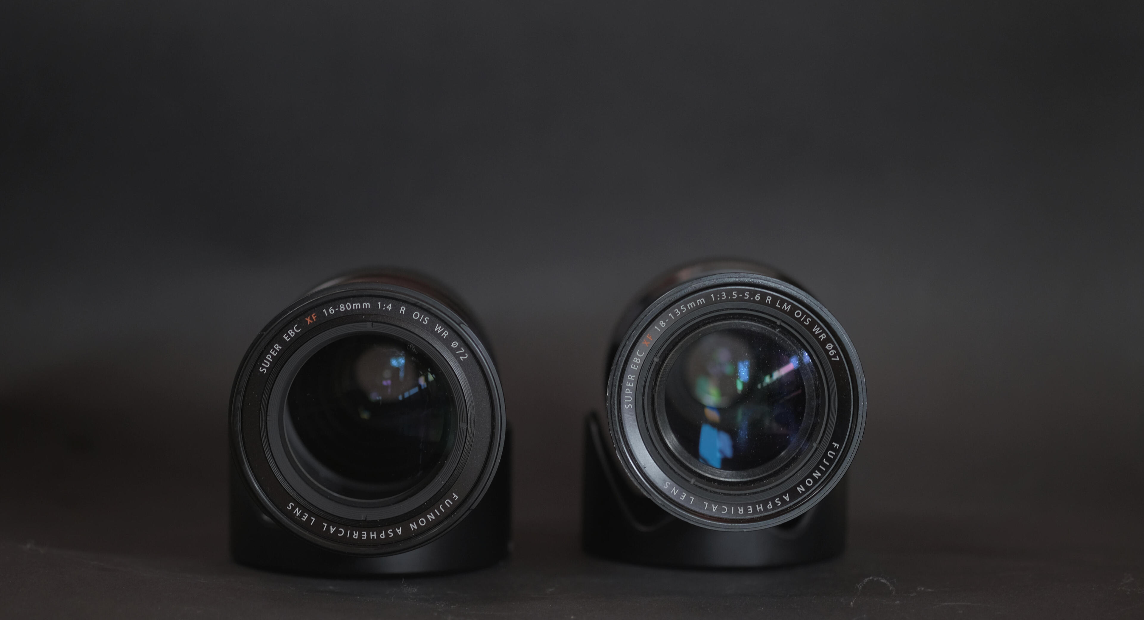
The 16‑80 has a 72 mm filter thread, while the 18‑135 uses 67 mm filters. This is somewhat annoying for me, as my filters are all 67 mm, which also fit on my 70‑300. I'd imagine users of the 72 mm 10‑24 see this differently. Anyway, using a thin polarizer with a 72‑to‑67 step-down ring works without issue on the 16‑80. My inch-thick macro filter however does vignette heavily until 23 mm.
Rendering
In terms of rendering, I find the 16‑80 to have a gentler transition from in-focus to out-of-focus, and indeed render out-of-focus backgrounds more smoothly than the 18‑135. At the long end, the 16-80 is actually a useful portrait lens, which is an unexpected but welcome feature for my photography.
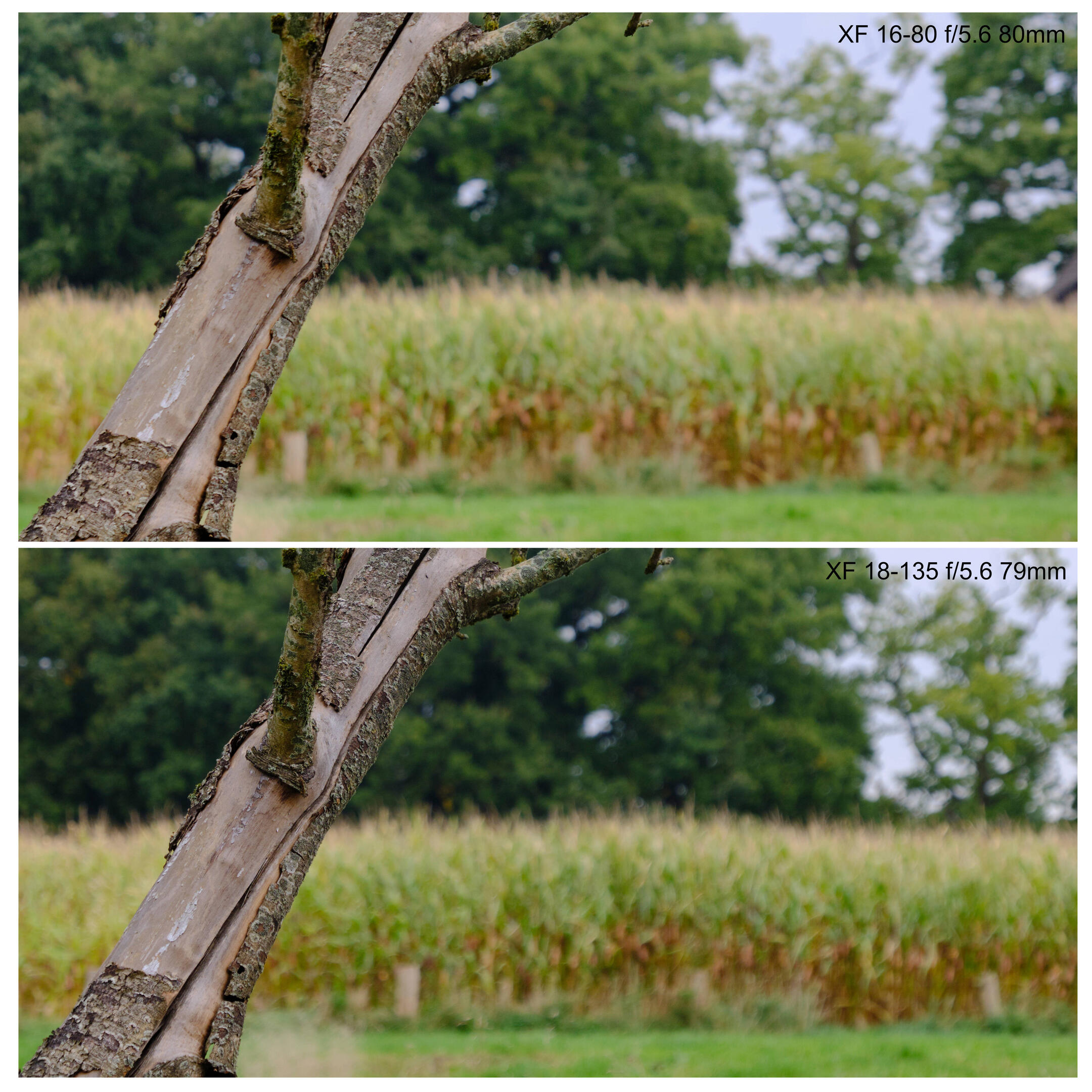
At the wide end, the 16‑80 exhibits some significant distortion. While the camera or post processing programs can easily correct this, it leaves the image corners stretched, and renders the 16‑80's nice round bokeh balls as ugly ovals. Thus large-aperture shots at the wide end can be somewhat problematic.
Resolution
Next, let's compare the resolution of the two lenses. To do that, I printed a test chart, and took some test images. All images were taken in identical illumination, on a tripod, with the chart covering half the sensor height/width. The following graphic shows a resolution scale near the center of the frame and near the left edge of the frame. And just for fun, I've thrown in a similar analysis from two prime lenses as well. The resolution scales are in 200x line widths per picture height. On my 6000×4000-pixel sensor, the theoretical maximum resolution would therefore be a resolution number of ⁴⁰⁰⁰∕₂₀₀ = 20. All test images are straight crops from original images, reproduced at their original resolution.
Center images were focused in the center, and side images were focused on the side. A two-second timer was used to eliminate camera shake. Due to the geometry of my room and the size of my printer, all pictures were taken near the close-focusing distance of the lenses. A red line indicates the limit of resolution of these lines, as judged by my eyes. The corresponding resolution numbers are generally consistent with the ones published by opticallimits and lenstip1, albeit I judged them a bit more conservatively.
The results of this test are surprising to me: the 16‑80 is actually my sharpest lens. It not only bests the 18‑135 at all settings, but also the 35 f/1.4. Only the 60 f/2.4 can reach similar resolution at the same f‑numbers. Generally, the 16‑80 is perfectly sharp right from f/4, while the 18‑135 has to be stopped down to f/8 to reach a similar resolution, especially on the image edges. Only at the long end does the 16‑80 benefit from stopping down.
That said, take these resolution measurements with a grain of salt. For instance, a “great” result of 15 (3000 LW/PH) translates to a blur radius of 1.3 pixels, while a “mediocre” result of 10 (2000 LW/PH) is instead 2 pixels. This is scientifically significant, but not at all relevant to (my) photography.
Additionally, the fact that the 60 f/2.4 macro lens scores so highly but the 35 f/1.4 does not is an indication that these measurements might be biased by being taken near the close focusing distance of the lenses. Thus the next set of images compares these lenses at more natural distances.
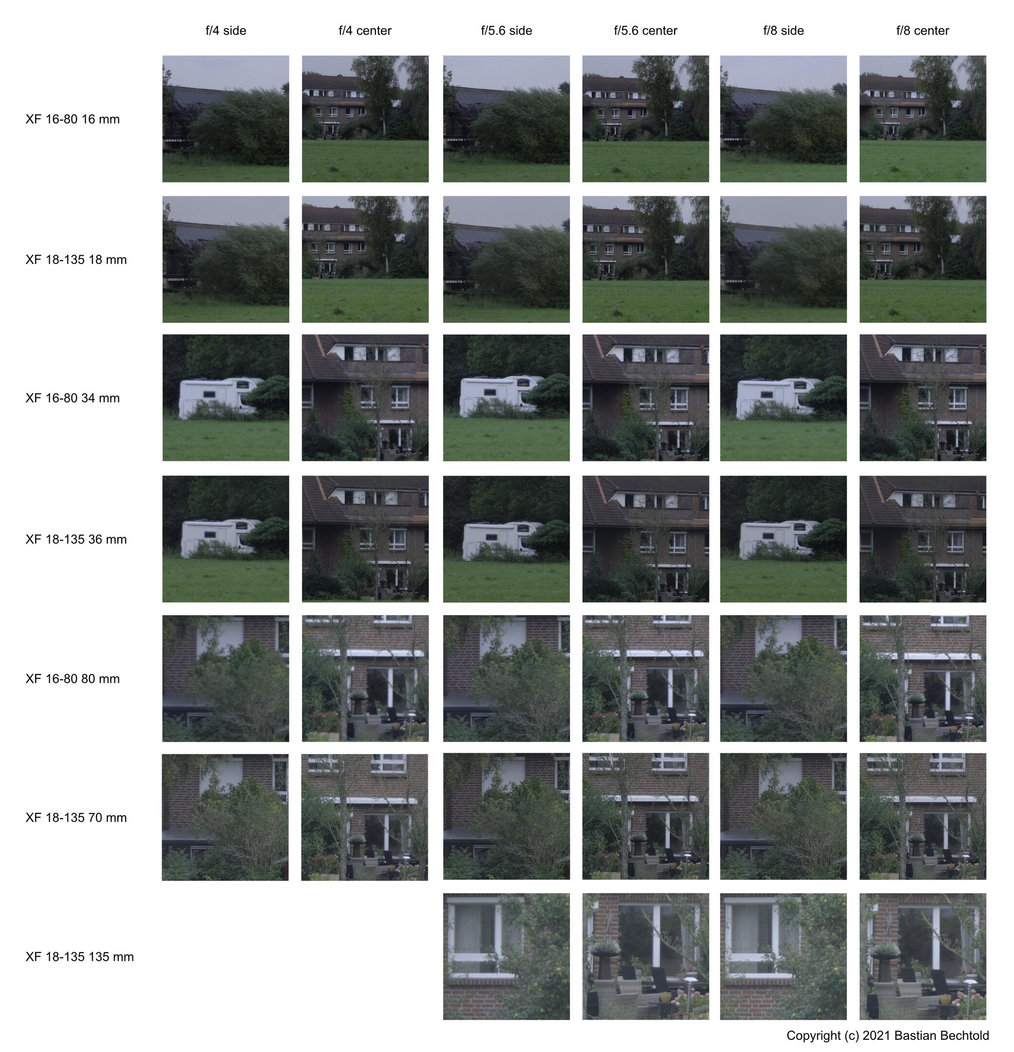
At this farther distance, and with a more natural subject, the differences are no longer as easily visible. What differences there are this time favor the 18‑135 instead of the 16‑80. Interestingly, I didn't see any significant differences between these pictures when looking at them “merely” side-by-side in Capture One. Only when I actually assembled these here graphics and looked at them at 200% did the differences become apparant.
Nevertheless, it remains curious that there would be such a difference between the two lenses. Then, someone mentioned that the 16‑80 might suffer from shutter shock, where the camera's mechanical shutter jolts the camera enough to upset the image stabilization system and induce a slight bit of motion blur. An issue such as this might explain the 16‑80's slightly reduced resolution in my test shots. So I created another series of images, but this time both, with the mechanical shutter, and with electronic shutter. In electronic shutter mode, nothing moves in the camera and there can be no shutter shock.
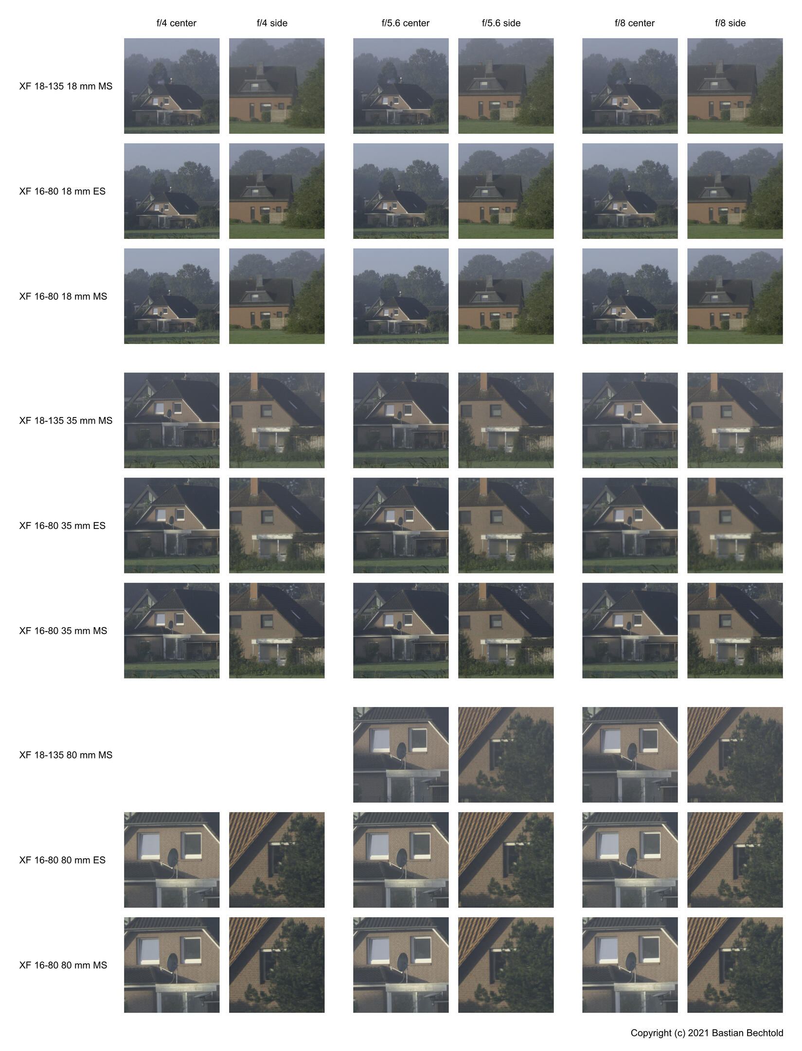
From this comparison, I can see no evidence of shutter shock. It might have been an issue on earlier firmware versions of the 16‑80, but my camera (an X-T2) and lens (at firmware 1.05) does not does not exhibit shutter shock. Furthermore, this series of pictures shows the 16‑80 and 18‑135 essentially matched in image resolution.
All of that said, I must add that all of these comparisons used extremely tight crops of high-contrast geometrical features. Most of the differences here are all but invisible in actual photographs. From these resolution experiments, I see no reason to prefer one lens over the other. Both of them are perfectly sharp in everyday use.
Conclusion
So, how to choose between the Fujifilm XF 16‑80 f/4 R OIS WR and the XF 18‑135 f/3.5‑5.6 R LM OIS WR? My 16‑80 has tighter aperture and zoom rings, does not creep, and has a smoother rendering of out-of-focus background. On the other hand, I do find the increased telephoto of the 18‑135 very useful, and it doesn't suffer from wide-angle distortion as much as the 16‑80.
In terms of resolution, I did not find fault with either lens. Both are very sharp across their entire focal range and the entire frame. That said, the 18‑135 does benefit from stopping down for optimum resolution, while the 16‑80 is sharp right from f/4, and the 16‑80 might be sharper for closer subjects.
My tentative conclusion from these experiments is therefore that I would slightly prefer the 16‑80 for people pictures, where the close-focus sharpness and nicer background rendering are advantageous, and the larger aperture at 80 mm might make a difference. And I would prefer the 18-135 for landscapes, where stopping down is usually easy and the longer focal length comes in handy.
That said, the differences in rendering and resolution are really very minor, and the choice most importantly comes down to the focal range. Which is as it should be with modern lenses. And both lenses are of course very well-built, weather sealed, and have fantastic image stabilization. But you probably knew that already.
multiply lenstip numbers by 2×16.7 mm to convert from lpmm (lines per millimeter) to LW/PH (line width per picture height)↩
Converting Capture one Presets to LUTs
A while ago, I bought an RNI film pack for Capture One. That's a set of presets that makes your digital photos look similar to analog film scans. However, since then my other image editor, Darktable just released a new version, I'm now back to using Darktable instead of Capture One, thus without access to those presets.
Here's how to export Capture One presets to LUTs, to make them accessable to other programs.
The fun thing is, LUTs are just PNG files that contain a table of colors. You know, a "Look Up Table", of sorts. So, in order convert a preset to a LUT, all we need to do is apply the preset to a pristine "identity" LUT, and export it as a new PNG.
- Get yourself an identity LUT.
For example, the one included in Stuart Sowerby's Fuji Film Simulation Profiles. Choose the sRGB PNG LUTs, for RawTherapee and Affinity Photo. - Open the LUT PNG in Capture One.
- Apply the preset you want.
Optionally lower saturation by -15, see below. - Export as PNG.
Make sure the color space is sRGB, just like the original file.
As easy as that.
A few more adjustments: many Capture One presets expect to be working on raw data, which is less saturated than Darktable's default. So I export with -15 saturation. Also, many presets include spacial adjustments such as Highlights or Shadows that are bound to not play well with the LUT PNG. To disable them, delete the offending lines from the *.costyle files1, or compensate the values with opposite slider movements.
When applying the LUTs in Darktable's lut 3D module, there are a few more things you can do to fit them into your workflow. For example, you can lower the opacity of the lut 3D module to vary their effect. Or you can choose chromaticity as blend more to only apply their color transformation, but keep Darktable's tonal rendering. In normal blend mode, some LUTs prefer a flat rendering as their input, so lower contrast in filmic rgb to zero and use the auto-pickers to set the image black and white point.
don't do this for RNI LUTs, it's forbidden by the User License Agreement that is hidden quite well in dark-grey-on-black at the very bottom of their website↩
Darktable for Fujifilm Cameras
You know what I like to see when I import photos from my Fujifilm camera into Darktable?
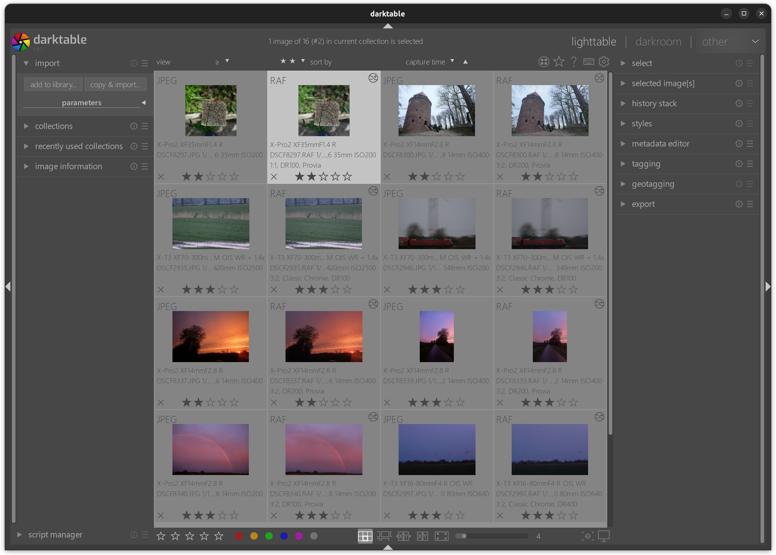
However, that is not the default. Darktable, like most raw developers, is camera-agnostic.
agnostic
ăg-nŏs′tĭknoun [...]
- One who is doubtful or noncommittal about something.
Which means that Darktable does not know about any Fujifilm-specific raw file metadata, such as crop, dynamic range modes, or film simulations. Thus what you'd normally see in Darktable is more like this:
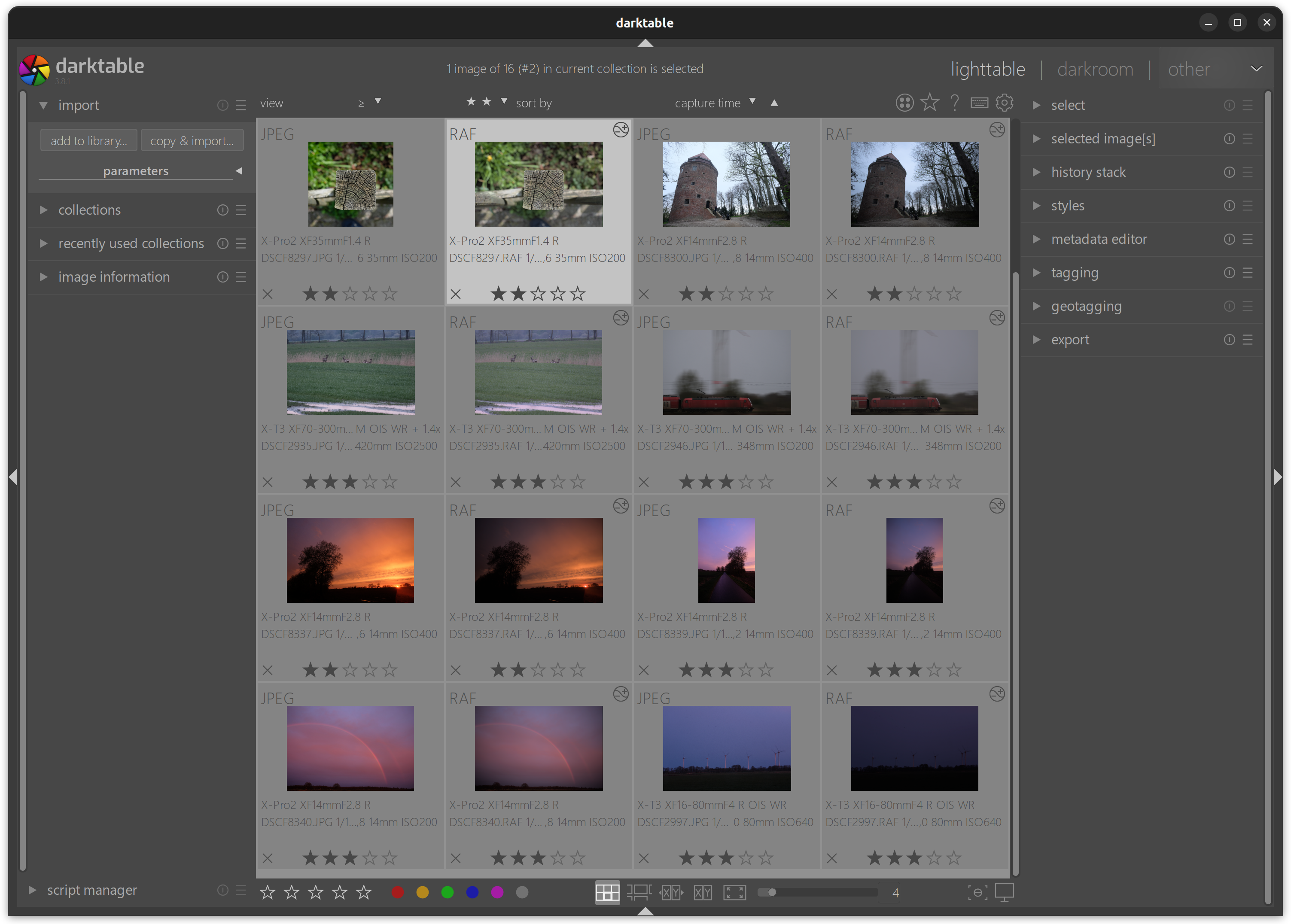
Notice how all the DR200/DR400 images are underexposed by one and two stops, how the first JPG is a square crop, but the RAF is 3:2, how the color of the grass and the train are subtly different in RAF and JPG.
But thankfully, Darktable has a scripting interface for automating things. And what I've done here is a little script that uses exiftool to read the missing metadata from the RAF file and apply appropriate styles to get Darktable's default rendering close to the JPG.
Here's the lua script in its entirety:
--[[ fujifilm_auto_settings-0.2

Apply Fujifilm film simulations, in-camera crop mode, and dynamic range.

Copyright (C) 2022 Bastian Bechtold <bastibe.dev@mailbox.org>

This program is free software; you can redistribute it and/or modify
it under the terms of the GNU General Public License as published by
the Free Software Foundation; either version 2 of the License, or
(at your option) any later version.

This program is distributed in the hope that it will be useful,
but WITHOUT ANY WARRANTY; without even the implied warranty of
MERCHANTABILITY or FITNESS FOR A PARTICULAR PURPOSE.  See the
GNU General Public License for more details.

You should have received a copy of the GNU General Public License along
with this program; if not, write to the Free Software Foundation, Inc.,
51 Franklin Street, Fifth Floor, Boston, MA 02110-1301 USA.
--]]

--[[About this Plugin
Automatically applies styles that load Fujifilm film simulation LUTs,
copy crop ratios from the JPG, and correct exposure according to the
chosen dynamic range setting in camera.

Dependencies:
- exiftool (https://www.sno.phy.queensu.ca/~phil/exiftool/)
- Fuji LUTs (https://blog.sowerby.me/fuji-film-simulation-profiles/)

Based on fujifim_dynamic_range by Dan Torop.

  Film Simulations
  ----------------

Fujifilm cameras are famous for their film simulations, such as Provia
or Velvia or Classic Chrome. Indeed it is my experience that they rely
on these film simulations for accurate colors.

Darktable however does not know about or implement these film
simulations. But they are available to download from Stuart Sowerby as
3DL LUTs. (PNG LUTs are also available, but they show a strange
posterization artifact when loaded in Darktable, which the 3DLs do
not).

In order to use this plugin, you must prepare a number of styles:
- provia
- astia
- velvia
- classic_chrome
- pro_neg_standard
- pro_neg_high
- eterna
- acros_green
- acros_red
- acros_yellow
- acros
- mono_green
- mono_red
- mono_yellow
- mono
- sepia

These styles should apply the according film simulation in a method of
your choosing.

This plugin checks the image's "Film Mode" exif parameter, and applies
the appropriate style. If no matching style exists, no action is taken
and no harm is done.

  Crop Factor
  -----------

Fujifilm cameras allow in-camera cropping to one of three aspect
ratios: 2:3 (default), 16:9, and 1:1.

This plugin checks the image's "Raw Image Aspect Ratio" exif
parameter, and applies the appropriate style.

To use, prepare another four styles:
- square_crop_portrait
- square_crop_landscape
- sixteen_by_nine_crop_portrait
- sixteen_by_nine_crop_landscape

These styles should apply a square crop and a 16:9 crop to
portrait/landscape images. If no matching style exists, no action is
taken and no harm is done.

  Dynamic Range
  -------------

Fujifilm cameras have a built-in dynamic range compensation, which
(optionally automatically) reduce exposure by one or two stops, and
compensate by raising the tone curve by one or two stops. These modes
are called DR200 and DR400, respectively.

The plugin reads the raw file's "Auto Dynamic Range" or "Development
Dynamic Range" parameter, and applies one of two styles:
- DR200
- DR400

These styles should raise exposure by one and two stops, respectively,
and expand highlight latitude to make room for additional highlights.
I like to implement them with the tone equalizer in eigf mode, raising
exposure by one/two stops over the lower half of the sliders, then
ramping to zero at 0 EV. If no matching styles exist, no action is
taken and no harm is done.

These tags have been checked on a Fujifilm X-T3 and X-Pro2. Other
cameras may behave in other ways.

--]]

local dt = require "darktable"
local du = require "lib/dtutils"
local df = require "lib/dtutils.file"

du.check_min_api_version("7.0.0", "fujifilm_auto_settings")

-- return data structure for script_manager

local script_data = {}

script_data.destroy = nil -- function to destory the script
script_data.destroy_method = nil -- set to hide for libs since we can't destroy them completely yet, otherwise leave as nil
script_data.restart = nil -- how to restart the (lib) script after it's been hidden - i.e. make it visible again

local function exiftool_get(exiftool_command, RAF_filename, flag)
    local command = exiftool_command .. " " .. flag .. " -t " .. RAF_filename
    dt.print_log(command)
    local output = io.popen(command)
    local exiftool_result = output:read("*all")
    output:close()
    if #exiftool_result == 0 then
        dt.print_error("[fujifilm_auto_settings] no output returned by exiftool")
        return
    end
    local exiftool_result = string.match(exiftool_result, "\t(.*)")
    if not exiftool_result then
        dt.print_error("[fujifilm_auto_settings] could not parse exiftool output")
        return
    end
    exiftool_result = exiftool_result:match("^%s*(.-)%s*$") -- strip whitespace
    return exiftool_result
end

local function apply_style(image, style_name)
    for _, s in ipairs(dt.styles) do
        if s.name == style_name then
            dt.styles.apply(s, image)
            return
        end
    end
    dt.print_error("[fujifilm_auto_settings] could not find style " .. style_name)
end

local function apply_tag(image, tag_name)
    local tagnum = dt.tags.find(tag_name)
    if tagnum == nil then
        -- create tag if it doesn't exist
        tagnum = dt.tags.create(tag_name)
        dt.print_log("[fujifilm_auto_settings] creating tag " .. tag_name)
    end
    dt.tags.attach(tagnum, image)
end


local function detect_auto_settings(event, image)
    if image.exif_maker ~= "FUJIFILM" then
        dt.print_log("[fujifilm_auto_settings] ignoring non-Fujifilm image")
        return
    end
    -- it would be nice to check image.is_raw but this appears to not yet be set
    if not string.match(image.filename, "%.RAF$") then
        dt.print_log("[fujifilm_auto_settings] ignoring non-raw image")
        return
    end
    local exiftool_command = df.check_if_bin_exists("exiftool")
    if not exiftool_command then
        dt.print_error("[fujifilm_auto_settings] exiftool not found")
        return
    end
    local RAF_filename = df.sanitize_filename(tostring(image))

    -- dynamic range mode
    -- if in DR Auto, the value is saved to Auto Dynamic Range, with a % suffix:
    local auto_dynamic_range = exiftool_get(exiftool_command, RAF_filename, "-AutoDynamicRange")
    -- if manually chosen DR, the value is saved to Development Dynamic Range:
    if auto_dynamic_range == nil then
        auto_dynamic_range = exiftool_get(exiftool_command, RAF_filename, "-DevelopmentDynamicRange") .. '%'
    end
    if auto_dynamic_range == "100%" then
        apply_tag(image, "DR100")
        -- default; no need to change style
    elseif auto_dynamic_range == "200%" then
        apply_style(image, "DR200")
        apply_tag(image, "DR200")
        dt.print_log("[fujifilm_auto_settings] DR200")
    elseif auto_dynamic_range == "400%" then
        apply_style(image, "DR400")
        apply_tag(image, "DR400")
        dt.print_log("[fujifilm_auto_settings] DR400")
    end

    -- cropmode
    local raw_aspect_ratio = exiftool_get(exiftool_command, RAF_filename, "-RawImageAspectRatio")
    if raw_aspect_ratio == "3:2" then
        apply_tag(image, "3:2")
        -- default; no need to apply style
    elseif raw_aspect_ratio == "1:1" then
        if image.width > image.height then
            apply_style(image, "square_crop_landscape")
        else
            apply_style(image, "square_crop_portrait")
        end
        apply_tag(image, "1:1")
        dt.print_log("[fujifilm_auto_settings] square crop")
    elseif raw_aspect_ratio == "16:9" then
        if image.width > image.height then
            apply_style(image, "sixteen_by_nine_crop_landscape")
        else
            apply_style(image, "sixteen_by_nine_crop_portrait")
        end
        apply_tag(image, "16:9")
        dt.print_log("[fujifilm_auto_settings] 16:9 crop")
    end

    -- filmmode
    local raw_filmmode = exiftool_get(exiftool_command, RAF_filename, "-FilmMode")
    local style_map = {
        ["Provia"] = "provia",
        ["Astia"] = "astia",
        ["Classic Chrome"] = "classic_chrome",
        ["Eterna"] = "eterna",
        ["Acros+G"] = "acros_green",
        ["Acros+R"] = "acros_red",
        ["Acros+Ye"] = "acros_yellow",
        ["Acros"] = "acros",
        ["Mono+G"] = "mono_green",
        ["Mono+R"] = "mono_red",
        ["Mono+Ye"] = "mono_yellow",
        ["Mono"] = "mono",
        ["Pro Neg Hi"] = "pro_neg_high",
        ["Pro Neg Std"] = "pro_neg_standard",
        ["Sepia"] = "sepia",
        ["Velvia"] = "velvia",
    }
    for key, value in pairs(style_map) do
        if string.find(raw_filmmode, key) then
            apply_style(image, value)
            apply_tag(image, key)
            dt.print_log("[fujifilm_auto_settings] film simulation " .. key)
        end
    end
end

local function detect_auto_settings_multi(event, shortcut)
    local images = dt.gui.selection()
    if #images == 0 then
        dt.print(_("Please select an image"))
    else
        for _, image in ipairs(images) do
            detect_auto_settings(event, image)
        end
    end
end

local function destroy()
    dt.destroy_event("fujifilm_auto_settings", "post-import-image")
    dt.destroy_event("fujifilm_auto_settings", "shortcut")
end

if not df.check_if_bin_exists("exiftool") then
    dt.print_log("Please install exiftool to use fujifilm_auto_settings")
    error "[fujifilm_auto_settings] exiftool not found"
end

dt.register_event("fujifilm_auto_settings", "post-import-image", detect_auto_settings)

dt.register_event("fujifilm_auto_settings", "shortcut", detect_auto_settings_multi, "fujifilm_auto_settings")

dt.print_log("[fujifilm_auto_settings] loaded")

script_data.destroy = destroy

return script_data
However, there's a catch: Scripts in Darktable can not modify darkroom state directly. But they can load styles. So to make the script work, we need to define a number of styles that do the heavy lifting here:
- Two styles
DR200andDR400for the dynamic range modes that brighten the image by one and two stops, respectively (I like to use the Tone Equalizer like this). - Four styles
square ̲crop_landscapeandsquare ̲crop_portraitandsixteen ̲by ̲nine ̲crop_landscapeandsixteen ̲by ̲nine ̲crop_portraitthat crop landscape/portrait images to 1:1 and 16:9 ratio. - One style for each film simulation you use:
provia,astia,velvia,classic ̲chrome,pro ̲neg ̲standard,pro ̲neg ̲high,eterna,acros,acros ̲green,acros ̲red,acros ̲yellow,mono,mono ̲green,mono ̲red,mono ̲yellow,sepia. The linked styles use Stuart Sowerby's Film Simulation LUTs as film simulations, which must be installed in$LUTs/Fujifilm XTrans III/$lut.3dl.
Download a zip file with all the above styles here, and appropriately-renamed LUTs [here](https://bastibe.de/static/2022-05/Fujifilm XTrans III.zip). (This section will be revised once I finish building my own set of LUTs).
Then copy the lua script to /.config/darktable/lua/contrib/, activate it in the script manager (bottom left in the lighttable), and it should automatically run whenever you import new Fujifilm raf files! (Start Darktable with darktable -d opencl to see debug messages, and bind a keyboard shortcut to lua scripts/fujifilm_auto_settings to trigger the script manually.)
RAW Developer Comparison 2
It's that time of the year again when all image editing programs come out with new versions. This comes at an inopportune time, as I feel restless of late. So, naturally, I had to try them all. Or maybe I just wanted a justification for buying DxO PhotoLab, because people on the internet speak so well of it 🙄.
For the following comparison I downloaded trial versions of ACDSee Photo Studio Ultimate 2023 (€155), Capture One 22 (€350 or €220/a), Darktable 4.0 (free), DxO Photolab 6 (€220 + €140 for FilmPack 6 + €99 for ViewPoint), Adobe Lightroom Classic 11.5 (€142/a), ON1 Photo Raw 2023 (€126), RawTherapee 5.8 (free), Silkypix Developer Studio Pro 11 (€155), Exposure X7 (€165), and Zoner Photo Studio X Fall 2022 (€60/a). I also installed Luminar Neo (€120 or €80/a) and Radiant Photo (€140) but I disliked them so immediately and viscerally that I didn't include them in the comparison below.
In order to put them through their paces, I took a random smattering of images from the last few years that I found difficult to work with for one reason or another, and checked how each of the programs dealt with them. Of course I am no expert in any of them except Darktable and Capture One, so my results are probably flawed. I tried to inject some objectivity by limiting my edits to the most obvious sliders wherever possible, especially in the programs I know better. Regardless, my comparison is probably less scientific than last time, because my brain sort of broke after staring at too many renderings of the same images for too long. Don't try this at home, folks!
Test Case One: Fire
Fire is notoriously difficult to deal with, because it covers a large dynamic range, and we have strong associations of certain colors with heat. Thus a more yellow rendering usually suits fire very well, whereas a more neutral rendering quickly looks unnatural. In particular, we seem to expect highlights to twist to yellow, and midtones to remain orange.
My editing goals for this picture are simple: raise shadows or blacks until the pan becomes faintly visible, and reign in highlights if necessary to prevent excessive clipping.

highlights turn strongly yellow

highlights turn yellow
shadows adjusts unusally far into midtones

highlights turn desaturate
weirdly salmon color
filmic v6, zero latitude, no color preservation
tone EQ very unusual re: shadows/blacks sliders

highlights turn yellow
filmic v5, zero latitude, no color preservation
tone EQ very unusual re: shadows/blacks sliders

highlights desaturate

highlights desaturate

highlights turn very yellow
pan immediately visible without adjustments

highlights desaturate
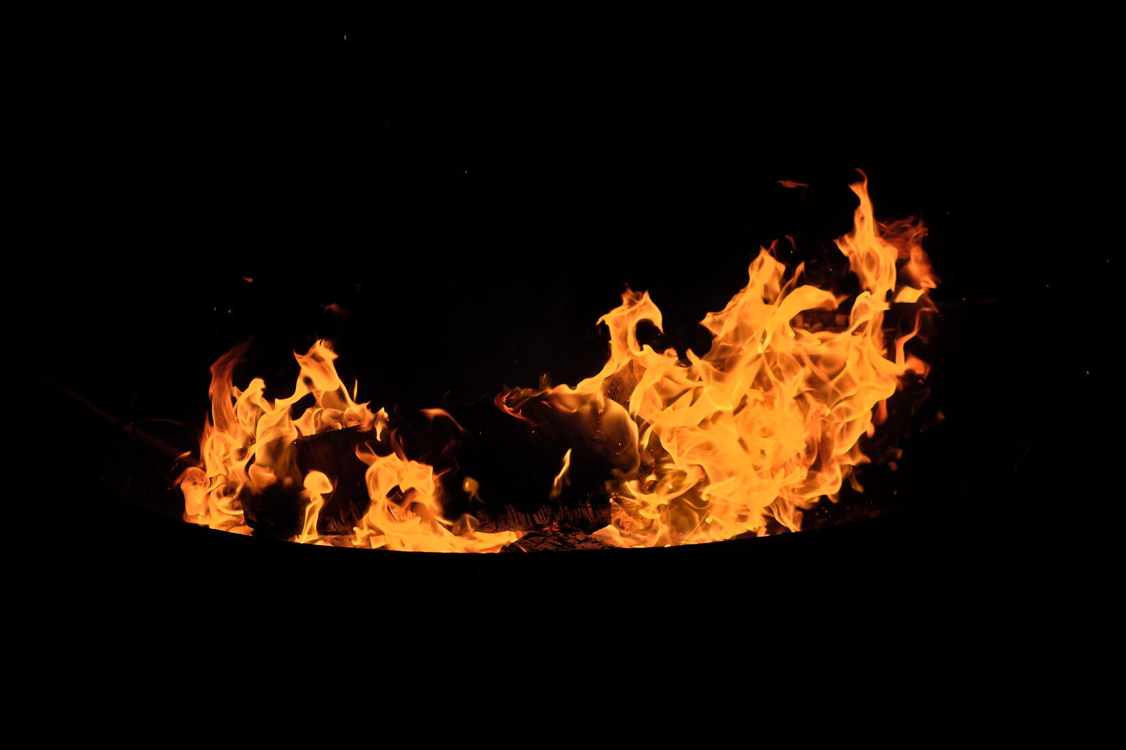
highlights turn yellow, but lose all definition
shadows slider not strong enough to show pan

highlights turn unpleasant white
raising shadows turns background off-black

highlights desaturate
weird, clarity-like effect
Fujifilm X-Pro2 with XF35mmF1.4 R 1/1000s f/2.2 ISO400
📂 DSCF9359.RAF (23.0 MB) 
There's a difficult tradeoff to be made here: Fire highlights physically don't change hue much compared to the fire body, but we visibly expect "hotter" fire to twist yellow. So a balance has to be struck between merely desaturating highlights, and twisting them yellow. You can see Darktable v6, DxO PhotoLab, RawTherapee, Exposure, and Zoner leaning towards desaturation, while the others render yellow color twists of some form or another. ACDSee and ON1 probably take the yellow a bit too far.
However, there's a flip side to this: Every program that renders yellow highlights in fire, does the same for overexposed skin, twists overexposed skies cyan, and red flowers magenta. It's a difficult tradeoff to get right. This is especially tricky since color shifts in highlights are often baked deeply into the programs' color science, and hard to get rid off where they're unwanted.
Anyway, to my eyes, the only fire-like renderings here come from Capture One, Darktable v5, PhotoLab, and Lightroom.
A Hazy Mountain
This lovely scene is a deep crop into an image taken at long distance on a hazy day. The challenge is therefore dehazing the mountains, chiseling out the contours with clarity and texture and contrast, and removing any extraneous noise.
This is a difficult task, as emphasizing local contrast tends to produce halos near the horizon, dehazing tends to introduce unpleasant color shifts, and the deep crop necessitates a subtle balance between denoising and detail retention.
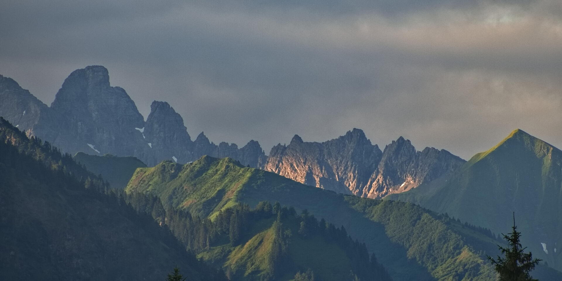
strong halos from clarity/texture
very inefficient/smeary denoising

very little dehaze used, as higher settings break tonality
little definition in shadows

very little default saturation, easy to fix
outstandingly subtle rendering to my eye
dehaze ("ClearView") produces strong hue shift
clarity ("Microcontrast") is very slow
contrast not enough editing range, added tone curve to help
denoise ("DeepPrime") annoyingly only visible in mini viewer

dehaze works perfectly!
denoise not very effective and slightly wormy
tends to strong halos from clarity
dehaze produces strong hue shift
strong halos on the horizon
highlights tend to blow to pure white somehow
dehaze produces hue shift that is hard to fix
does not hide cropped-out image?

pleasant rendering, but not very detailed
there does not seem to be a clarity-like slider?
works very well in this image
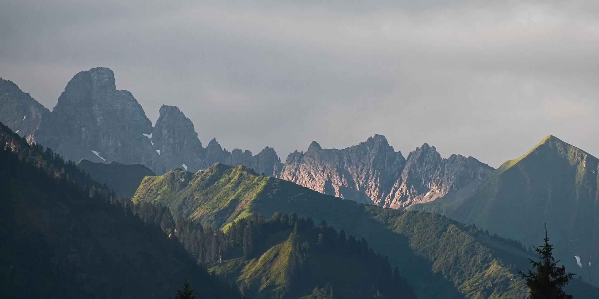
weirdly ineffective dehaze
contrast introduces strong saturation
ineffective and wormy denoising
Fujifilm X-T2 with XF70-300 @ 231mm 1/400s f/5.7 ISO200
📂 DSF4442.RAF (23.0 MB) 
Overall, most of these renderings turned out fine. But there are pretty substantial differences in denoising, haloing, and detail retention of the shadows specifically. Halos especially are a personal bug-bear of mine, where the sky above the horizon line brightens and (worse) the mountains below the horizon line darken. This is especially visible in ACDSee, ON1, and Zoner, and to a lesser extent in DxO, Lightroom, and RawTherapee.
There were also significant differences in noise removal. Especially ACDSee, Exposure, and Zoner had weirdly ineffective denoising, and were unusually difficult to balance against smearing and worms in Lightroom, ON1, and Silkypix. Colors were a bit difficult to control in ACDSee, ON1, and RawTherapee.
The most pleasant renderings to my eye are DxO, Exposure, and Darktable in this round, although many of the others are very usable as well.
High Key Rendering
Contrary to the popular style at moment, I sometimes like my highlights a little blown. I especially like a smooth, desaturated, film-like drop-off in my highlights, which seems strangely difficult to replicate in digital photography.
So instead of turning the following picture into an HDR hellscape, I want to compress the bright background into the highlights, while expanding the dark foreground to fill the midtones. The capture actually has all highlight information intact, so I don't want to blow anything out completely, just gracefully fade it into pastels.
nice highlight rendering
very blotchy noise reduction in the shadows

weirdly saturated trees
very noisy foreground

default rendering horrendous
setting color preservation to luminance helps
weirdly saturated trees
very noisy foreground
oversaturated by default (easy to fix)
good foreground brightness by default
strangly contrasty highlights

trees remain unrealistically dark
noisy foreground

trees remain unrealistically dark
unsightly HDR look
terribly oversaturated trees
shadows does not raise black point, remains dark
weird color areas in the sky
strange color fringes on trees
highlights hard to deal with

noisy foreground
Fujifilm X-Pro2 with XF16-80mm @ 16mm 1/400s f/9 ISO400
(no raw, for privacy reasons)
The different renderings of this image are more of a matter of preference than any of the previous ones. To my eyes, I like the versions drawn by ACDSee, Capture One, Zoner Photo, and DxO PhotoLab best, and I recon that many of the other versions could have been improved with a little more manual tuning. The only problematic versions of this image were the strange HDR-like ON1 render, and the Silkypix variant with its lost black point.
Summary
Overall, all of these programs seem reasonable tools for image editing. Most of their differences can probably be overcome if you learn them better. That said, this comparison has left me with a few clear favorites. To be clear, the above comparison only showed the most decisive images of a much larger set which informs my opinion. It should also be noted that my tastes in image editing do not focus on detail recovery, detailed masking, nontrivial retouching, or scene-changing edits such as wholesale sky swapping.
One area I am particularly interested in, however, is the inherent complexity of the editing tools: For example, I like my saturation slider to only change saturation and leave lightness alone. Similarly, contrast adjustments should not affect saturation. Another interesting part is the behavior of highlights adjustments. Ideally, I'd like highlights to be able to counteract exposure adjustments so I can balance them against one another. Better yet if the same can be done with the tone curve.
| Name | Editing is | Export takes | Saturation changes overexposure? | Contrast changes lightness? | Highlights rescues overexposure? | Tonecurve rescues overexposure? |
|---|---|---|---|---|---|---|
| ACDSee Photo Studio | realtime | 25s | yes | yes | yes | no |
| Capture On | realtime | 15s | a little | no | yes | no |
| Darktable | delayed | 15s | no | no | yes | yes |
| DxO PhotoLab | delayed | 45s | yes | a little | yes | a little |
| Lightroom Classic | realtime | 15s | a little | a little | yes | a little |
| ON1 Photo RAW | realtime | 30s | yes | a little | no | no |
| RawTherapee | wait and see | 30s | a little | yes | no | no |
| Silkypix Developer | lo-res wait/see | 80s | no | a little | no | no |
| Exposure X7 | realtime | 30s | yes | strongly | yes | a little |
| Zoner Photo Studio | lo-res realtime | 30s | yes | yes | yes | a little |
If saturation changes lightness and contrast changes saturation, editing can become rather more difficult, as the effect tends to be hard to counteract without complex luminosity masking. This is a reason for me to dislike my experience with ACDSee, ON1, Exposure, and Zoner particularly. The highlights slider issue also has a big influence on how you edit images. If highlights can be recovered after exposure adjustments, you can use exposure mostly for image brightness, and recover highlights later if needed. On the other hand, if highlights can't be recovered, then the exposure slider must instead be used to protect highlights, and image brightness has to be relegated to the tone curve or shadows/midtones sliders. This feels weirdly backwards to me, and is a reason for me to disregard ON1, RawTherapee, and Silkypix.
The gold standard here is of course Darktable, where saturation ("chroma") is completely decoupled from lightness. And, as a particular point of pride, any module whatsoever can edit highlights without any risk of them blowing irretrievably. In practice, this actually simplifies development noticeably. The former is a bit of a double-edged sword, though, as chroma of bright colors can only be pushed so far without going out of gamut; Darktable therefore provides a second saturation control that additionally lowers brightness to keep bright colors in gamut, much like other tools.
You may also have noticed that the three examples pictures above were taken with Fujifilm cameras. These cameras are highly acclaimed for their film simulations. Of the tested software, Lightroom Classic, Silkypix Developer, Capture One, and ON1 Photo RAW natively support these film simulations. DxO PhotoLab can add them for an additional €139 FilmPack. And ACDSee Photo Studio, RawTherapee, Darktable, and Exposure X7 at least support third-party LUTs which can retrofit film simulations. Funny how programs either charge money for native film simulations, or support generic LUTs. What a coincidence! (Only ON1 Photo RAW supports both film simulations and (ICC) LUTs, and only Zoner Photo Studio supports neither).
So, after spending a few evenings with these programs, what is my verdict?
ACDSee Photo Studio Ultimate 2023 ★★★☆☆
Overall a rather good package. Fantastic organizational features, too. Even sports an API for extending its functionality! And pixel editing, a mobile app, and just a ton more.
However, it does not suit my tastes. Something about the UI and some tools seems a bit unpolished. Particularly, clarity and dehaze produce too strong halos for me, and the denoising is unpleasantly ineffective and smeary. Panning sometimes breaks the image into a pixelated mess, and there's no Fuji film sim support. Still, when it works, it produced some of my favorite renders in this comparison!
As another weird point, it's Windows only, and behaves oddly windowsy, too. For example, the library view by default shows all files and folders, not just images, and you actually need to reinstall the entire software if you want to change its language.
Capture One 22 ★★★★★
A product I know well, and own a license for. This comparison has reinforced that choice. Capture One's image editing tools are somewhat basic, but they seem refined and flexible. There's a strong focus on workflow efficiency, too, with its speed edit shortcuts and style brushes.
If there is a criticism to be leveled at Capture One, it's the high price and the somewhat slow pace of development. Many a competitors' feature is only included in Capture One years after they have become widespread. And many new features focus on the needs of working professional photographer instead of amateurs like me.
Regardless, Capture One will remain my one-of-two raw developer of choice. And it runs on my rather slow Surface tablet for emergency vacation edits!
Darktable 4.0 ★★★★☆
Darktable is the other raw developer I know intimately. In a sense, it is the polar opposite of Capture One: all the algorithms, parameters, and details are laid bare; nothing is hidden or automated. Its editing tools are also by far the most unusual of this bunch, which must no doubt be bewildering to newcomers. But if you're interested in deep control and alternative editing workflows, there's just nothing like it. Personally, I have scripted it and molded it extensively, which has made my Darktable similarly efficient and fast as Capture One. Such flexibility is actually rather rare in image editing software.
But I seriously hope they fix that horrendous highlights rendering of filmic v6 in the next revision. That's currently a constant pain point to work around.
Darktable will remain my one-of-two raw developer of choice. And it runs on Linux!
DxO PhotoLab 6 ★★★★☆
This program really is what prompted this entire ordeal. I heard so many good things about DxO PhotoLab, and was planning on replacing Capture One with it after this comparison.
There truly is a lot to like about DxO PhotoLab. Its tools seem robust, its default rendering is often very close to a finished image, and its denoising is rather remarkable. However, the program just felt clunky to use. Things are organized inefficiently, some operations take annoyingly long to process, and some effects are only visible in a tiny preview window or indeed the exported file. The local adjustments also seemed unnecessarily cumbersome to use, with that weird radial menu and those awkwardly imprecise "Control Points".
And what's with the weirdly branded sliders all over the program? Why is it "DxO Smart Lighting" instead of shadows, "DxO ClearView Plus" instead of dehaze, and "Microcontrast" instead of clarity, and "DxO DeepPrime XD" instead of denoising?
Truthfully, I might still have bought a license for this program as it is powerful and fun to use, despite my complaints. But €220 for the main program plus €140 for the FilmPack (for Fujifilm film simulations, but also basics such as a vignette tool) plus €100 for ViewPoint (for cool distortion stuff, but also the keystone tool) is just a bit too much, thank you very much.
Lightroom Classic 11.5 ★★★★☆
People like this program, and for good reason. Robust tools, a pleasant rendering, and just a staggering amount of tutorials and help online due to its popularity.
Nevertheless, Lightroom does not appeal to me. I don't like how Lightroom seems to takes undue possession of my images on import, I am repelled by the weird old-fashioned UI with its bonkers conventions (hold Alt to show masks, crop moves image instead of rectangle, etc.). I don't like its yearly-subscription-only pricing structure, either, although the price and terms are actually rather reasonable. And I don't like that Adobe Creative Cloud mothership that's necessary to install and maintain Lightroom.
But I do realize that this is actually good software. It's just not my favorite.
ON1 Photo RAW 2023 ★★☆☆☆
The new AI denoising and sharpening produced only artifacts, the new AI masking completely missed my subjects, there were algorithm artifacts everywhere, such as halos, hue shifts, and clipping. Perhaps something about my version was broken, being a very recent release. Additionally, one time I wanted to do a 1:2 crop, which you have to create a new crop preset for. However, the preset will not be saved with a ":" in the name. It took me a few tries to figure out that that's what prevented me from cropping. It doesn't help that the UI is surprisingly slow, often taking a second or so to redraw a tool change. And the installer is 2.7 GB, three times the size of any other tool in this list!
On the other hand, there are some cool tools in the effects panel, and some renders actually didn't look half bad. Perhaps it just needs a few bugfixes or more polish. But as it stands, I can not recommend this software.
RawTherapee 5.8 ★★★☆☆
I suppose RawTherapee should be regarded like Darktable, a killer program that requires deep study to wield well. I did not wield it well, but that probably says more about me than RawTherapee.
Still, I don't like the somewhat busy program layout, and how some operations take a long time to process. The export workflow is also strangely unusual, but I'm sure that that's something I could get used to. And I hear the next version will come with local adjustments.
Perhaps it is better-suited for a detail-oriented user than me. There's a lot to like here, but it's not what I'm looking for.
Silkypix Developer Studio Pro 11 ★☆☆☆☆
Something about this program is endearing to me. But in this comparison, it was just more cumbersome than useful. Many of its tools simply were not up to the task (can't raise shadows far enough, denoising produces only artifacts). And at some point, it slowed down to the point where it would take several seconds to see the effects of a single slider movement. This program did not work for me.
Exposure X7 ★★☆☆☆
Another strangely unpolished program on this list. Somehow, fonts everywhere are huge for no apparent reason, and sliders uncomfortably short. And I struggled preventing it from blowing highlights and clipping shadows. I don't see the appeal of this program.
Zoner Photo Studio X Fall 2022 ★★★★☆
As of the most recent version, Zoner Photo finally added native support for some Fujifilm cameras. Not all of my cameras are included yet, but to their credit, Zoner Photo can still open the missing files through ACR, albeit a bit more slowly.
Really, there is a lot to like about this program. Most tools work as advertised, with few issues (no local white balance, somewhat ineffective denoising), and a strong automatic mode. I also enjoy how it is unapologetically Windows-only, and uniquely feels native to Windows in a pleasant way.
It's a somewhat basic program compared to some of these others, but it's appropriately affordable, and fast. Not exactly what I'm looking for, but highly recommended for what it is!
The Leica Experience
In the world of photography, there is one brand that stands apart from the rest: Leica. It exudes an air of quality, refinement, and heritage. These cameras signal wealth and sophistication, and serve equally as cameras and as fashion pieces. Many of the greatest photographers in history shot their work on Leica. They are very expensive, too.
That cachet is strongest with their rangefinder series of cameras, which use an anachronistic manual focusing method that relies on optomechanical clockworks instead of digital trickery. Where you frame your shots through a plain window with overlayed framelines, but no digital display or distracting iconography of modern cameras. A reduction to the necessary, pure distilled photography, according to the myth.
It was thus with much anticipation that I took delivery of a Leica M240 with a Leica 35mm ƒ∕2 “Summicron” lens, loaned graciously by a friend from my local camera club. I have learned enough times to optimize for joy, not utility, so this could be a costly prospect if the experience should appeal to me.
The camera is indeed a beautiful object, exquisitely machined from solid metals. In an unexpected inversion of modern camera design, it sports a chunky body, but a small lens. A pleasant thing to hold, if a bit more heavy than I had expected. Operation of the camera is indeed pure simplicity. There's a shutter speed dial with an automatic setting, an aperture ring on the lens, and a focus tab. The latter two parameters offer no automation, contrary to modern cameras.
My Leica-using friends in the camera club predicted that I'd get used to the manual focusing quickly. And indeed I did. But precise focusing with a rangefinder is somewhat slow and only possible in the frame center. So where speed is required, I instead relied on good old zone focusing: pre-setting the expected distance on the lens, and stopping down a bit to get a deep zone of focus. Thus prepared to take a shot, there remains nothing but pressing the shutter button. This perfect simplicity of just being there, and worrying about nothing but the scene and the composition, feels unexpectedly freeing. On the flip side of course, framing with a window finder is imprecise, and getting accurate focus at large apertures is not easy or fast.
Another surprise were the rangefinder lenses. These are very much unlike modern designs, and focus on compactness and rendering over versatility. They are not sharp wide open, exhibit strong field curvature, and need to be stopped down to get sharp off-center. Annoyingly, the combination of field curvature and the centered rangefinder patch makes anything but center compositions impossible wide open. Still, this is actually a fair tradeoff for smaller lenses, and one I wish more modern lenses would offer, especially as it also tends to make for a smoother focus transition and bokeh.
Overall, I enjoyed the rangefinder style of shooting. However, the Leica M240 also annoy me a bit by taking too long to switch on. More than once, I raised it to my face, and it simply wasn't ready to shoot yet. It takes a good second to take the next shot, too. Even for a ten year old camera, that is annoyingly slow. I also very much missed a functional, movable back screen, to shoot from low or high angles without contorting myself into camera-yoga, and modern amenities such as USB charging and easy access to the SD card. I'm sure, however, that more modern models are faster at least, even if the back screen does remain fixed and there remains no sensor stabilization.
After two weeks with the camera, I had to return the Leica M240. This is a piece of camera gear I have long wanted to try. I felt the immediacy of the window finder, the simplicity of the rangefinder focusing, the heritage and cachet of the brand. These things were indeed beautiful. But it is still with some relief that I can conclude that this camera is ultimately not for me. I can respect anyone for whom this experience strengthens the connection with the process and images. But for me, I realized that I prefer a camera that goes out of my way, and the Leica is not that.
The Perfect 23mm Lens
What's in a perfect lens? Is it sharpness? Contrast? Microcontrast? Bokeh? Whatever does that even mean?
Today is new lens day. To test my purchase, and get it out of my system, today, I will measure my new lens. It's the Fujifilm XF 23mm f/1.4 R LM WR, a preposterously complex lens for a ridiculously high-resolution camera. Will it prevail against my older Fujifilm XF 23mm f/1.4 R? How will it fare against my travel zoom, the Fujifilm XF 16-80mm f/4 R OIS WR?
First up, resolution: I printed a test chart on A3 paper. First I tried printing the PDF directly with Preview.app, but noticed that the chart itself started blurring lines at 1250 L/PH1, which implies that Preview.app prints at 1250/8.7in≈150DPI2. Not satisfied, I exported the test chart to a high-DPI tiff, and printed with Canon's print application, which appropriately resolved the finest lines on the test chart.
I took pictures of the marked 3:2 area on the chart. Since all my lenses are easily sharp enough to resolve the maximum 20 L/PH on the chart, I aligned the chart to the center quadrant of a 3x3 grid on my camera display, and cropped appropriately in post.
Each of these crops is at 1:1 resolution of the original capture, at the center of the frame, with no sharpening, straight from the raw file. Exposure was adjusted to a consistent 95% L in HSL. The red line indicates the level of resolution where the lines are just resolvable3. The resolution scale is in 300x L/PH. For instance, a resolution of 14 corresponds to 4200 L/PH, which is slightly short of the 5150 pixels in the 40 MP image. Since the color filter demosaicing is not entirely lossless, this is an excellent result.
On average, the new lens resolves a good 10% more lines than the old 23 prime, and perhaps 20% more than the zoom. In the real world, these numbers mean nothing. All three of these lenses are easily sharp enough for everything I might throw at them.
Next to the resolution is the contrast level in ΔL4 (HSL), measured at the right side of this pack of lines, which is a good proxy for contrast of high frequency detail, or microcontrast. A lower black level means more microcontrast. Indeed, this is where the new lens shows a clear improvement over the other two lenses, with visibly more contrast in fine details.
Also notable is a visible magenta color cast on the old 23mm prime wide open, and a minor blue color cast on the new 23mm. In normal images, color fringe suppression will mostly get rid of these, so these are not usually worrisome.
And then I repeated the procedure in the image corners. I took the same pictures, but this time the resolution chart covered the top-right quadrant of my 3x3 grid:
As expected, resolution and contrast fall off towards the image corners. For the new lens, the falloff is about 20% resolution, and 40% microcontrast at open apertures, lowering it roughly to the level of the old lens' center. For the old 23mm prime, it's about 40% resolution, and 40% contrast at open apertures, which is visibly soft. The effect diminishes rapidly for smaller apertures, however, and is mostly gone at f/4. Consequently, the 16-80 f/4 merely loses a small bit of contrast.
In summary of these objective measurements, the new lens is ridiculously good. In the real world, I would expect to see a minor difference in microcontrast, mostly visible in the image corners. But stop down, and all three lenses will perform very similarly.
As a sanity check, here's the central resolution target, shot a bit closer, to get a feeling for how the above measurements look like on larger structures:
As you can see, the differences in resolution are not a big deal in the real world, and even the contrast levels for larger subjects are not as different as the measurements might suggest. The color fringing wide open is still visible, however.
Next, let's look at the lenses' bokeh. For an objective measure, I took a picture of various film boxes along a measuring stick. Focus was at 50cm distance, with the close box at 25cm, and the far one at 75cm. This should give a good indication of the out-of-focus rendering on both sides of the focus plane.
You can see a slightly harsher bokeh and very minor color fringes in the old lens at f/1.4. But from these images, I don't see a compelling reason to choose one over the other. Curiously, at f/4, the 16-80 seems to show slightly less blur than the two primes.
For an assessment in more realistic conditions, I took a few photos of flowers and point lights. The flowers give a good indication of the focus transition from in-focus to out-of-focus, while the point lights show how specular highlights are rendered.
The transition pictures once more show a tendency for colored seams on the old prime, which is absent on the new one. This makes the new lens' bokeh seem a little smoother. Apart from that, the differences are very minor. As expected, there is no significant difference in detail between these shots. The point lights essentially confirm this, with a bit more color fringing on the old lens.
In conclusion, I found the new Fujifilm XF 23mm R LM WR slightly sharper than the old Fujifilm XF 23mm R, with noticeably less color fringing, and slightly better microcontrast. Once stopped down to f/4, these differences become insignificant. At that point, both prime lenses retain a very minor resolution advantage over the Fujifilm XF 16-80 R OIS WR.
Thus my curiosity in the technical quality of these lenses is satisfied, I verified that my lens is functioning properly, and I can now go out and shoot pictures.
On Tone Mapping
When we render a photo, we mimic the psychovisual effects of image brightness. I recently realized that we do this to trick our brain into a perception of brightness, even though the image is not actually very bright. Here's my current understanding of this aspect of image formation:
A camera records brightnesses up to ~30,000 nits of e.g. sunlit snow. Your computer screen, however, displays only ~300 nits, and a print on your living room wall is probably lit at ~100 nits. Due to the Hunt Effect and Stevens Effect, this greatly diminishes our perception of brightness and saturation. You know this, from how everything looks dull after the sun goes down. Thus when displaying or printing a photo, we need to boost contrast and saturation to achieve a realistic perception of the scene we photographed. If we had a 30,000 nit display, this would not be necessary.
Increasing contrast means pushing bright pixels brighter, and dark pixels darker. However, the brightest and darkest possible colors for our displays and printers are white and black, therefore increasing contrast eventually desaturates highlights and shadows. This is odd, since bright colored lights in reality do not appear to desaturate: Cars' brake lights stay red, and neon signs stay colorful. But the desaturation is necessary for rendering realistic contrast on a display or print.

So what can we do to retain a perception of saturation in bright colored lights? We trick our brain: When our eyes are dark-adapted, and suddenly a bright colored stimulus hits our retina, the cone cells momentarily max out, and we see something approaching white. Then the cells adapt, and color comes back. We simulate this effect with a white core, and a colorful shine, which fools our vision system into a perception of “bright colored light”, even though our display isn’t actually all that bright, and the light isn't actually colored. And thus a light sabre looks red, even though it actually is white.
Additionally, our hue perception changes as colors go very bright: the Bezold–Brücke effect shifts hues as they go bright, and the Abney effect changes hue with the addition of white light. Thus when we push contrast, we not only need to fade the brightest colors to white, but also twist their hue to create a realistic perception of brightness.

(AgX smooth, preserve hue 30%)

(AgX none, preserve hue 100%)
We do all this to mimic the psychovisual effects of very bright light, even though the light from the display or print isn't actually particularly bright. But with a good psychovisual simulation, we fool our brain into a perception of brightness way beyond the capabilities of the display medium. Fascinating stuff!
A Review of the Pixii Camera
It is so rare to hold a piece of true high tech in your hands: Modern cameras cram almost physics-defying sensors and lenses into a consumer-affordable device1. But do we need all that? That's the question asked by the Pixii camera, a boutique French camera, that foregoes most of these modern amenities and boils the camera down to the bare essentials: A lens, an aperture, a shutter, and a sensor.
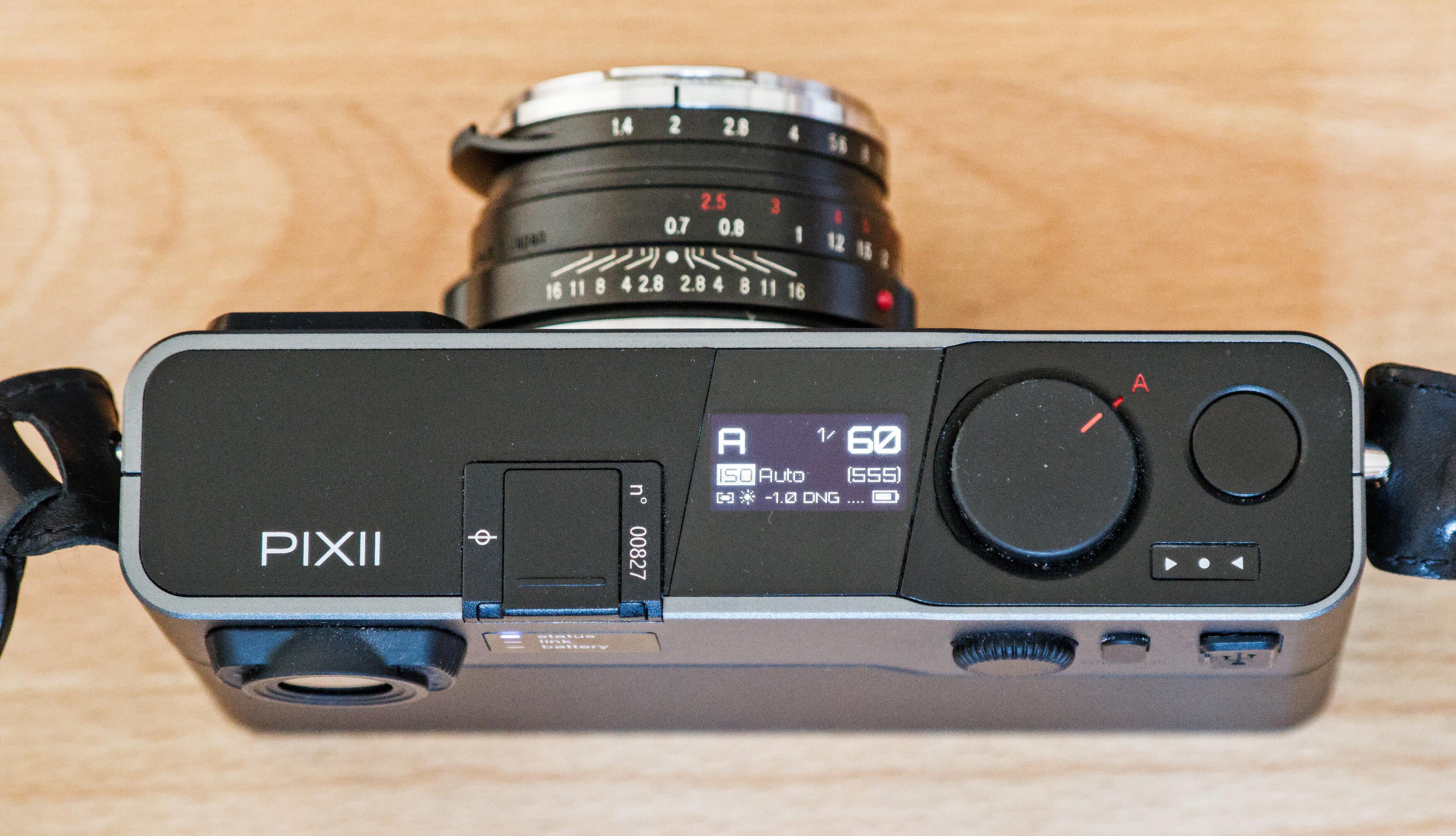
There's an aperture ring and a manual focusing tab on the lens, there's an unmarked shutter speed dial on top, a shutter button, and a menu to set auxiliary things such as your ISO, light meter settings, and file format. And that's about it.
Crucially, there is no screen on the back, no autofocus, and just a window finder with an optomechanical rangefinder for focusing. It feels and acts like a mechanical analog camera, but takes digital pictures. In contrast to the otherwise-similar Leica M cameras, however, the Pixii is a very new product, introduced in 2018 by a small French company.
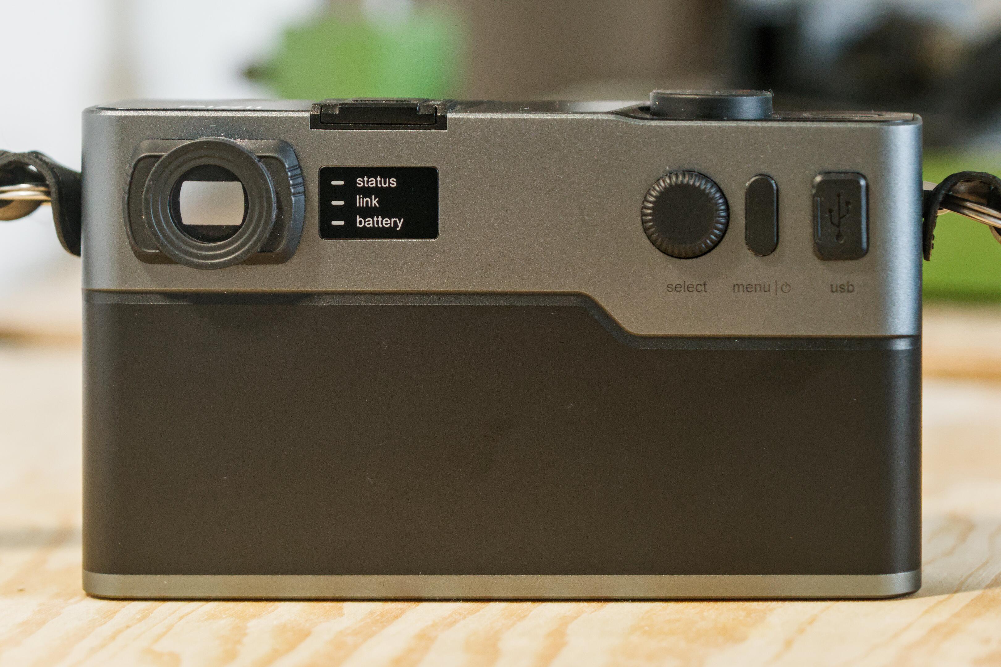
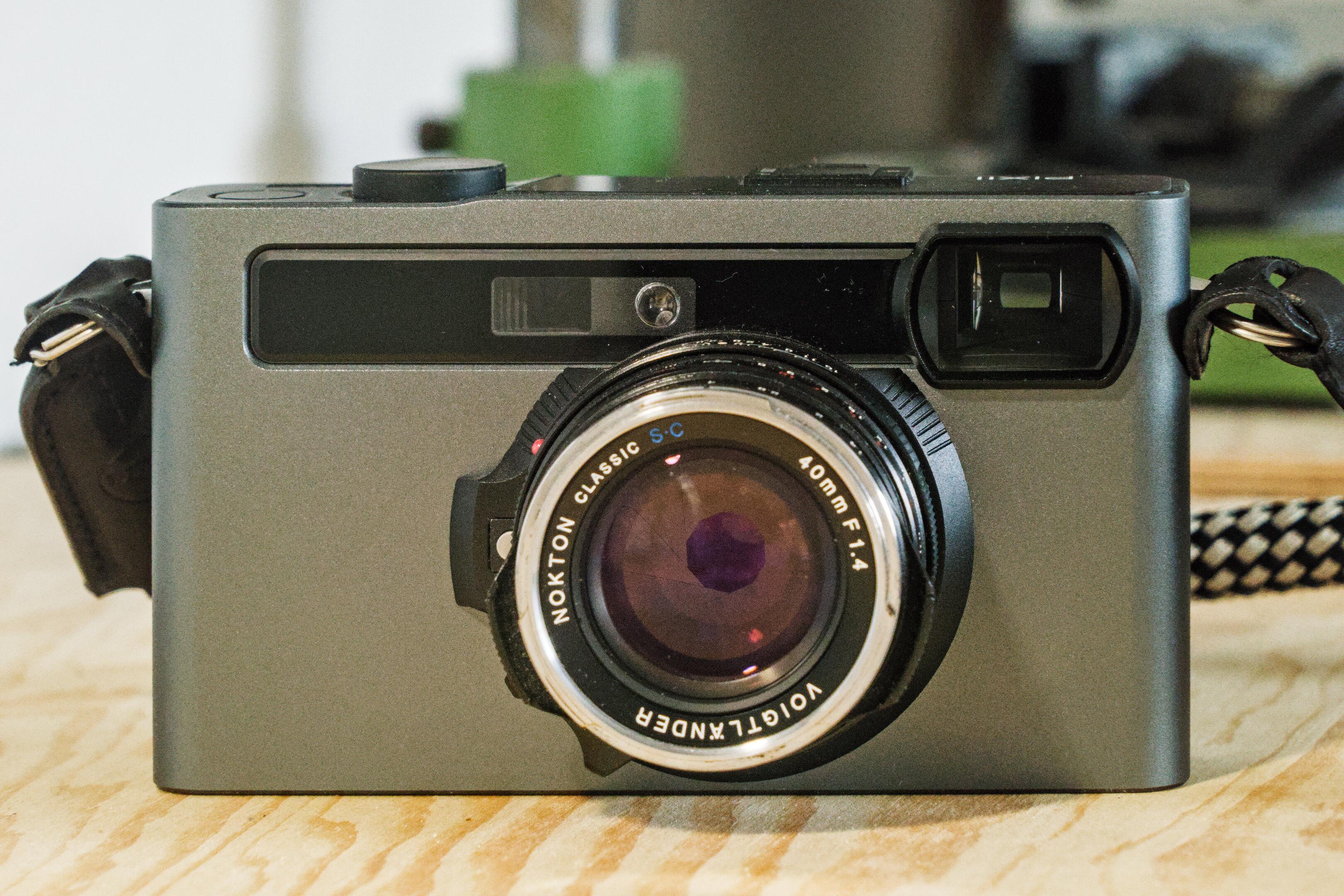
Camera manufacturers measure their legacy in centuries2, so a truly new camera is a modern miracle. I have been extremely interested in trying out a Pixii camera, but figured they'd be too rare to ever get ahold of one. However, the same friend and avid camera collector who last year gave me a Leica M240 to try, now found a Pixii, and graciously loaned it to me for a few weeks.
And what a fascinating camera it is: There is such a joyful simplicity to its operation. The basic verbs of photography are available as tactile dials, for focusing, composing, and shooting, but everything else is either automated or removed entirely. No screen, no chimping3, no worrying about scene modes or subject tracking or picture profiles. I like that. It's just the right kind of friction to prompt me to simplify and be present.
Of course you need to meet it on its own terms. This is not a speedy sports camera. It does take a few seconds to turn on. But shot-to-shot times are reasonable, and the shutter fires with little delay. What it tries to do, it does very well. When shooting, the camera beautifully fades into the background, and lets me focus on the light and the scene.
There are other minor gripes of course, such as the battery being a bit on the weak side, the file transfer being unnecessarily finicky and slow, perhaps the somewhat odd timing of the power button. But that's a small price to pay for a unique experience.
What is not acceptable, however, is that it sometimes randomly overexposes shots, sometimes corrupts files, and that the white balance can be so temperamental as to be useless. These are serious software issues, and it frankly gives me pause that Pixii wasn't able to fix them in the eight years since the camera has been released.
But what can I say, there is something ineffably charming about the Pixii. For reasons that I'm struggling to articulate, it is just a fun shooter. In fact, I find it more engaging than the Leica M240 I tried a year ago. Perhaps I like the more modern feel of it, the lower weight, the French quirkiness. The charming animations on its anachronistic dot-matrix LED display, and the sleek modern design.
I can clearly see what they're trying to do here, and largely agree with their goals: This is a camera that's meant to be used through the viewfinder, so a lack of labels on the buttons is not a failure of design, but a conscious encouragement to use that viewfinder. The menu system is simplistic, but makes sense when used in the viewfinder. The lack of a back screen, the simple shape-and-texture coded buttons, they all make sense. Perhaps it's this cohesion of design that so attracts me to the camera.
I have a strange affection for the Pixii camera. It is such a unique piece of kit, so full of character, and obvious love for the concept. This is surely not a camera for everybody, but it's an experience you can't get anywhere else, and that's worthy of praise. If only they could fix those digital issues I mentioned earlier, and speed up the startup process a bit, I might just buy one myself.
your camera can sense light level differences of a dozen-or-so photons, your image stabilization is only limited by the rotation of the earth, and all of that runs on a power budget that would make your phone blush in shame.↩
the otherwise newest photography companies were probably Sigma from 1961 and Sony from 1946 – perhaps excluding Phase One from 1993, which mated Phase One's original digital sensor with Mamiya's heritage in optics and mechanics.↩
that's reviewing your every picture on the screen to make sure everything's ok.↩
Printing Photos
About a year ago I got a fancy Canon Pro 200 photo printer. Since then, I've been learning how to print photos at home. Here's an unstructured list of things I learned:
Make sure your screen isn’t too bright. There’s no hard and fast rule for screen brightness (contrary to popular belief1). If the screen is too bright, everything looks more saturated and contrasty; thus, you’ll edit with reduced contrast and saturation, and your prints will look flat. So, if your prints look too flat, lower your screen brightness. Conversely, if your prints look too contrasty, raise your screen brightness.
Avoid stray light onto your screen, as this produces glare, which raises the screen’s black point. If that happens, you’ll compensate by lowering your blacks in the edit, leading to prints with crushed blacks. If your prints have muddy, crushed blacks, check your screen for stray light. Better screens often come with much better antireflective coatings, which makes a big difference.
Avoid colorful objects within your field of vision while editing, these will bias your color perception. If your prints come out with an unexpected color cast, check if there is too much color in your field of vision while editing. This may include moody lighting or colored furniture. A colorful desktop background on your secondary screen can also be a problem.
See that your screen uses a neutral color temperature of 5000-6500K, use room lighting with a similar color temperature (4000-5000K), use a screen with decent colors, or calibrate your screen. But frankly, calibration is only relevant if you fixed everything else first, and only makes a small difference on a decent screen. Beware of old screen calibrators, though, as some models can age and drift over time2.
Make sure to edit with full-black and full-white. Prints have very limited dynamic range. Off-black blacks and off-white whites tend to look flat and broken. Use Darktable’s color assessment mode or a white editing background to get a feel for what white should be, and look at your histogram or waveform to ensure deep blacks. Off-white is immediately obvious in a print, off-black just looks muddy.
Prints need to be sharpened specifically for the intended print size. It’s not sufficient for details to be sharp at a pixel level. In fact, the pixel level is often entirely meaningless, as it’s way too small to be visible (corollary: noise doesn’t matter). So resize your image for the intended print size, and sharpen that file. Or use your printer driver’s sharpening option if there is one (“contrast reproduction” in Canon’s driver). Alternatively, dedicated printing software such as QImage often includes dedicated sharpening options for printing.
When experimenting with different papers, be aware that ICC profiles correct for the paper's tint. A print on a warm stock will be printed with cooler colors to compensate. This can look very silly. Especially for black-and-white prints, you're often better off to use the printer's black-and-white mode that doesn't introduce a color cast. In general, I've seen a few rather poor ICC profiles. Unless you're truly committed to hit a particular hue (often required in commercial work), it's worth experimenting with using just the paper profile, but no ICC.
Different papers and formats have a big influence on the appearance of a print. It's good fun and very instructive to experiment with various options. I like to have at least a glossy, a lustre, and a smooth fine art stock at hand. You can use a more structured paper to hide a slight softness in the image. The paper size also plays a big role. I particularly like 10x15 card stock, and double-A4 panoramic paper. A4/letter is too common in our world, and often looks boring, so go bigger or smaller, or leave a white margin. I didn't see any big differences between similar papers of different manufacturers, so it's safe to buy affordable and local options for common papers3.
Lastly, it all depends on how the print will be presented. The print will look different depending on the illumination and surroundings. So whatever you do, make a small test print first, hold it up where it’s supposed to go, and adjust from there. It's quite common that prints change character as the illumination in the room changes throughout the day. In particular, make sure the print receives light from bulbs with a good CRI, or all your color corrections will be in vain.
there are standards for cinema, video, and retouching, which define appropriate screen brightness for different room illuminations. But these are meant for dark rooms. For looking at prints (and office ergonomics), however, you need a bright room, so the standards do not apply. What matters is appropriate contrast reproduction, which is possible in any illumination. As a rule of thumb, make the screen a bit less bright than you'd think.↩
In particular, the ColorMunki Smile and Spyder <= 5 are known to drift with age.↩
of course make sure the paper is appropriately coated for inkjet printing, and provides ICC profiles for your printer.↩
